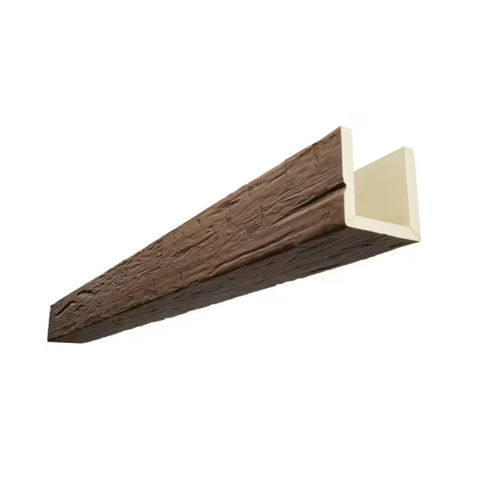
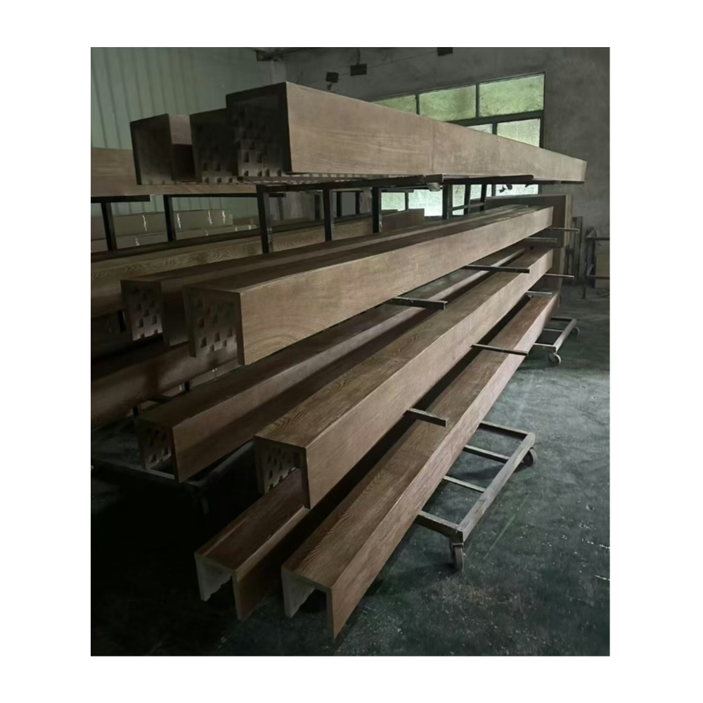
The designer's mood board showed a room with nearly black walls, white ceiling, and three pale oak beams running across the vault. The homeowner looked at it and said, "That sounds dark." The designer nodded. "It is dark. But the beams are going to be the light source. The room is dark on purpose, and the beams make it feel intentional."
That is the logic of the charcoal-and-light pairing. The walls recede. The ceiling lightens. The beams become the room.
Why this contrast works
The human eye is drawn to contrast. A dark field with a light element reads as dramatic. A light field with a dark element reads as heavy. The charcoal wall, pale ceiling, and light beam combination creates a specific spatial reading: the ceiling floats above, the walls recede, and the beams read as a deliberate architectural intervention.
The contrast also photographs exceptionally well. Dark-walled interiors with bright architectural details are the dominant aesthetic in high-end residential photography right now. A room with charcoal walls and light beams is almost guaranteed to look good in listing photos, which matters for resale and for the designer who wants the room published.
Specifying the right light wood tone
The light wood tone is the most important variable in this pairing. Too warm, and the beam competes with the charcoal wall for attention. Too white, and the beam disappears into the ceiling.
The sweet spot for most charcoal room specifications is a warm whitewash or a pale honey oak.
Warm whitewash
A whitewashed oak tone — roughly 60 to 70 percent luminance with a cool to neutral undertone — reads as a natural material that has been bleached by light. It contrasts strongly with charcoal without feeling artificial. This is the most common specification for the charcoal-and-light pairing.
Pale honey oak
A slightly warmer tone — 40 to 50 percent luminance with a warm amber undertone — reads as a natural aged wood. This is slightly warmer than the whitewash and pairs better with warm metallic accents (brass, bronze) in the room. For rooms with wood furniture or warm lighting, the honey oak tone is the better choice.
Natural pine
The lightest option, with 70 to 80 percent luminance. Natural pine reads as almost white at a distance. This is the most dramatic pairing with charcoal and works best in contemporary or Japandi interiors. It is less forgiving of warmer accents in the room.
Avoid cool-toned grays in the beam if the room has any warm metal or wood accents. A cool gray beam with warm brass hardware creates a tonal conflict that reads as accidental rather than designed.
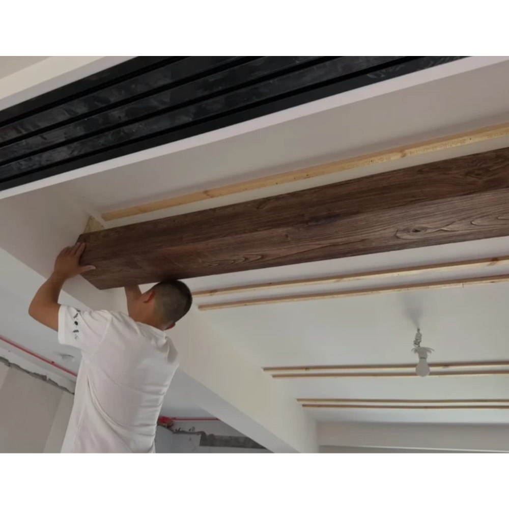
The ceiling matters as much as the beams
In a charcoal-and-light room, the ceiling is not neutral. A flat white ceiling against charcoal walls reads as part of the light source — the ceiling is where the room gets its brightness. The beams are an extension of that brightness.
If the ceiling is not white, the contrast breaks. A gray ceiling with charcoal walls and light beams creates a dark room with brown beams, which is not the intended effect. Keep the ceiling white or near-white. Off-white with a neutral undertone is acceptable; greige is not.
How many beams for a charcoal room
The charcoal wall amplifies the visual weight of anything on the ceiling. Fewer beams reads as more intentional. The sweet spot for most rooms is two to three parallel runs, evenly spaced.
A single beam over a charcoal room reads as a minimalist gesture. Two beams reads as considered. Three beams reads as full design commitment. Five or more beams in a standard room reads as busy, even in a dark-walled space.
For a room with a vaulted ceiling and a floor area under 400 square feet, two or three beams. For a room over 400 square feet with a 12-foot or higher ceiling, three or four.
Texture contrast
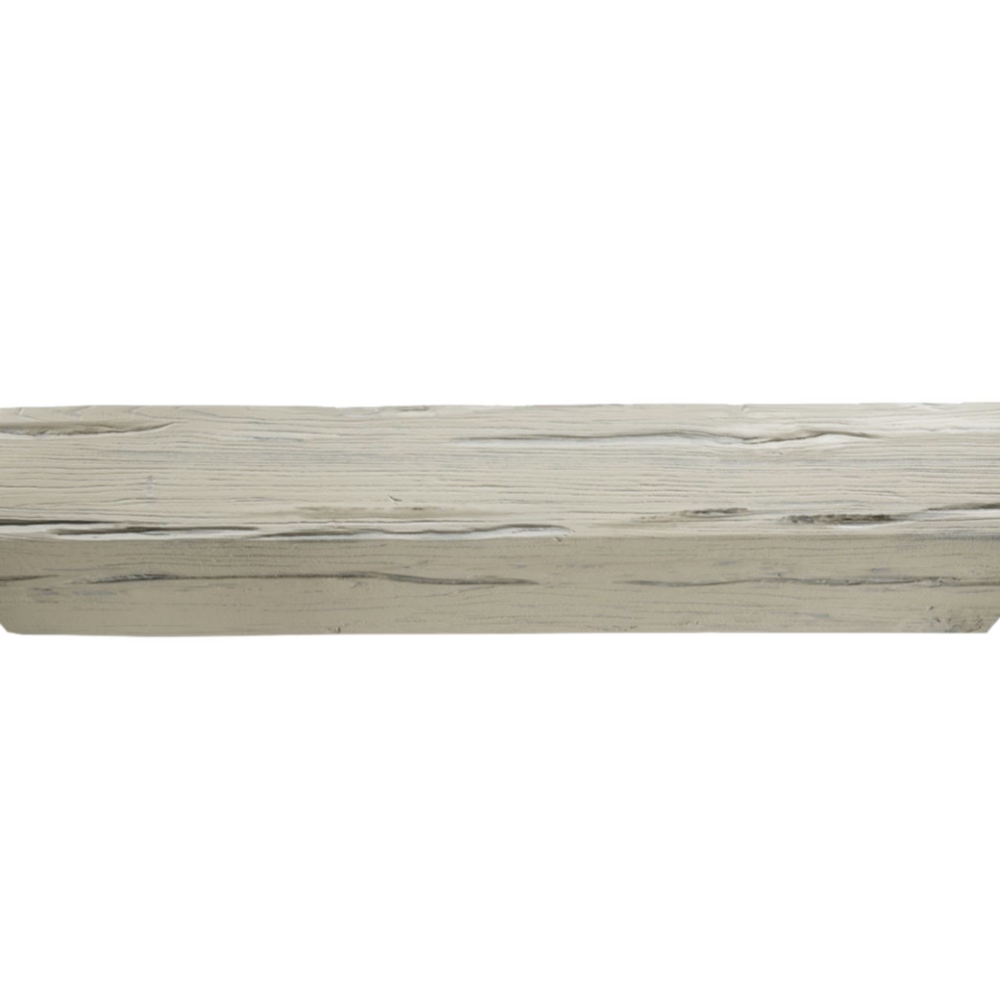
The grain on the beam matters in a charcoal room. The contrast between the smooth dark wall and the textured wood grain is part of the visual interest.
A light-grain smooth-face beam reads as clean and contemporary. The texture is present but restrained. This is the right choice for minimalist interiors.
A medium-grain beam with subtle knot detail reads as warmer and slightly more organic. The knots add character without adding complexity. This is the right choice for updated transitional interiors.
A heavy-grain hand-hewn beam in a charcoal room is too much. The wall is already dark and dramatic; the beam should provide contrast and warmth, not compete for drama.
Lighting the beams
In a dark room, lighting is everything. The beams should be lit — not from below, but from above or from the side.
Two effective approaches:
Recessed downlights in the ceiling beside the beams. The beam sits in shadow at the top of its profile and catches light at the bottom edge, giving the grain depth. This is the most natural-looking approach and works with standard recessed cans.
Beam-mounted linear LED. A slim LED strip mounted inside a hollow box beam casts light both up and down. The beam becomes a light fixture as well as an architectural element. This is more dramatic and more contemporary.
Avoid aiming a single downlight directly at a light beam from below — it flattens the grain and makes the beam look painted rather than dimensional.
Furniture and material coordination
A charcoal-and-light room works with a range of furniture and material palettes.
Modern and contemporary: Light linen sofas, chrome or matte black metal tables, white or cream area rugs. The room feels minimal and considered.
Updated transitional: A warm leather sofa in cognac or saddle, brass hardware on a media console, a natural fiber rug. The leather adds warmth that balances the charcoal.
Coastal modern: White or cream upholstery, natural rattan or woven accents, a washed linen rug. The contrast is between the dark walls and the light, airy furnishings.
Japandi: Low-profile furniture in natural oak or walnut, matte black metal accents, a neutral woven rug. The charcoal reads as a modern take on a traditional dark interior.
The common thread is restraint. The charcoal walls are already dramatic. The furniture should complement, not compete.
What goes wrong
The most common failure in a charcoal-and-light room is undertrained lighting. A dark room with the same recessed lighting as a white room is a dark room with bad lighting. The light level in a charcoal room needs to be 20 to 30 percent higher than a white room to feel equivalent.
The second failure is an inconsistent undertone in the beam. A beam that looks warm white in the factory photos but arrives with a gray or pink undertone reads as wrong in a charcoal room. Always get a physical sample.
The third failure is too many beams. The designer who specified five parallel runs in a 12-by-14-foot room created a room that looks like a barn. Three runs in the same room would have been elegant.
The charcoal-and-light room is one of the most powerful expressions of contemporary interior design. It rewards careful specification and punishes shortcuts. Get the beam color right, light it properly, and keep the rest of the room restrained. The room will take care of itself.
Technical References
ASTM standards cited in every specification
Test Data
Lab results from internal testing program
Updated 2026
Reviewed against current product specs