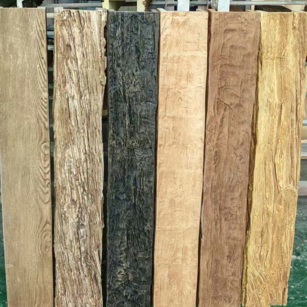
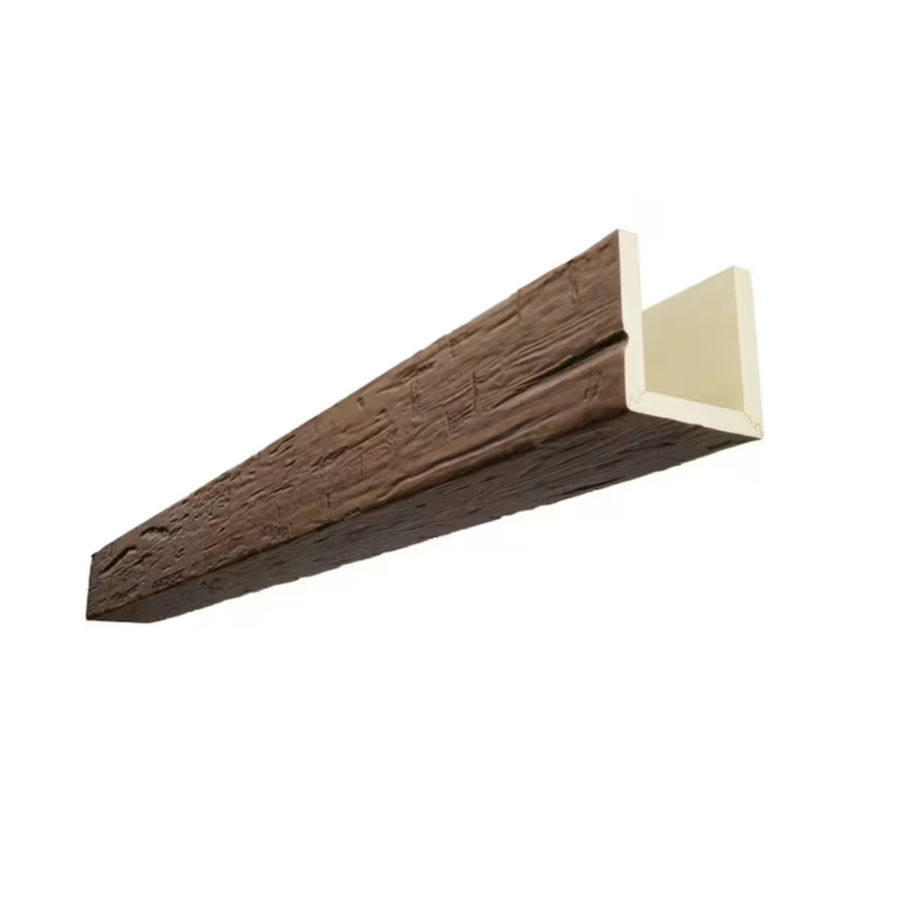
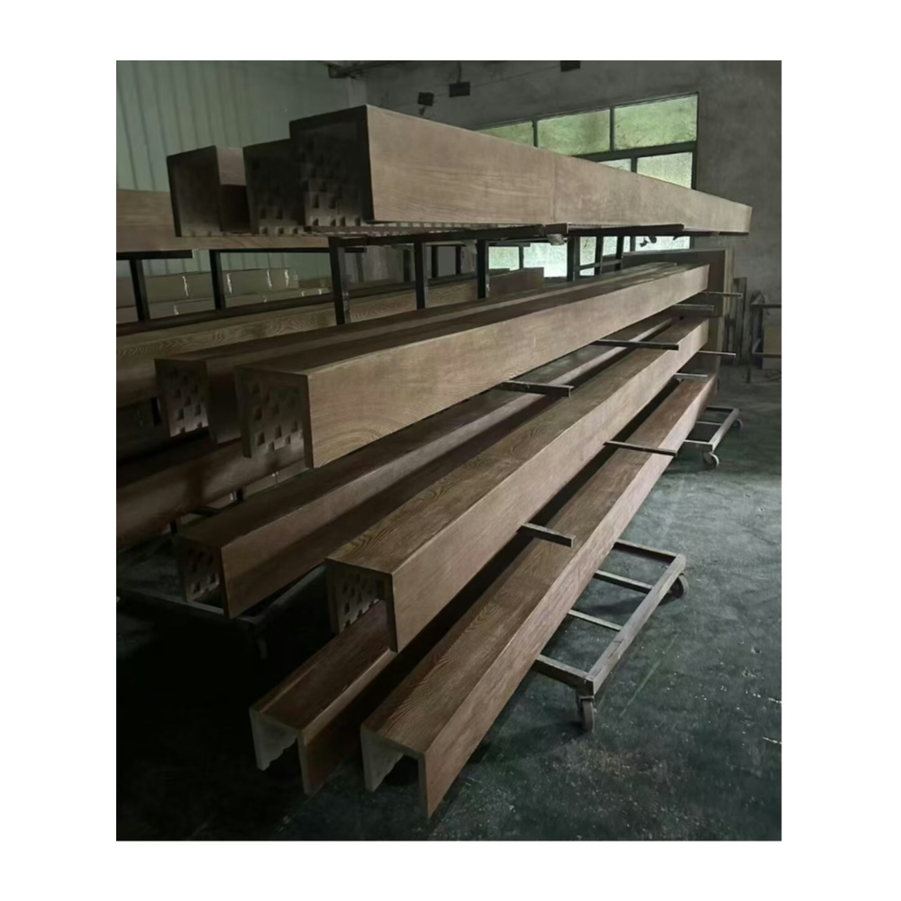
Espresso is the mid-range dark brown that sits between milk chocolate and black coffee — warm but not red, deep but not gray. It reads as sophisticated rather than heavy, which makes it the right choice when a room needs warmth without the rustic associations of honey oak or the starkness of ebony. In interior design terms, espresso is the color of a room that takes itself seriously.
Why espresso works in dark interiors
Dark interiors succeed when the darkness has depth — when the walls, ceiling, and furniture are not simply black or gray but have undertones that create visual interest at close range. An all-black room with a flat black ceiling and matte black walls can look like a void. An espresso-toned room has warmth in the shadows, subtle color shifts as light moves across surfaces, and a natural material quality that synthetic finishes struggle to replicate.
Real espresso-stained wood is the material most commonly associated with this palette, but it comes with the maintenance burden of real wood: susceptibility to humidity changes, the need for periodic refinishing, and weight that limits how it can be installed. Polyurethane faux wood in espresso achieves the same visual result without these constraints.
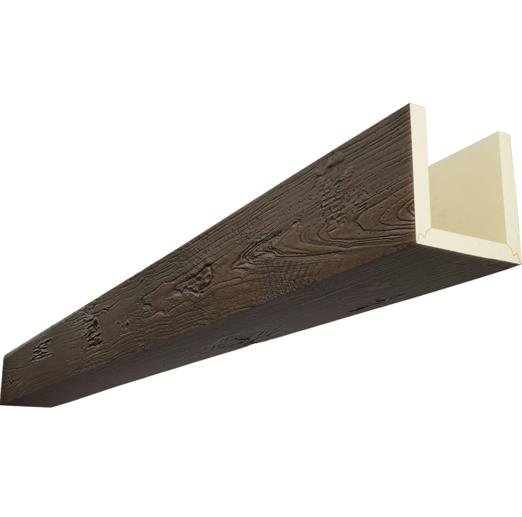
The espresso finish we produce for our beams is a multi-tone application: a dark base coat, a mid-brown glaze that follows the grain lines, and a highlight tone on the high spots. The result has the depth of real wood rather than the flat appearance of a single-tone paint.
Complementary color palettes
Espresso beams pair with a narrow range of wall colors. The most successful pairings:
Warm near-black walls — Benjamin Moore HC-174 (Charcoal Brown) or equivalent. The wall and the beam are in the same tonal family, but the beam's grain pattern provides visual texture against the smooth wall. This is the highest-contrast approach and works best in larger rooms where the darkness has room to breathe.
Dark warm gray — Farrow & Ball's Railings or equivalent. This has slightly more gray in the mix than espresso and creates a cooler, more contemporary feel while still maintaining warmth. The contrast between the warm brown beam and the cool gray wall is subtle but effective.
Deep navy — A navy wall with espresso beams works particularly well in libraries, studies, and home offices. The navy grounds the room while the espresso adds warmth and a connection to the natural material palette.
Cream or ivory accents — In a room with espresso beams and dark walls, cream-colored furniture, trim, and accessories prevent the room from reading as monochromatic. The contrast is what makes the dark palette work.
Colors that don't work well with espresso beams: anything with orange undertones (it competes with the espresso warmth), anything with pink undertones (it clashes with the brown), and anything too light (it makes the espresso look dirty rather than intentionally dark).
Lighting design for espresso beam rooms
Dark rooms need more light planning than light-colored rooms. In a room with espresso beams and dark walls, light sources serve two purposes: illuminating the room for function and creating visual drama through contrast.
Recessed can lights should be positioned to graze the beam surfaces — that is, positioned so that the light travels parallel to the grain rather than perpendicular to it. This reveals the texture and grain pattern. Perpendicular lighting flattens the surface and makes the beam look painted rather than wood-grained.
For accent lighting, consider a picture light mounted to the wall above the beam run, shining down onto the beam face. This creates a highlight that draws the eye along the beam's length and emphasizes the craftsmanship.
In dining rooms and living rooms, pendant lighting with brass or black metal hardware complements espresso beams without introducing a competing warm tone. Glass or fabric pendant shades in cream or smoke gray work well.
Room types that benefit from espresso beams
Home theater and media room — Dark espresso beams over a dark ceiling create the right ambient environment for watching movies. The beams add architectural interest without reflecting light toward the screen. Pair with theater-style seating in dark leather.
Executive home office — An espresso-beam ceiling in a home office communicates seriousness and permanence. It works particularly well with a dark wood desk, brass hardware, and leather-bound books on open shelving.
Formal dining room — An espresso-beam ceiling in a dining room elevates the space without the stuffiness of traditional dark wood paneling. Pair with a long dining table in a complementary dark wood tone, linen drapes in cream or ivory, and a statement chandelier.
Master bedroom — Dark ceiling beams can create an intimate, cocooning effect in a master bedroom. Pair with a upholstered bed in charcoal or navy, heavy linen drapes, and bedside lighting in warm brass or matte black.

Finish specification for espresso beams
When ordering espresso-toned beams, specify the finish as "dark espresso multi-tone wood grain." Our standard espresso finish uses a base tone of approximately Munsell 2.5YR 2/2 (dark reddish-brown), a mid-tone glaze of approximately 2.5YR 3/4, and a highlight of 2.5YR 4/6.
If you have a reference chip — a paint swatch, fabric swatch, or piece of wood — we can color-match to it. The spectrophotometer reading from the reference gives us a starting point, and our finishing team adjusts by eye to account for the way polyurethane accepts pigment differently from the reference substrate.
For importers specifying espresso beams for a product catalog, we recommend requesting a sample beam before photographing the product. The espresso finish photographs differently on camera than it appears in person, and a sample confirms the actual tone before the catalog images are committed.
The espresso finish across different beam profiles
The espresso multi-tone finish performs differently on different beam profiles. A square beam with a smooth face shows the grain pattern clearly, with each grain line visible and the tonal variation between light and dark areas pronounced. A chamfered beam catches light at the chamfered edge, which creates a highlight that breaks up the grain pattern and adds dimensionality.
For the deepest espresso effect — where the beam reads as nearly black from a distance but reveals warm brown tones at close range — we recommend a square profile with a smooth finish. The visual richness accumulates as the viewer approaches the beam, which creates a sense of discovery that a flatter finish doesn't provide.
For a more contemporary espresso look — where the beam reads as a consistent dark element from any distance — a slightly lighter espresso tone with a satin topcoat is more appropriate. This version is less dramatic but more versatile across different room types.
Espresso beams in specific room orientations
The orientation of a room — which compass direction its windows face — affects how the espresso beam ceiling looks throughout the day. Understanding this relationship helps set expectations for the finished result.
North-facing rooms receive cool, soft natural light throughout the day. Espresso beams in a north-facing room maintain their depth and richness because the cool light doesn't wash out the dark tones. These rooms are naturally suited to dark finishes.
South-facing rooms receive warm, bright direct sunlight for much of the day. Espresso beams in a south-facing room will look slightly lighter and warmer during sunlit hours because the natural light adds warmth to the dark surface. This is not a flaw — it makes the room feel more dynamic — but it means the espresso effect is most pronounced in the early morning and late afternoon when the light is softer.
East-facing rooms receive warm morning light that shifts to cooler, softer light in the afternoon. Espresso beams in east-facing rooms are at their richest in the morning and slightly flatter in the afternoon.
West-facing rooms receive the warmest, most intense afternoon light. Espresso beams in west-facing rooms can look dramatically different at 4pm compared to 9am. The evening light — warm, golden, and low — brings out the best in espresso beams.
The espresso finish and art presentation
A room with espresso beams is an excellent backdrop for art. The dark neutral background allows art to speak for itself without competing for attention. This is particularly valuable in rooms where the art collection is a significant investment — a home gallery, a formal living room, or a library.
The wall color against which the art is hung should be carefully chosen. A dark espresso-adjacent wall color — charcoal brown, dark warm gray — creates the most neutral backdrop for a wide range of art styles. A lighter wall — warm taupe or cream — creates more contrast but can make some art styles look isolated rather than integrated.
Lighting for art in an espresso-beam room should be warm and directional. Picture lights with warm LED bulbs (2700K) mounted above frames provide the classic gallery lighting approach. Track lighting with adjustable heads offers more flexibility for rotating art displays.
Climate and environmental considerations
In regions with high humidity — coastal areas, tropical climates, or rooms with swimming pools — the espresso finish on polyurethane beams maintains its appearance without the warping, swelling, or rot that would affect real walnut in the same conditions. This practical advantage is significant in vacation homes, beach properties, and homes in humid subtropical climates.
For exterior applications in covered outdoor spaces, the marine-grade topcoat is required. The standard topcoat provides adequate UV stability for interior use but is not designed for the more demanding conditions of exterior exposure. The marine-grade topcoat includes additional UV inhibitors and a more robust water-resistant layer.
In dry climates — desert regions, high-altitude locations — real wood beams are prone to checking and splitting as they lose moisture. Polyurethane beams are unaffected by these conditions and maintain their dimensional stability and appearance indefinitely.
Long-term maintenance and finish refresh
The espresso multi-tone finish on polyurethane beams requires minimal maintenance. Periodic dusting with a lamb's wool duster or microfiber cloth is sufficient for most interior applications. In kitchens or high-traffic areas, occasional cleaning with mild soap and water keeps the surface clean.
After 10 to 15 years in a residential environment, the clear topcoat may begin to lose some of its initial luster — a gradual, barely perceptible dulling that is typical of all surface coatings. A professional can restore the original sheen by applying a fresh coat of clear matte finish. This is a one-day process that requires no removal of the beams and no significant disruption to the room.
The color depth of the espresso finish — the multi-tone layering that creates the visual richness — does not fade significantly with this treatment because the color is in the glaze layers beneath the topcoat, not in the topcoat itself.
Technical References
ASTM standards cited in every specification
Test Data
Lab results from internal testing program
Updated 2026
Reviewed against current product specs