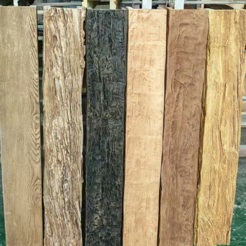
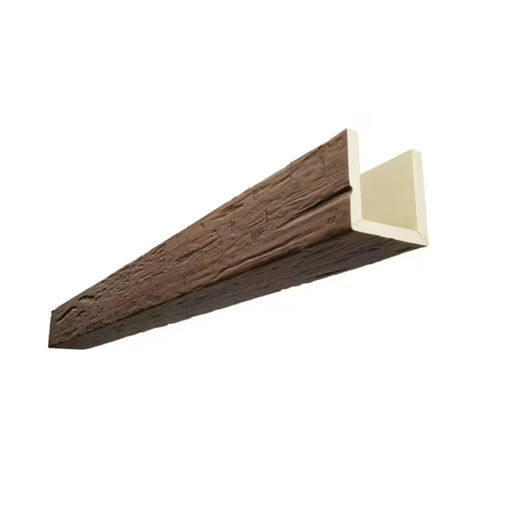
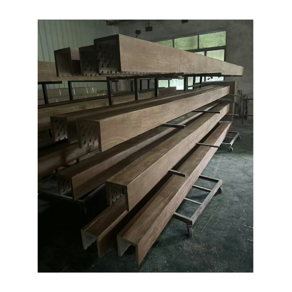
Color is the first thing we notice about a room, and in rooms with faux wood beams, the relationship between the wall color and the beam finish is one of the most influential design decisions you'll make. The wall sets the room's background and mood; the beams add warmth, texture, and architectural weight. How these two elements interact—through contrast, harmony, or something in between—shapes the room's character in ways that are felt immediately upon entering the space.
The goal isn't to find a single "correct" combination but to understand the principles that govern successful wall-beam color relationships, and to apply those principles to your specific palette. With a clear understanding of contrast, value, and temperature, you can make confident color decisions that produce interiors you're proud to live in.
Understanding Value Contrast
Value—the lightness or darkness of a color—is the most important factor in wall-beam color relationships. A light wall with a dark beam creates strong value contrast that defines the beam as a distinct architectural element. A medium-toned wall with a medium-toned beam creates less contrast, which can produce either a unified, cohesive look or a flat, undifferentiated one depending on the specific tones involved.
Strong value contrast—light walls with dark beams, or dark walls with light beams—is the most reliable approach for making beams visible and impactful. The human eye distinguishes between light and dark automatically, and when the beam is clearly darker or lighter than the surrounding wall, it registers as a distinct element with clear boundaries. This is why a white wall with dark walnut beams is such a classic combination: the value contrast is immediate and unambiguous.
Low value contrast—walls and beams that are close in lightness—requires more precision in tone selection. The goal in low-contrast combinations is typically to create subtle differentiation rather than bold contrast. A warm off-white wall with a cream or wheat-toned beam can achieve this, producing a layered look where the beam adds warmth and texture without creating a strong visual boundary. This approach works best in rooms where the beams are meant to enhance the space subtly rather than dominate it.
The worst outcome in value contrast is near-miss matching—where the wall and beam are similar enough in value to look unintentional rather than deliberately coordinated. A grey wall with a grey beam in a slightly different shade, for example, can appear to be a mistake rather than a design choice unless the difference is large enough to be clearly intentional. When in doubt, increase the contrast.
Temperature and Mood
Color temperature—warm versus cool—affects the mood of the room independently of value. A warm-toned beam (honey oak, amber, wheat) against a cool-toned wall (grey, blue, white) creates temperature contrast that energizes the room. The warmth of the beam prevents the cool wall from feeling cold, while the cool wall keeps the warm beam from feeling heavy or dated. This combination is one of the most versatile in interior design, working across styles from modern to traditional.
A warm-toned beam against a warm-toned wall creates temperature harmony. The room feels cohesive, comfortable, and grounded. This approach works particularly well in spaces meant for relaxation—bedrooms, living rooms, dining rooms—where the goal is warmth and coziness rather than energy and stimulation. The risk of warm-on-warm harmony is that it can become monotonous if the tones are too similar, so some variation in hue or value is important to maintain visual interest.
Cool-toned beams against cool-toned walls produce a clean, contemporary aesthetic that feels fresh and architectural. Grey beams against grey walls, white beams against blue-grey walls—these combinations have a sophistication that aligns well with modern and minimalist design. The challenge with cool-on-cool combinations is maintaining warmth; a room with no warm tones at all can feel clinical or unwelcoming. Introducing warm accent colors through textiles, artwork, and accessories compensates for the cool temperature of the permanent elements.
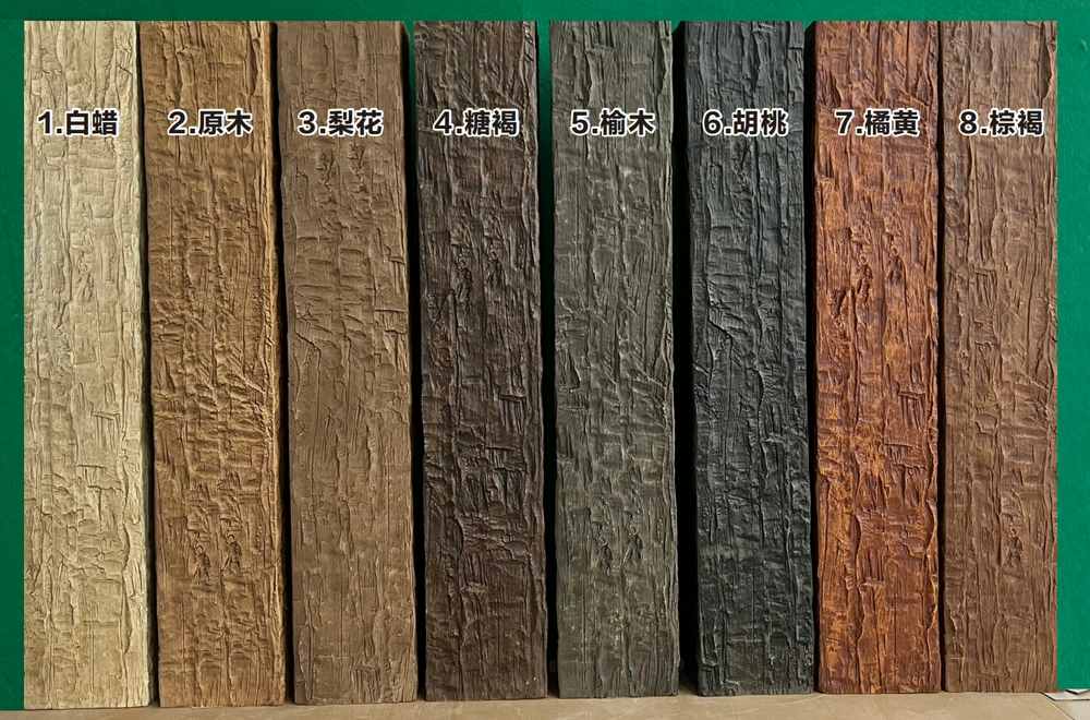
Neutral Walls and Bold Beams
One of the most popular approaches in contemporary beam design is to use neutral wall colors—white, off-white, light grey, greige (grey-beige)—as a backdrop for beams in more saturated or characterful finishes. This approach lets the beams become the visual focus of the room without competing with a bold wall color.
White walls are the ultimate neutral canvas, and white paired with almost any beam finish creates a clean, readable relationship. The beam's color and texture are immediately visible against the white background, and the contrast between the light wall and the wood-toned beam establishes a clear visual hierarchy: the wall recedes, the beams advance. This is an excellent default choice for any room where the beams are meant to be a prominent design feature.
Off-white and cream walls add subtle warmth to the room that can either complement warm-toned beams or offset cool-toned ones. An off-white wall with honey oak beams feels organic and cohesive. An off-white wall with charcoal beams creates a slightly softer contrast than pure white, which can be more appropriate in rooms where the overall mood should be warm rather than crisp.
Light grey walls work well with both warm and cool beam finishes, but they shift the room's temperature toward cool regardless of the beam's temperature. If you want a grey wall with warm-toned beams, make sure the beam's warmth is substantial enough to register against the grey—lighter warm finishes like honey or blonde work better than deeper warm finishes like walnut, which can get lost against a grey background.
Bold Walls and Subtle Beams
The inverse approach—bold wall colors with more restrained beam finishes—works when the walls are the primary design focus and the beams are meant to support rather than dominate. This approach is common in spaces where the wall color reflects a strong aesthetic commitment: a deep navy living room, a forest green library, a terracotta dining room.
When the wall is bold, the beam finish should complement rather than compete. A warm wood tone—a medium oak or walnut—works with warm bold walls (terracotta, rust, ochre) by reinforcing the warmth of the palette. The beam adds texture and architectural interest without introducing a new color family. A cool wood tone—a grey-tinted oak or a bleached finish—works with cool bold walls (navy, forest green, deep purple) by complementing the cool palette while adding the organic texture that prevents bold color from feeling flat.
Painted beams in a finish that matches or complements the wall color is an option in bold-wall rooms. A navy beam over navy walls creates a subtle textural contrast rather than a strong color contrast, letting the wall color dominate while the beam adds the dimensional interest that prevents a bold painted wall from feeling like a solid color block.
Testing Your Color Choices
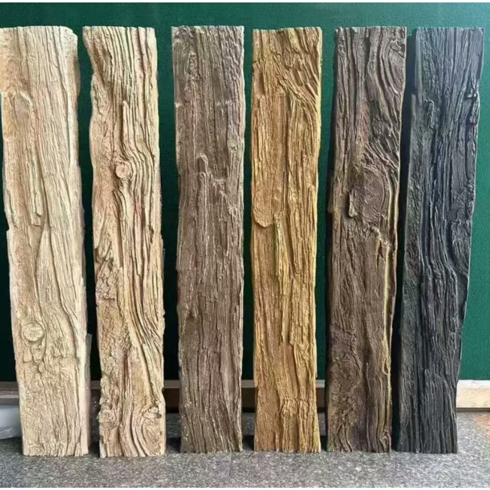
Before committing to a wall color or beam finish, test them together in the actual room. Paint a large swatch of the wall color on the primary wall and place a sample of the beam finish—or a board with the same finish—against the wall at the ceiling line. Live with these samples for several days, observing them in morning light, afternoon light, and evening artificial light.
Light changes everything. A combination that looks perfect in the bright afternoon light of a paint store can look completely different under the warm, low light of evening lamps. A combination that reads as sophisticated contrast in natural light may look muddy under purely artificial lighting. The room's actual lighting conditions are the only reliable test.
Consider the room's orientation. North-facing rooms receive cool, blue-toned natural light and benefit from warmer wall and beam tones. South-facing rooms receive warm, yellow-toned natural light and can handle cooler wall and beam tones without appearing cold. East and west-facing rooms shift between warm and cool throughout the day, requiring the most flexible color choices.

The relationship between wall colors and faux beam finishes is one of the most powerful tools in interior design. By understanding how value and temperature interact, and by testing your choices in the room's actual light, you can create combinations that are not just acceptable but genuinely harmonious—spaces where the walls and beams work together to produce a mood and character that feels considered, intentional, and complete.
Technical References
ASTM standards cited in every specification
Test Data
Lab results from internal testing program
Updated 2026
Reviewed against current product specs