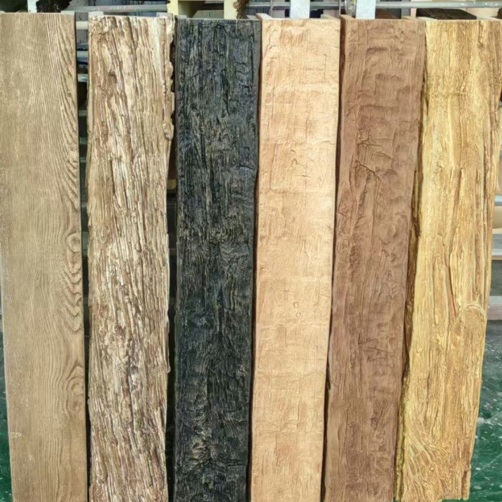
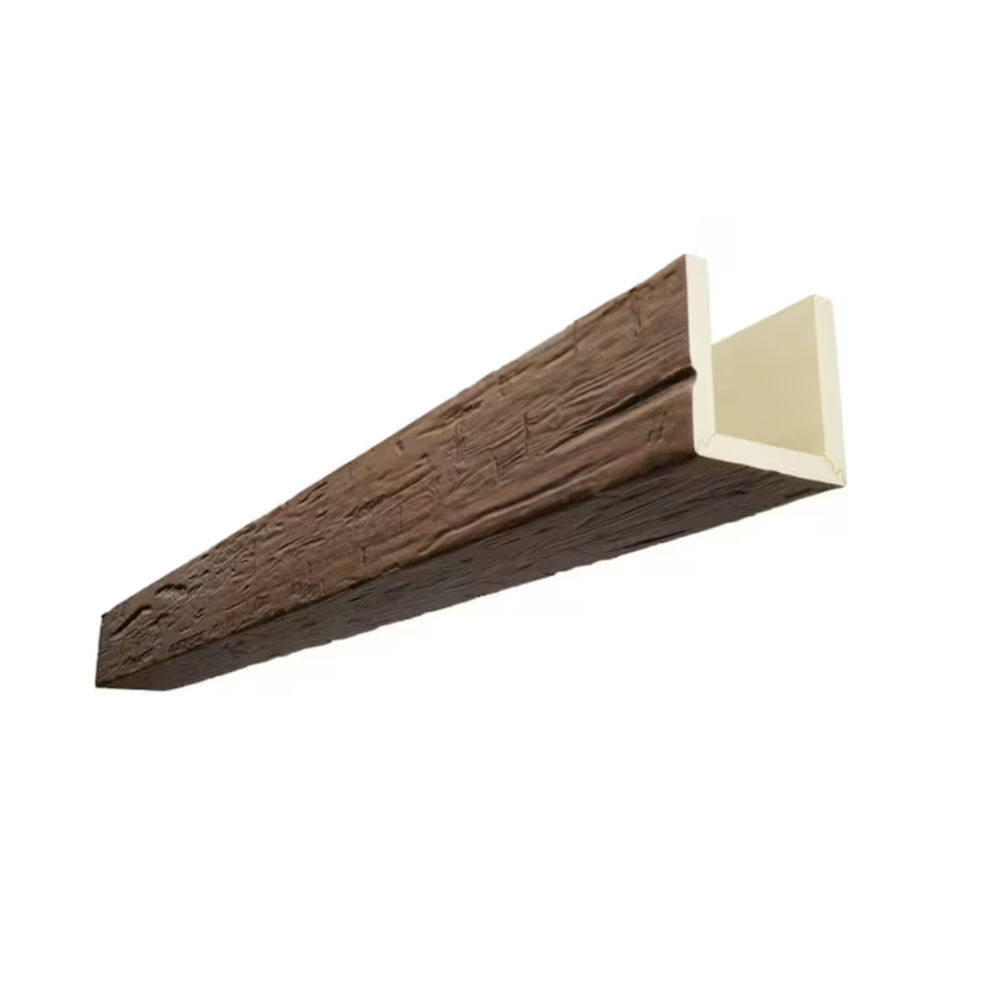
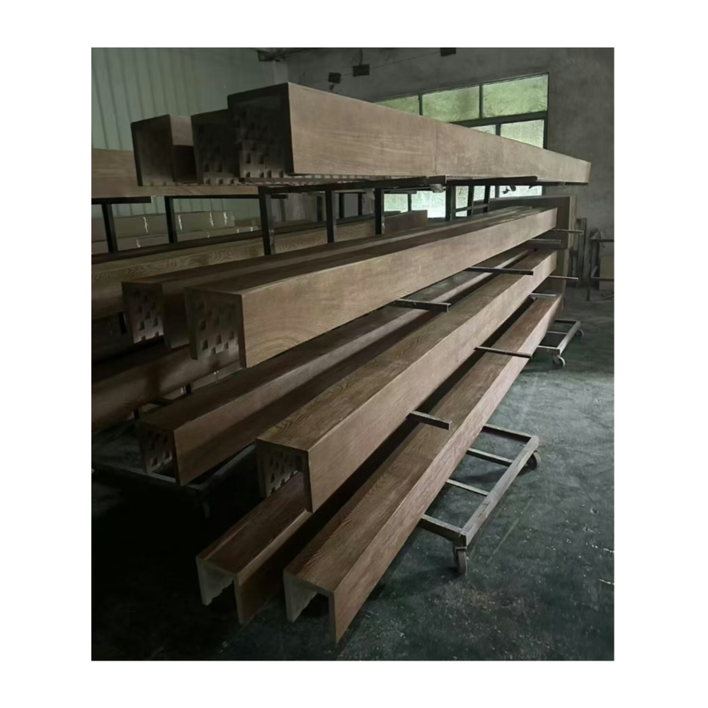
Nature-inspired interiors have experienced sustained popularity, with botanical themes appearing across wall coverings, textiles, and decorative accessories. When these organic elements meet the substantial presence of ceiling beams, the combination creates spaces with remarkable visual depth and layered complexity. Successfully integrating faux wood beams with botanical wallpaper requires thoughtful coordination that allows both elements to contribute without competing for attention.
The challenge lies in balance. Bold botanical prints command significant visual attention, as do timber beams with their substantial presence and textural complexity. Combining these powerful elements risks overwhelming spaces or creating discordant compositions. Strategic selection and placement, however, transforms potential conflict into sophisticated design that celebrates nature's abundance.
Understanding Visual Weight Dynamics
Botanical wallpapers range from delicate sprig patterns to large-scale tropical leaves and dense jungle scenes. The visual weight of these patterns determines how aggressively they'll compete with ceiling beams for attention. Delicate botanical patterns complement substantial beams more readily than dense, high-contrast prints that demand their own visual space.
Beam scale relative to wall patterns affects composition harmony. Large-scale botanical prints paired with substantial ceiling beams can create overwhelming intensity in intimate spaces. Conversely, modest beam sizes may disappear against bold botanical patterns that demand attention. Matching visual intensities creates compositions where neither element dominates inappropriately.

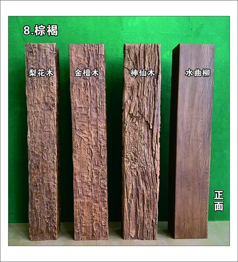
Color relationships between beams and wallpapers establish the foundation for successful combinations. Warm wood tones complement green botanical palettes naturally, creating cohesive nature themes. Neutral or warm-toned beams work with botanical papers regardless of color accents, while cool-toned beams require more careful botanical color selection.
Color Coordination Strategies
Green botanical palettes benefit from wood tone beams that echo the organic warmth of living plants. Honey oak, warm maple, and medium walnut beams complement green-forward botanical papers without creating excessive warmth. These combinations feel natural because they parallel actual garden environments where wood and growing plants coexist.
Flowering botanical papers present more complex coordination challenges with wood tones. Papers featuring warm-toned blooms—roses, poppies, or autumn leaves—coordinate naturally with traditional wood stains. Cool-toned flower palettes—lavender, blue hydrangea, or white blossoms—require more neutral beam treatments to prevent color discord.
Monochrome botanical papers in grayscale or sepia tones provide flexibility for various beam treatments. These sophisticated patterns establish elegant backdrops without introducing color competition. Both stained wood and painted beam finishes work well against monochrome botanical backgrounds, allowing beam selection based on other room factors.
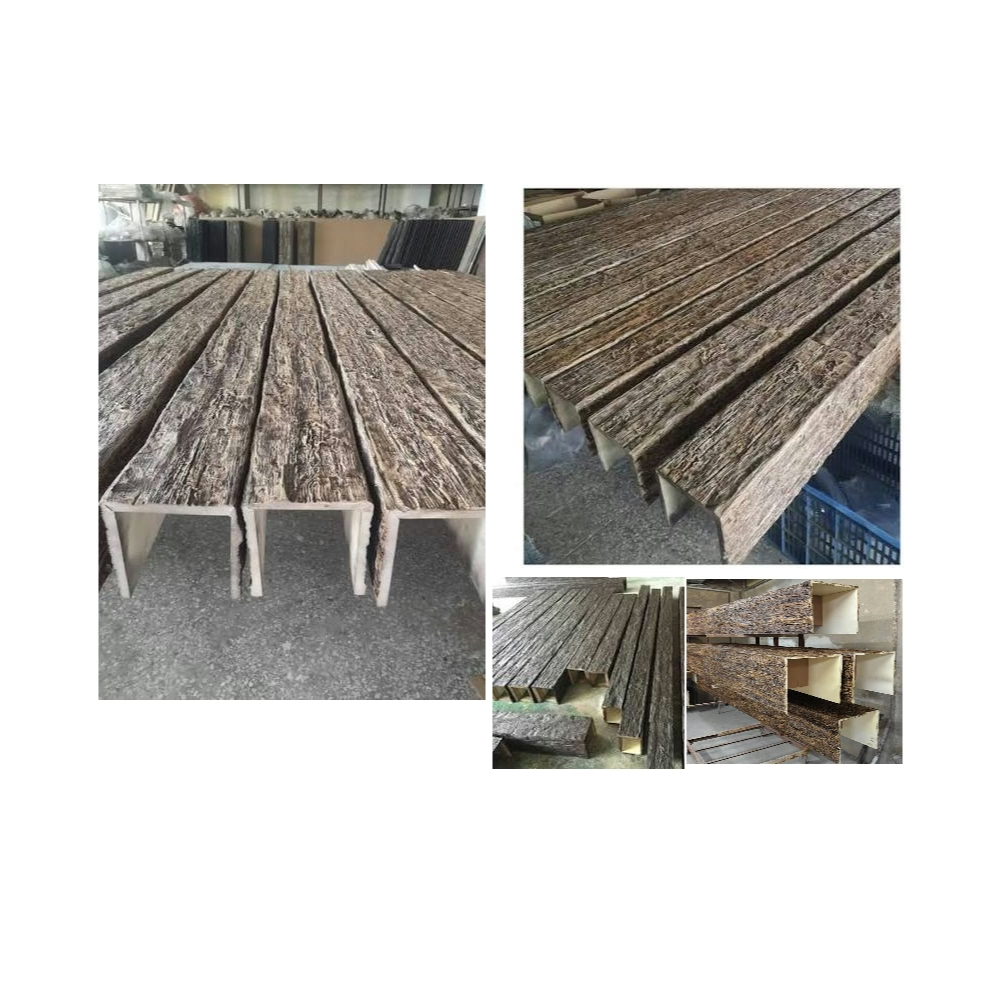
Pattern Scale Considerations
Small-scale botanical patterns in repeating motifs work well in rooms with substantial beams, where the pattern creates texture without demanding excessive attention. These delicate papers resemble wallpaper patterns from traditional interiors, lending refined character to spaces featuring traditional or transitional beam profiles.
Medium-scale botanical patterns—leaves, branches, or moderate florals approximately six to eighteen inches in dimension—suit most residential beam applications. These patterns provide sufficient presence to create visual interest while remaining subordinate to the larger-scale beam elements above.
Large-scale tropical botanical patterns featuring oversized monstera leaves, banana palms, or bird of paradise specimens require restrained beam treatment. Either modest beam scales that don't compete or dramatically large beams that establish dominance over the pattern work better than middle-ground beam sizes that create visual wrestling matches with oversized botanical elements.
Room-Specific Application Approaches
Bedroom applications favor softer botanical papers with moderate scales that create restful, nature-inspired atmospheres. Ceiling beams in bedrooms benefit from painted finishes—white, cream, or soft gray—that recede visually without adding visual weight to spaces designed for relaxation. This combination creates layered nature without intensity appropriate for more active spaces.
Sunroom and conservatory applications accommodate bolder botanical combinations more readily. These garden-adjacent spaces benefit from the immersive quality that dense botanical papers and substantial beams create together. Natural light prevents these bold combinations from feeling oppressive, while the botanical themes reinforce connections to surrounding garden environments.
Dining room applications with botanical papers and beams create memorable gathering spaces. The formality potential of dining rooms supports more dramatic combinations—substantial beams with bold botanical papers in rooms where intense visual interest enhances rather than distracts from the dining experience.
Styling Principles for Balanced Compositions
Balanced visual intensity means neither beams nor wallpaper dominates the other. When bold botanical papers cover walls, beams should either recede visually through painted treatment or establish clear dominance through exceptional scale and presence. The middle ground of medium presence for both elements typically fails to satisfy.
Tonal harmony between beams and botanical papers creates cohesive atmospheres. When botanical papers feature warm earth tones, wood-tone beams reinforce this warmth. When papers lean cool or neutral, painted beams in coordinating colors establish appropriate relationships.
Accessorizing the completed composition with botanical elements—living plants, nature-inspired art, and organic material accessories—strengthens the overall theme. These accessories should complement rather than compete with wall and ceiling treatments, creating layered compositions where nature-inspired elements appear throughout without redundancy.
Technical References
ASTM standards cited in every specification
Test Data
Lab results from internal testing program
Updated 2026
Reviewed against current product specs