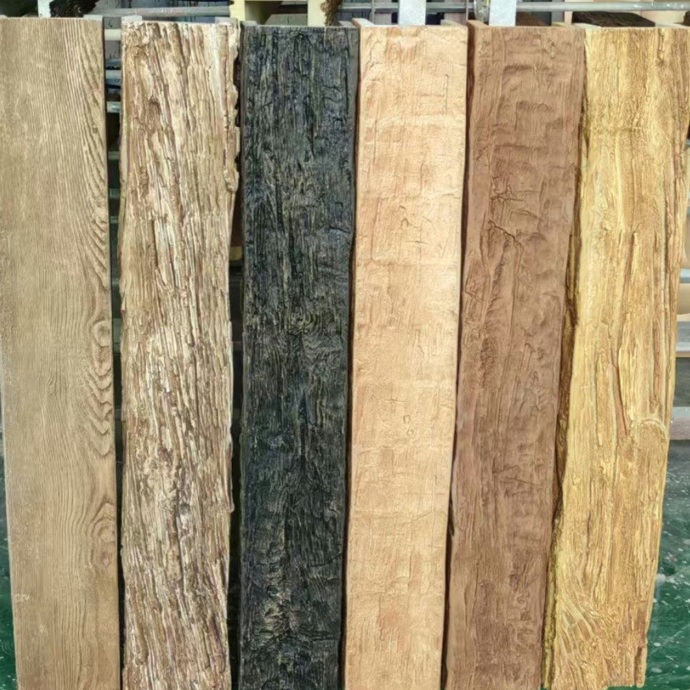
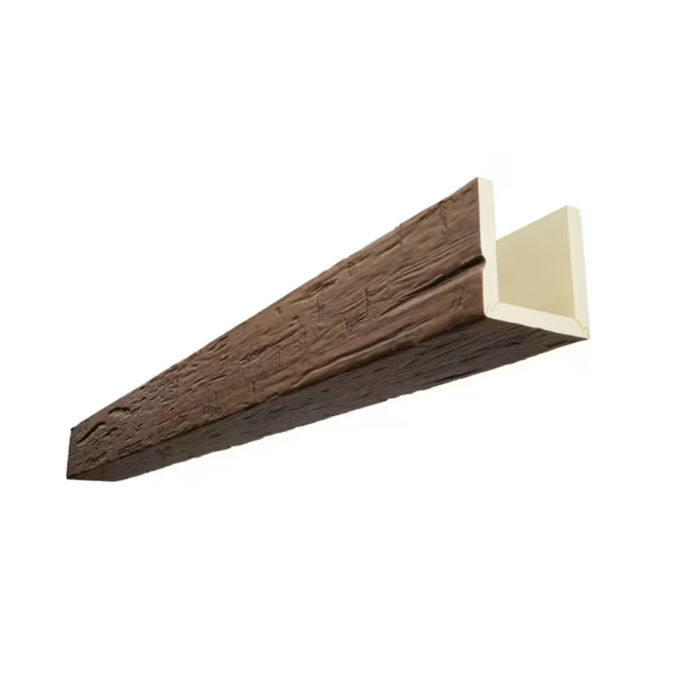
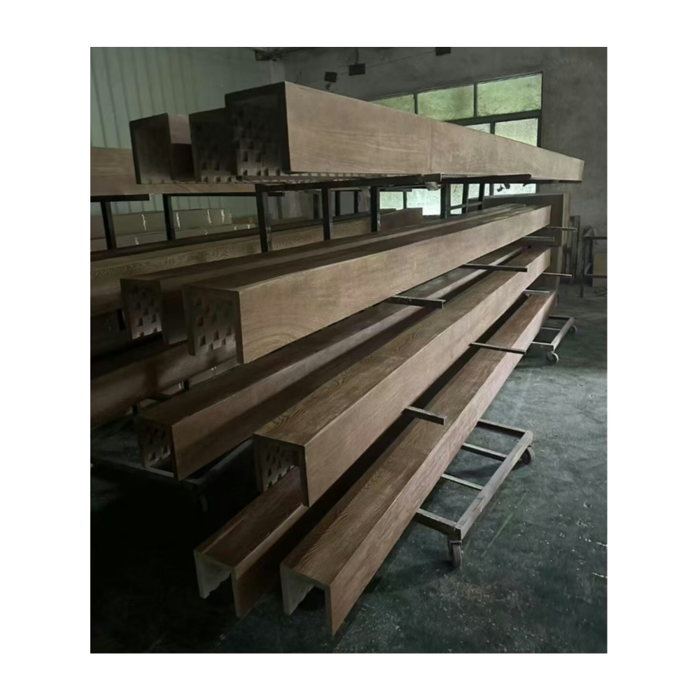
Japandi emerged as a recognized interior style through cross-cultural appreciation of design principles that Japanese and Scandinavian traditions share despite their geographic separation. Both aesthetics value craftsmanship, natural materials, functional beauty, and visual restraint. The fusion creates spaces that feel intentional, serene, and deeply comfortable without the excess that characterizes more flamboyant design approaches.
Ceiling treatments in Japandi interiors must respect the style's emphasis on visual calm while adding the warmth that prevents spaces from feeling sterile. Wood materials serve this purpose naturally, connecting interior environments to the organic origins that both Japanese and Scandinavian design philosophies revere. Faux wood beams in light natural tones provide these warmth benefits while maintaining the restraint that Japandi spaces require.
Core Principles of Japandi Aesthetic
Simplicity forms the foundation of Japandi design, with each element present only if it serves meaningful purpose. Decorative excess gets eliminated ruthlessly, leaving spaces that feel curated rather than cluttered. When beams appear in Japandi contexts, they should contribute architectural purpose rather than purely decorative interest, aligning with the honest construction approach that Japanese design values.
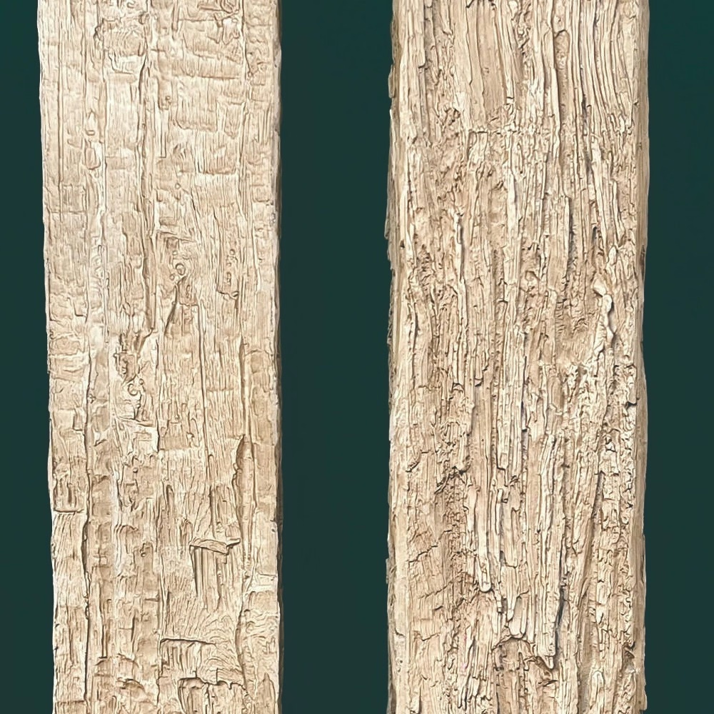
Natural material authenticity matters deeply in Japandi spaces, where synthetic materials feel inappropriate despite their practical advantages in many applications. Polyurethane faux beams that convincingly replicate natural wood appearance satisfy the aesthetic requirement for organic material presence while providing installation and durability benefits. The key lies in quality reproduction that earns visual acceptance alongside genuine natural materials.
Functionality guides every selection decision, with beauty emerging from purposeful design rather than applied ornament. Beams in Japandi contexts should serve spatial purposes beyond appearance, whether defining zones, concealing utilities, or providing acoustic benefits. This functional rationale distinguishes thoughtful Japandi installation from purely decorative addition.

Light Wood Tones in Japandi Contexts
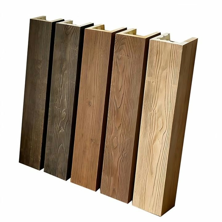
The muted, desaturated palette that Japandi interiors favor extends to wood tone selection, with lighter appearances preferred over rich, saturated alternatives. Natural oak, light maple, and bleached wood finishes align with the color restraint that Japanese minimalism demands while providing warmth that pure white or gray schemes would lack.
Wood grain visibility should remain subtle in Japandi applications, with fine, consistent patterns preferred over bold, dramatic textures. The restrained grain quality echoes both Japanese appreciation for refined detail and Scandinavian preference for understated natural beauty. Overly prominent grain patterns might feel excessive in spaces where visual restraint governs all other selections.
Matte finish surfaces suit Japandi aesthetics better than glossy treatments, reflecting the organic quality that natural materials possess. Highly polished wood surfaces read as more formal or contemporary than the casual elegance that Japandi spaces aim to achieve. Polyurethane beams can achieve appropriate matte finishes through product selection or finishing techniques that eliminate surface shine.
Spatial Harmony in Japandi Beam Installations
Proportions in Japandi design lean toward smaller scales than Western aesthetics might suggest, with rooms feeling cozy rather than grand. Beams should follow this scaling tendency, appearing as modest architectural details rather than dramatic structural statements. Single beams or small groupings work better than extensive installations that would overwhelm intimate spaces.
Negative space appreciation influences beam placement decisions, with empty areas valued as highly as occupied ones. Beams should leave substantial ceiling areas untouched, creating breathing room that prevents visual crowding. This negative space treatment allows beams to make stronger statements when they do appear, with the contrast between occupied and empty areas adding visual interest.
Alignment and symmetry provide visual order that Japandi interiors require, with beam installations following consistent geometry rather than organic arrangement. Straight, parallel, or perpendicular relationships between beams and architectural features create the intentional order that Japanese design values. This geometric discipline distinguishes Japandi from more casual design approaches.

Integration With Japandi Color Schemes
Neutral bases in Japandi palettes typically feature warm whites, soft grays, and natural beige tones that coordinate naturally with light wood beams. The warmth in these neutrals prevents the cool, institutional feeling that pure white or gray might create. Beams should enhance rather than clash with this warm neutral foundation.
Accent colors in Japandi spaces appear sparingly, with muted earth tones, deep greens, or terracotta adding subtle color interest without disrupting overall restraint. Beams might coordinate with these accent colors or remain neutral, depending on desired effect. When beams serve as accent elements, their presence should feel deliberate rather than default.
Material layering creates textural interest in Japandi interiors without relying on color variation. Wood beams contribute one textural layer, with complementary textures from linen, ceramics, stone, or woven materials providing additional visual richness. This layering approach maintains the color restraint that Japandi requires while preventing spaces from feeling flat or boring.
Furniture and Decorative Coordination
Low-profile furniture suits Japandi aesthetics, with seating and tables that sit close to floor levels rather than rising dramatically. Beams positioned above these low arrangements should maintain appropriate scale relationships, not appearing oversized relative to furniture beneath. This proportional coordination creates visual harmony throughout spaces.
Minimal decorative accessories in Japandi interiors mean that each visible element receives substantial attention. Beam installations should look intentional and refined, as their visibility makes any quality issues obvious. Investment in quality reproductions that convincingly replicate natural wood appearance pays dividends in overall space quality perception.
Textile selections including woven rugs, linen throws, and cotton cushions provide warmth complementing beam installations. These soft materials create sensory richness that balances the harder surfaces that beams represent. Coordinated material choices throughout spaces ensure that beam installations feel integrated rather than isolated.
Technical References
ASTM standards cited in every specification
Test Data
Lab results from internal testing program
Updated 2026
Reviewed against current product specs