Vaulted ceilings represent one of residential architecture's most dramatic features, with angled planes that add volume, drama, and architectural interest to living spaces. These soaring ceilings create opportunities for stunning interior treatments that flat surfaces cannot achieve, but they also present unique challenges for color coordination and material selection. The substantial visual presence of vaulted ceiling planes means that beam coloration significantly affects overall room character, making thoughtful color selection essential for successful design outcomes.
The challenge of vaulted ceiling color schemes stems from the large surface areas that angled planes create, with beams spanning across significant visual territory while adjacent ceiling sections fill remaining space. Colors and finishes that might work perfectly in standard-ceiling rooms can become overwhelming or inadequate in vaulted applications, requiring adjusted selection based on the specific scale and drama that vaulted ceilings introduce. Understanding how different colors behave across these larger surfaces helps ensure appropriate choices.
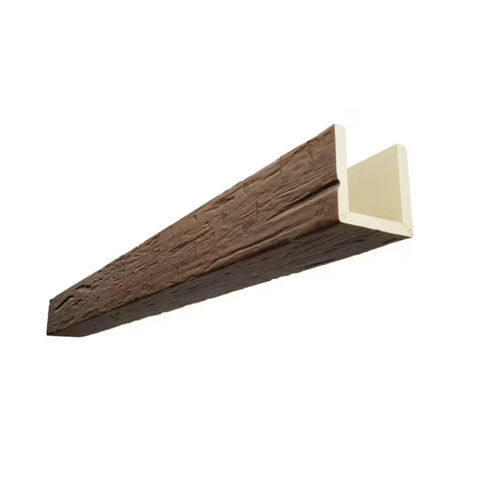
Faux wood beams in vaulted ceiling applications provide the opportunity to introduce wood warmth and character that transforms dramatic architecture into welcoming interior spaces. Without softening elements, vaulted ceilings can feel cavernous and impersonal despite their visual impressiveness. Wood-textured beams add organic warmth that humanizes the architectural geometry, creating environments that feel designed for habitation rather than merely impressive to observe.
Natural Wood Tones for Timeless Appeal
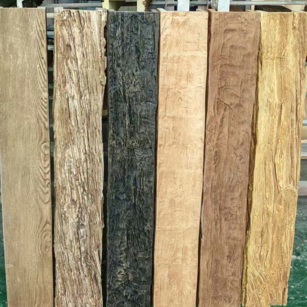
Natural wood tones represent the most versatile approach for vaulted ceiling beams, offering warmth and character that complements virtually any interior color scheme while respecting the timeless aesthetic that vaulted ceilings often imply. The organic quality of wood grain provides visual warmth that counteracts any coolness in surrounding surfaces, creating balanced atmospheres that feel both refined and welcoming. Natural tones also read as appropriate in traditional and contemporary contexts alike, ensuring that beam selections won't feel dated as design fashions evolve.
Light oak finishes work particularly well in vaulted ceilings where maintaining brightness and openness remains important despite the dramatic architecture. The pale coloration reflects light across larger surface areas, preventing the cave-like darkness that darker beams might create in rooms with limited natural light. This lightness also allows beams to read as architectural enhancement rather than structural imposition, adding interest without demanding primary attention from the overall composition.
Medium oak and honey tones introduce more pronounced warmth that creates cozy atmospheres appropriate for family living spaces. These colors work well in rooms with significant glazing or other light sources that prevent the darker tones from overwhelming the space. The warmth of these finishes creates inviting environments that encourage gathering and relaxation, making them particularly suitable for living rooms where social activity is primary purpose.
Dark wood tones including walnut and rich mahogany create dramatic contrast that emphasizes the architectural drama of vaulted ceilings. These bold choices work best in larger vaulted spaces with substantial dimensions that can support such intensity without feeling compressed or overwhelming. The drama that dark beams create makes strong visual statements, establishing ceiling treatment as the primary design feature of the room.
Matching or Contrasting With Floor Colors
The relationship between vaulted ceiling beams and floor surfaces creates fundamental color dynamics that significantly affect room perception. Matching beams to floor coloration creates vertical continuity that makes spaces feel more cohesive and grounded, with warm tones flowing from floor to ceiling in unified composition. This approach works particularly well when floor materials already feature wood, as beam repetition reinforces the natural material theme throughout the space.
Contrasting beam and floor colors create visual division that can improve proportion in rooms where either ceiling or floor might otherwise dominate. Light ceiling beams paired with dark wood floors, for example, creates balance that prevents either surface from overwhelming the other. This contrast approach works well in rooms with strong architectural features on either plane, ensuring that both ceiling drama and floor interest receive appropriate visual attention.
Neutral floors in gray, beige, or other non-wood materials allow beam color selection based on other room elements without concern for floor coordination. In these situations, beams can echo wall colors, furniture tones, or other dominant elements, creating color relationships that unify disparate components. The flexibility that neutral floors provide simplifies selection while opening diverse coordination possibilities.
Considering Wall Color and Overall Palette
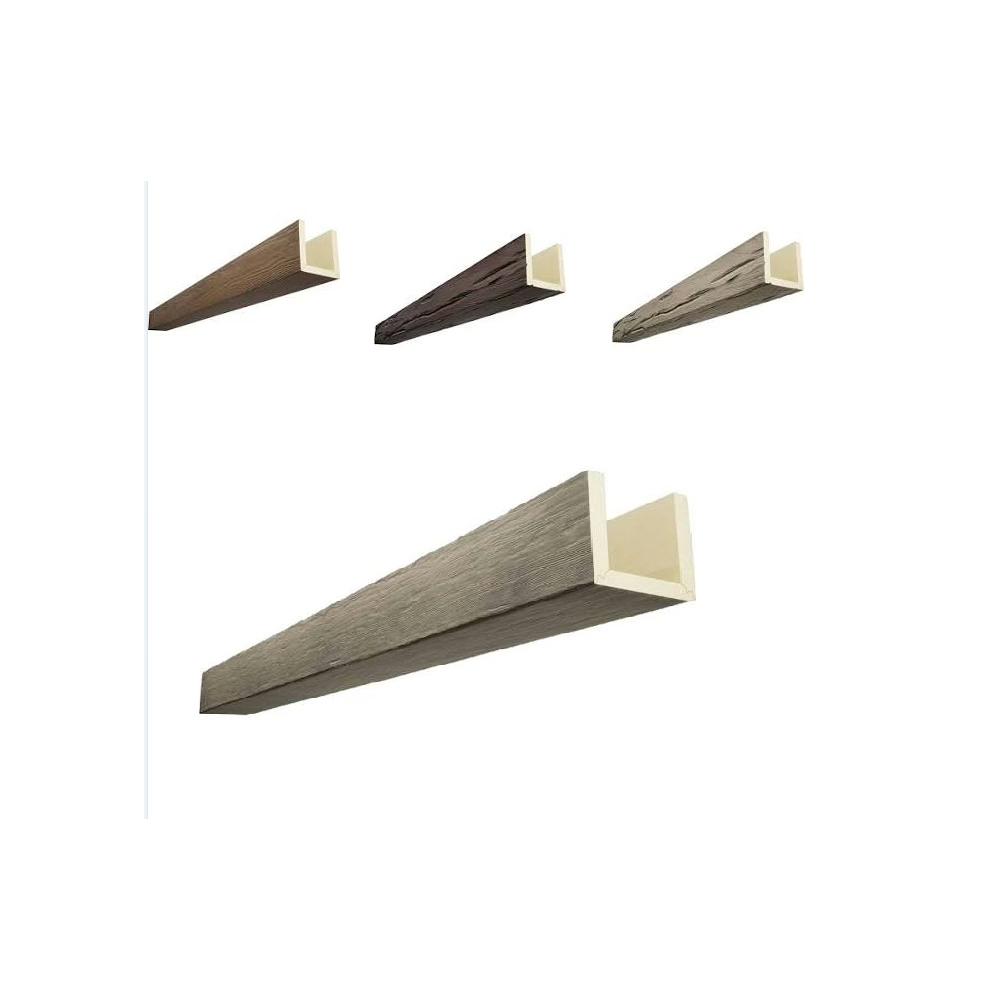
Vaulted ceiling beams occupy substantial visual territory that interacts with all wall surfaces throughout the room, making wall color coordination essential for successful design outcomes. Beams that echo wall coloration create unified envelope that emphasizes architectural form while minimizing color complexity. This approach works well in rooms where the vaulted geometry itself should be the primary visual focus, with color serving architecture rather than competing with it.
Contrasting beam and wall colors creates visual layering that distinguishes different surfaces while adding depth to the overall composition. The shadow lines created at beam edges and wall intersections emphasize three-dimensionality, making vaulted forms more readable and dramatic. This approach suits contemporary interiors where strong visual definition aligns with broader design intentions.
The overall color palette of the room should inform beam selection, with beams either reinforcing established color relationships or introducing new elements that expand the palette's range. Rooms with extensive color variation throughout furnishings and accessories benefit from neutral beam selection that doesn't add additional color complexity. Simpler rooms with minimal color can accommodate more dramatic beam colors that introduce the visual interest that more colorful spaces already possess.

Light and Shadow Considerations
The play of light across vaulted ceiling beams significantly affects how beam colors are perceived throughout the day and under different lighting conditions. North-facing rooms with consistent cool light may benefit from warmer beam tones that compensate for the lacking sunlight, while south-facing rooms flooded with golden light can accommodate cooler tones that won't be overwhelmed by natural illumination.
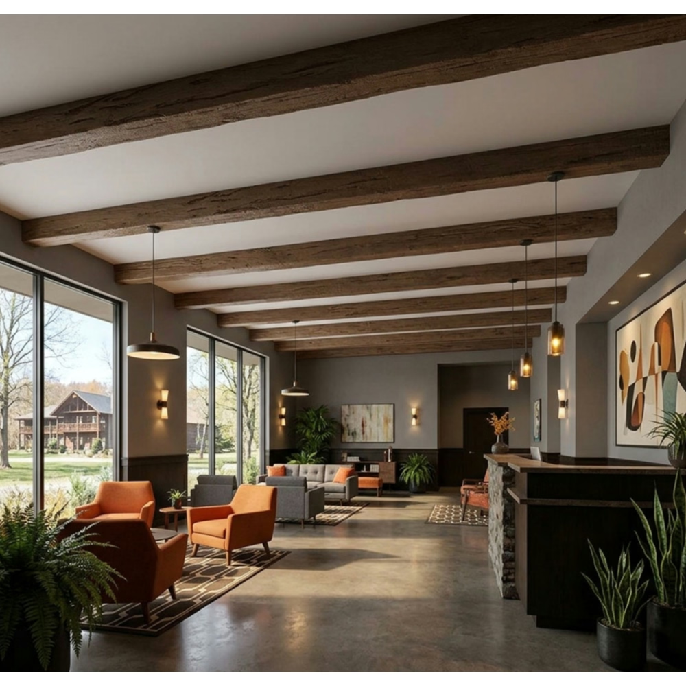
Artificial lighting in vaulted ceiling applications should be designed in coordination with beam selection and placement. Recessed lighting can be positioned to wash beam surfaces with even illumination that emphasizes wood grain texture, or aimed to create dramatic shadows that accentuate beam form. Pendant fixtures hung from beams provide both functional illumination and visual interest that complements beam presence. The specific lighting approach should align with the atmosphere goals established during beam color selection.
The shadow patterns that beams cast onto adjacent vaulted surfaces create additional visual elements that factor into overall color scheme success. Beams that cast shadows onto surfaces of similar color create subtle, integrated effects, while beams casting shadows onto contrasting surfaces create more dramatic pattern effects. Understanding these shadow relationships helps ensure that beam installations will produce intended visual effects across all lighting conditions.
Dramatic vs. Subtle Approaches
The decision between dramatic and subtle beam color schemes fundamentally affects the role ceiling treatment plays in overall room design. Dramatic approaches using bold, dark, or contrasting beam colors establish ceiling treatment as primary focal point, with beams commanding attention and organizing other design elements around them. This approach suits rooms where dramatic architecture should be celebrated rather than softened, with beam color selection supporting this celebratory intent.
Subtle approaches using natural, light, or coordinating beam colors create ceiling enhancement that supports other design elements without competing for primary attention. This approach works well in rooms where furniture, art, or other features carry primary visual importance, with beams providing quiet architectural contribution that enhances without dominating. The subtle approach maintains architectural interest while preserving focus on the room's primary content.
Many successful vaulted ceiling living rooms occupy middle ground between these extremes, with beam colors selected to provide meaningful visual presence while respecting other design priorities. The specific position on this spectrum depends on room characteristics, user preferences, and design intentions that should guide all material selections. Taking time to clarify these priorities before selecting beam colors ensures that final choices support rather than undermine overall design goals.
Technical References
ASTM standards cited in every specification
Test Data
Lab results from internal testing program
Updated 2026
Reviewed against current product specs