The visual power of extreme contrast has captivated designers and occupants since the earliest days of architectural expression. High-contrast environments command attention, establish hierarchy, and create memorable spatial experiences that more muted palettes struggle to achieve. Stark white walls combined with dark espresso faux beams represent this principle in its most refined residential application, delivering sophisticated drama through uncompromising color relationships.
White walls have long served as design foundations precisely because of their neutrality and light-enhancing properties. The problem with white, however, lies in its potential for emptiness and visual insipidity when applied to entire rooms without thoughtful accent or contrast elements. Dark espresso beams solve this dilemma by introducing substantial visual weight that transforms flat white expanses into dynamic, architecturally interesting spaces.
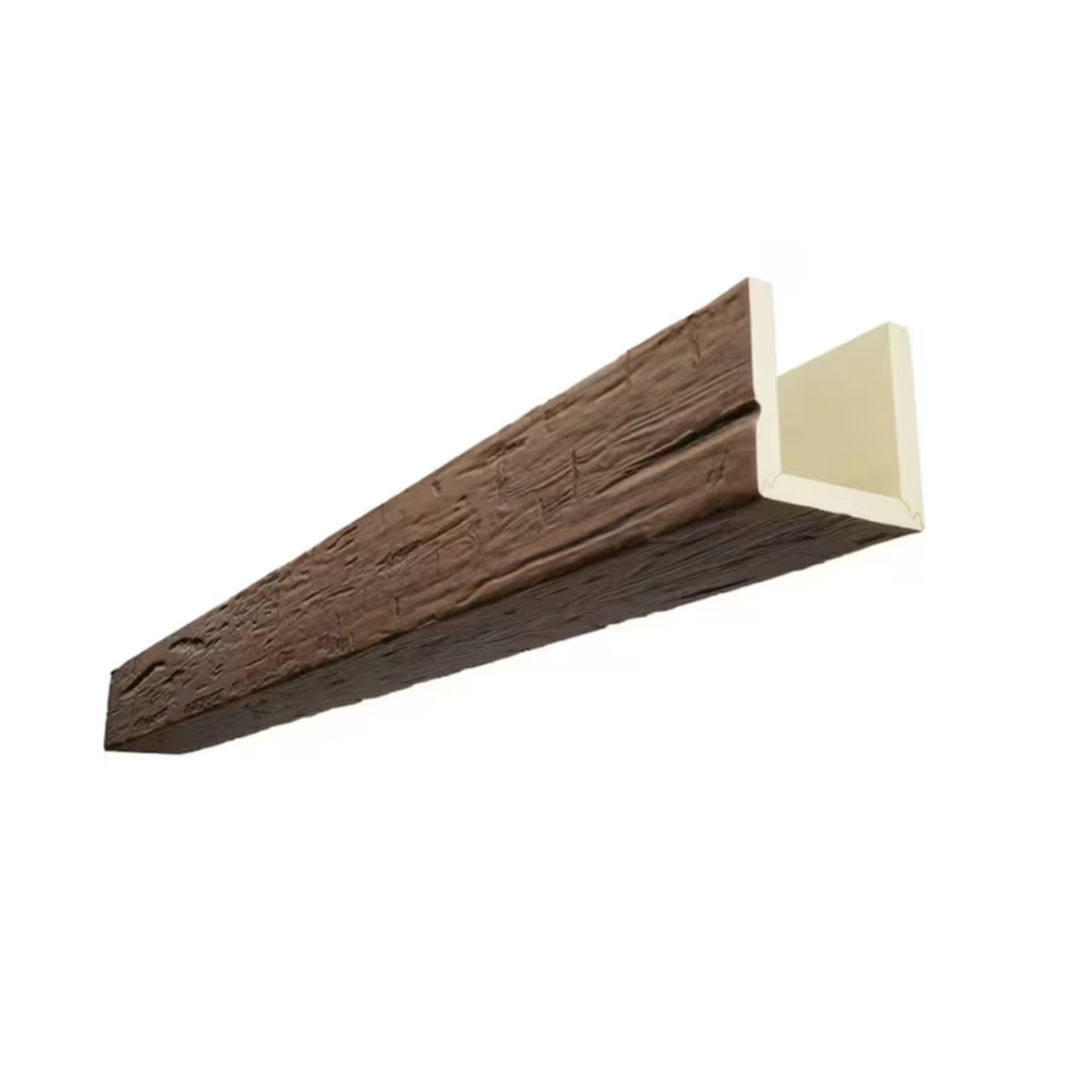
The espresso tone occupies a distinctive position among dark wood values. Neither the coldness of ebony nor the reddish intensity of mahogany, espresso carries warm brown undertones that create richness without heaviness. Against white walls, these warm undertones prevent the potentially sterile impression that pure black or grey might create, maintaining approachability despite dramatic contrast.
The Dramatic Impact of High Contrast Design
Human perception responds powerfully to stark visual contrasts, with the brain processing contrasting elements as distinct visual events requiring attention. This perceptual response makes high-contrast interiors inherently more engaging than those featuring subtle value relationships. The white-and-espresso combination leverages this response to create spaces that feel architecturally significant rather than merely decorated.
Spatial perception shifts dramatically in high-contrast environments. Dark elements recede while light elements advance, creating layered depth that flat color relationships cannot achieve. Espresso beams overhead create perceived ceiling height reduction that makes vast spaces feel more intimate, while white walls expand outward, creating spatial complexity that enriches room experience.
Emotional responses to high-contrast environments tend toward the dramatic and energizing. These spaces feel more eventful, more intentional, more designed than neutral environments. For occupants seeking interiors that feel special or significant, high contrast provides accessible means of achieving those aspirations without requiring elaborate decoration.
Understanding Espresso Wood Tones
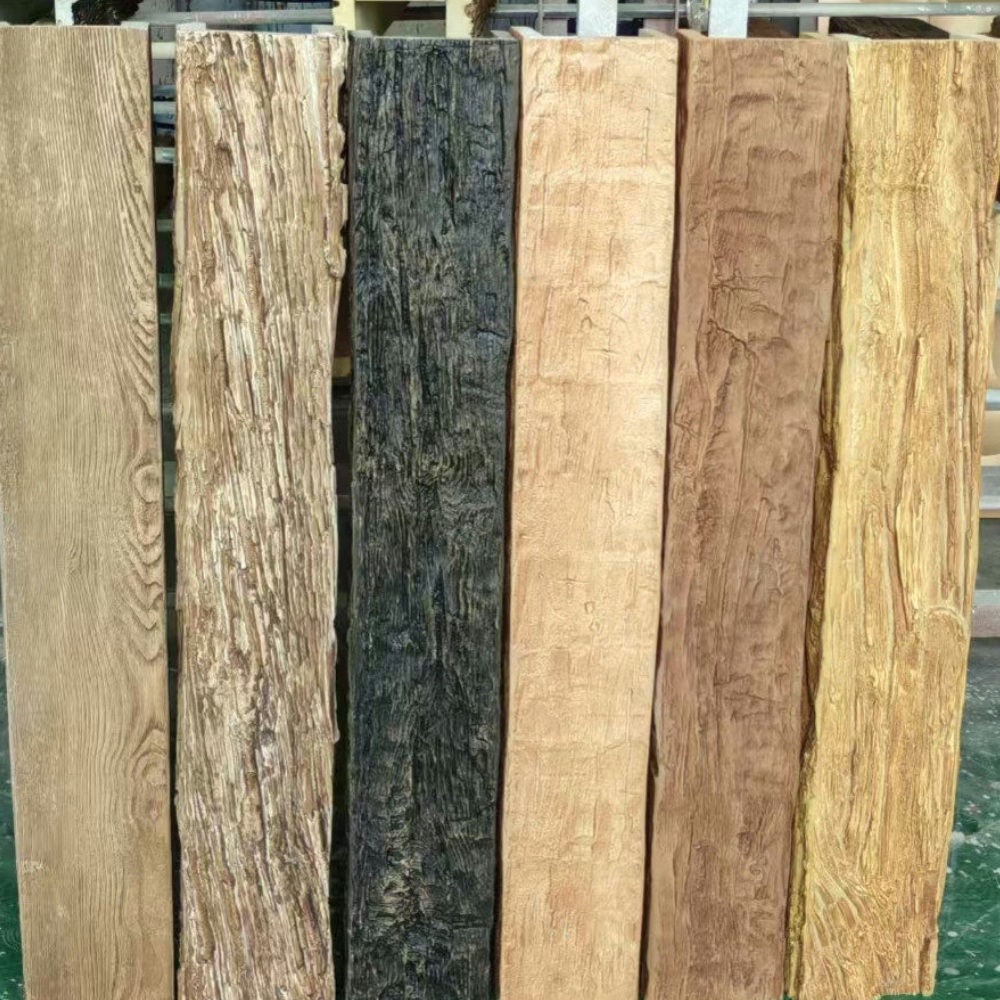
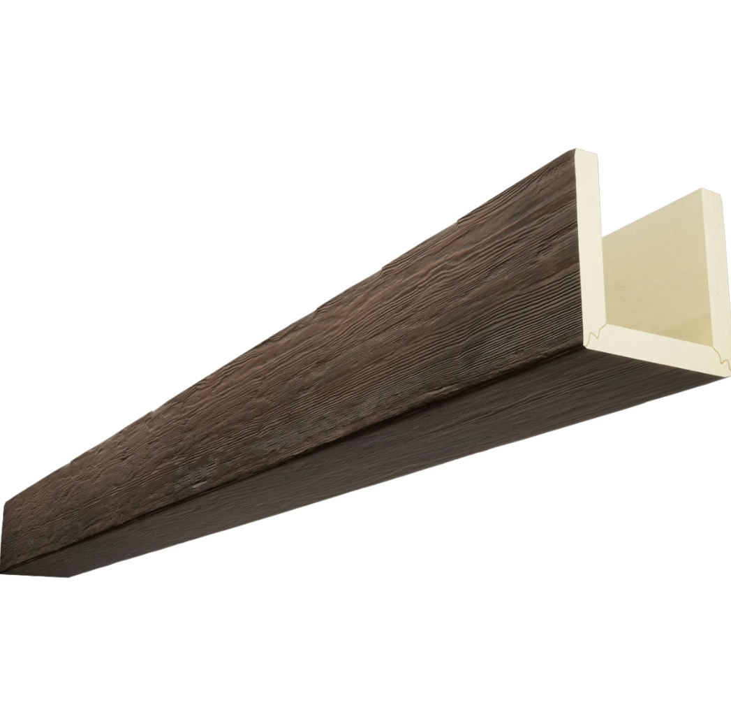
Espresso encompasses a range of dark brown values united by warmth and richness rather than specific color matching. True espresso falls somewhere between medium and dark brown, carrying sufficient lightness to show wood grain variation while remaining definitively dark in overall character. The specific expression varies by manufacturer and product line, with some leaning toward chocolate browns and others approaching near-black with brown undertones.
Grain visibility in espresso beams creates necessary textural interest that prevents flat appearance. The dark value reduces contrast between grain lines and background surfaces, requiring more pronounced texture for readable grain patterns. Quality espresso beams feature deep, authentic wood grain that remains visible despite dark coloration.
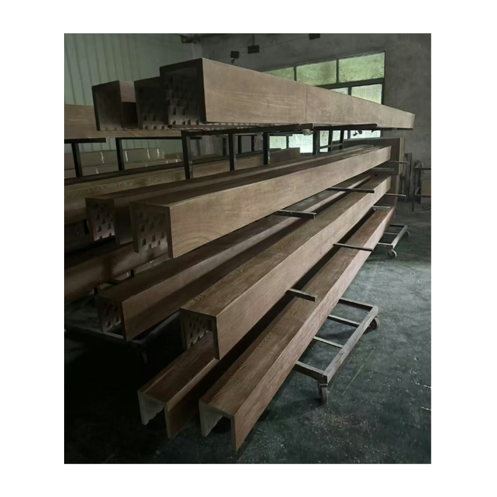
Finish quality significantly influences espresso beam appearance and longevity. Premium finishes penetrate wood surfaces for integrated color that resists chipping or peeling. Lower-quality surface coatings may appear plasticky or develop visible wear patterns that undermine sophisticated intentions.
Why White Walls Maximize Impact
White walls create maximum visual contrast against dark elements, ensuring espresso beams command attention as intended. The purity of white—particularly in contemporary flat or eggshell finishes—provides clean backdrop that emphasizes beam presence without competing visual elements. This contrast ensures architectural features remain dominant rather than competing with wall decorations.
Light reflection from white walls improves overall room illumination, offsetting the darkness that espresso beams introduce. This balance prevents the cave-like impressions that all-dark treatments might create, maintaining practical livability despite dramatic aesthetic choices. The white surfaces bounce light throughout spaces, ensuring comfortable visibility in all conditions.
Design flexibility increases with white wall foundations. Artwork, furniture, and accessories can introduce any color without requiring coordination with wall colors. This versatility proves valuable for households whose tastes evolve over time or those seeking adaptable environments that accommodate changing decorative preferences.

Design Applications Across Spaces
Living rooms benefit substantially from white-and-espresso contrast treatments that create sophisticated gathering spaces. The dramatic combination establishes strong architectural presence while maintaining light, airy atmospheres appropriate for social occasions. Furniture and accessories can introduce additional color and texture without competing with the established architectural palette.
Home office applications leverage the professional, focused atmosphere that high-contrast environments create. The dramatic aesthetic suggests intentional design choices that communicate seriousness and attention to detail. Video conferencing backgrounds benefit from the sophisticated framing that espresso beams provide against white walls.
Bedroom applications require careful calibration to ensure appropriate relaxation despite dramatic color relationships. The white walls provide necessary lightness for restful atmospheres, while espresso beams add cozy enclosure that promotes security and comfort. This balance achieves contemplative sophistication appropriate for private retreats.
Kitchen and Dining Considerations
Kitchens present practical challenges for espresso beam installations given moisture, heat, and cooking byproducts. Quality polyurethane beams handle these conditions without damage, maintaining appearance despite challenging exposure. Espresso beams above islands or dining areas create focal points that elevate functional spaces above mere utility.
Dining rooms gain sophisticated atmosphere from white-and-espresso treatments that enhance shared meal experiences. The dramatic backdrop creates special-occasion feeling that elevates everyday dinners above routine. Guests appreciate the design intentionality that such treatments communicate.
Breakfast rooms and informal dining areas can embrace the high-contrast aesthetic for fresh, energetic morning environments. The light-reflecting white walls ensure bright morning illumination, while espresso beams add warmth that complements coffee and morning sunlight. The combination creates invigorating start-to-the-day environments.
Furniture and Decor Coordination
Upholstery selection in white and cream tones maximizes light presence while coordinating with wall treatments. This approach maintains the airy, open quality that white walls establish. Cream leather, white linen, and off-white velvet all contribute to sophisticated, light-filled environments.
Grey upholstery introduces sophisticated neutrality that bridges white walls and espresso beams without introducing additional color intensity. This approach suits contemporary interiors where restraint takes priority over warmth. The grey value sits comfortably between white and espresso without competing for attention.
Warm accent colors in terracotta, rust, or amber provide visual interest that connects to espresso warmth. These colors echo wood undertones while adding vibrancy that pure neutrals might lack. The strategic introduction of warm accents prevents potentially monotonous all-neutral palettes.
Textile and Accessory Layers
Natural textiles reinforce the organic warmth that espresso beams establish. Undyed linens, raw cotton, and natural wool accessories add textural variety that complements wood grain. These materials introduce comfort without color competition, maintaining the sophisticated restraint that white-and-espresso environments establish.
Area rugs in creams, greys, and subtle patterns anchor furniture groupings while adding comfort underfoot. The rug selection should coordinate with both wall and beam colors without creating visual confusion. Subtle patterns in neutral palettes work better than bold designs that might compete with dramatic ceiling treatments.
Artwork selection benefits from the neutral foundation that white-and-espresso provides. Black-and-white photography, abstract pieces in grey tones, and contemporary art in limited palettes all integrate naturally. Bold color introductions can work when intentionally coordinated with overall design direction.
Lighting Design Strategies
Natural light interaction with white walls creates bright, uplifting environments throughout daytime hours. The high reflectivity ensures maximum illumination penetration, making even rooms with limited windows feel light and open. This quality makes white walls particularly valuable in compact spaces or those facing away from direct sunlight.
Artificial lighting in warm white color temperatures (2700K-3000K) complements the warmth that espresso beams introduce. These temperatures create cozy evening atmospheres that contrast appropriately with bright daytime conditions. LED options in tunable white enable atmosphere adjustment for different occasions.
Ambient lighting should provide generous overall illumination that maintains the light, open quality white walls establish. Recessed fixtures, flush mounts, and semi-flush fixtures in clean contemporary styles work well. Avoid overly decorative fixtures that might compete with beam presence overhead.
Accent Lighting for Beams
Beam highlighting through directional accent lighting emphasizes the dramatic presence that espresso installations create. Track fixtures or adjustable recessed cans aimed at beam surfaces create visible pools of light that draw attention upward. This technique reinforces beams as design focal points while adding atmospheric dimension.
Uplighting from below beam surfaces creates shadow effects on surrounding ceiling areas. This approach emphasizes dimensional quality while adding evening drama. The shadow patterns change with fixture positioning, offering opportunities for intentional atmospheric design.
Integrated lighting within beam configurations creates contemporary effects that blur boundaries between architecture and illumination. Linear LED strips within beam cavities provide ambient lighting while maintaining architectural presence. Smart controls enable dynamic effects that transform appearance throughout daily routines.
Balancing Drama with Livability
Successful white-and-espresso interiors balance dramatic aesthetic impact with practical livability. The lightness of white walls ensures comfortable everyday occupation despite dark overhead elements. The warmth of espresso prevents cold or harsh impressions that pure black might create. Together, these elements achieve sophisticated drama without sacrificing comfort.
Scale consideration ensures appropriate visual presence. Large rooms can accommodate substantial espresso beams with generous proportions. Smaller spaces require more modest interventions that maintain balance without overwhelming intimate scales. Honesty about room dimensions guides appropriate beam selection.
Proportion between wall and ceiling treatments influences overall impressions. Rooms with extensive white wall area can support substantial dark beams overhead. Spaces with less wall surface relative to ceiling area may benefit from more restrained beam selections. Evaluating actual proportions prevents mismatched relationships.
The enduring appeal of high-contrast design ensures white walls and espresso beams will remain relevant choices. As design trends cycle through various specific expressions, the fundamental power of dramatic contrast provides reliable foundation for sophisticated interiors. This combination represents timeless design logic that transcends specific trend phases.
Maintenance considerations favor white walls and espresso beams for busy households. White surfaces show less visible dust and wear than lighter tints that might yellow or show marks. Espresso finishes hide dust and minor scuffs that lighter wood tones would reveal. This practical advantage simplifies cleaning requirements while maintaining sophisticated appearance.
The growing appreciation for bold, intentional design suggests continued strong interest in high-contrast interior treatments. As more homeowners discover the dramatic impact that white-and-espresso combinations deliver, these installations will increasingly appear as desirable features distinguishing exceptional homes from ordinary ones.
Technical References
ASTM standards cited in every specification
Test Data
Lab results from internal testing program
Updated 2026
Reviewed against current product specs