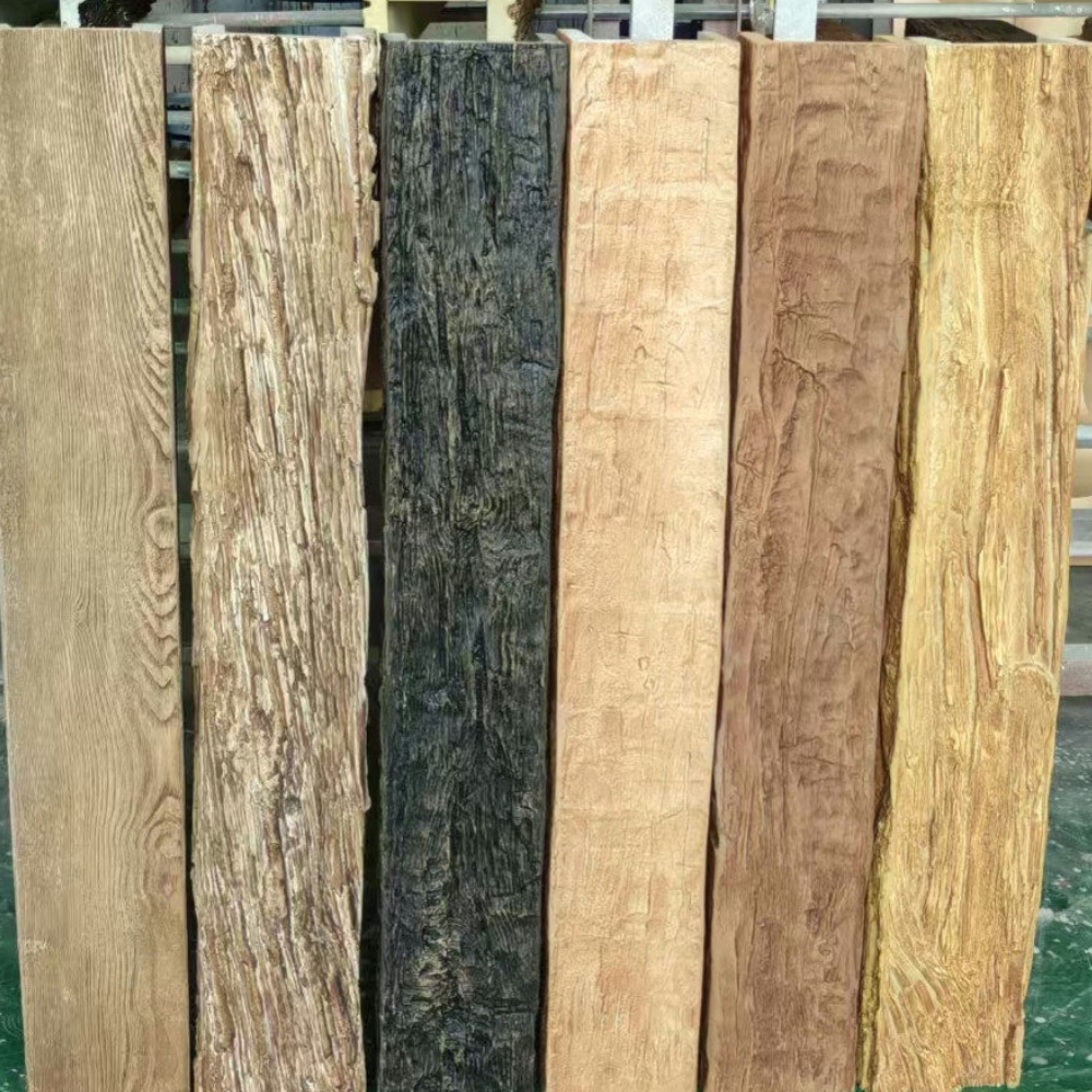
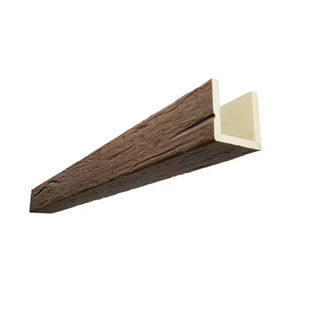
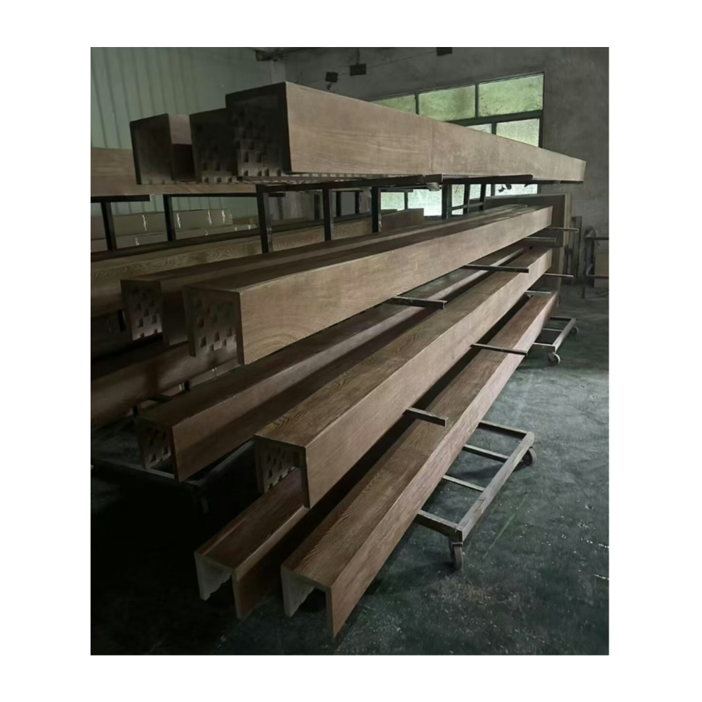
Monochromatic color schemes have emerged as sophisticated alternatives to more traditional warm neutrals, offering visual refinement that complex color palettes often struggle to achieve. The strategy of working within single-color families creates environments of remarkable cohesion where texture and value variation provide visual interest without chromatic distraction. Cool grey walls combined with weathered grey faux timber beams exemplify this approach at its most refined.
The success of monochromatic grey design depends critically on value differentiation—the contrast between light, medium, and dark grey values that prevents monotonous impressions. Cool grey walls establish foundation values, while weathered grey beams introduce darker accents that create necessary visual hierarchy. The wood grain texture further enriches these relationships through subtle pattern variation that engages close inspection.
The "cool" designation indicates subtle blue undertones that distinguish these greys from warmer alternatives. Cool greys read as more contemporary, more restrained, and more urban than their warmer counterparts. These associations align naturally with modern architectural aesthetics and minimalist design sensibilities that emphasize clean, purposeful expression.
Understanding Monochromatic Design Logic
The monochromatic approach eliminates color decision fatigue by restricting the palette to single-hue family variations. Rather than coordinating multiple colors, designers work within value and saturation ranges of one color, reducing decision complexity while ensuring cohesive results. The grey family provides sufficient range for sophisticated compositions without requiring additional hues.
Visual rest results from monochromatic environments where eye movement encounters consistent color family rather than chromatic variety. This restfulness proves valuable in spaces intended for focus, contemplation, or relaxation. The absence of color competition allows occupants to attend to other spatial qualities without chromatic distraction.
Cohesive environments feel more spacious and harmonious than polychromatic alternatives, particularly in smaller rooms where multiple colors might create visual fragmentation. Grey monochromatic schemes maintain spatial unity that helps smaller areas feel more complete and considered.
The Role of Texture in Monochromatic Schemes
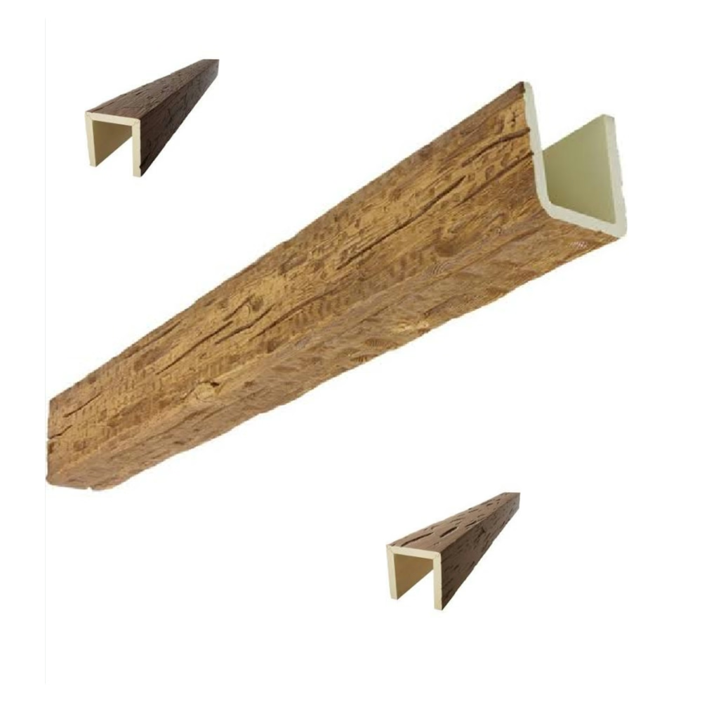
Without color variation to provide interest, monochromatic spaces rely heavily on texture for visual engagement. Weathered grey beams contribute substantially through authentic wood grain patterns that catch light differently across surface variations. These textures reward extended viewing while maintaining grey color family integrity.
Complementary textures throughout grey monochromatic spaces should vary deliberately to prevent flat impressions. Smooth plaster walls, textured area rugs, woven textile layers, and dimensional beam surfaces all contribute different tactile qualities that create visual richness. The variety occurs within grey values, preventing chromatic competition while maintaining textural interest.
Pattern also provides engagement in monochromatic contexts. Geometric patterns in grey values, organic patterns suggesting natural forms, and subtle textile weaves all add visual complexity. These patterns should read as grey-on-grey variations rather than introducing unintended color shifts that might disrupt monochromatic cohesion.
Value Layering Principles
Successful grey monochromatic design requires intentional value layering across surfaces, furniture, and architectural elements. Light grey walls establish foundation values, medium grey furniture introduces middle values, and dark grey beams provide necessary accents. This hierarchy prevents flat, uninteresting compositions where all elements compete at similar values.
The specific value selections should create comfortable contrast ratios that ensure visual distinction between elements. Overly similar values create confusion where surfaces blend together indistinguishably. Excessive contrast might create harsh, uncomfortable relationships. The goal involves comfortable differentiation that enables easy visual parsing of spatial composition.
Consistent undertones throughout the palette ensure cohesive relationships. Cool greys with blue undertones should coordinate across all elements, avoiding warm grey intrusions that might create unexpected color shifts. This tonal consistency unifies diverse elements into coherent whole despite value variations.

Creating Weathered Grey Beam Appearance
Authentic weathered grey appearance develops naturally in timber exposed to sun, rain, and seasonal temperature variations over extended periods. This natural process bleaches and silveres wood surfaces through complex chemical changes. Manufacturing processes replicate these effects through careful surface treatment and color application that achieves convincing weathered character.
The weathered appearance should include subtle variation across beam surfaces rather than uniform grey coloration. Darker shadows in grain valleys, lighter peaks on raised grain, and slight color variations across lengths all contribute to authentic weathered quality. These variations prevent the flat, painted appearance that simpler grey treatments create.
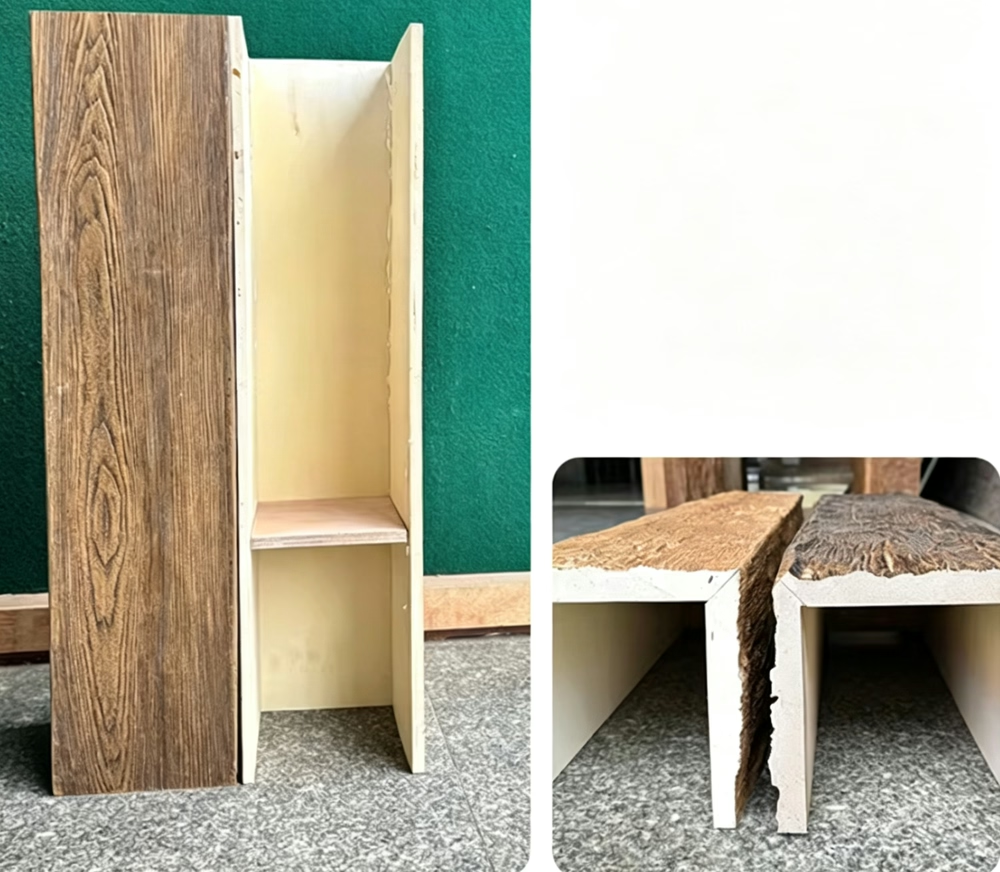
Surface texture interacts importantly with grey color treatment. Weathered wood typically features slightly raised grain and worn surfaces where softer wood components have weathered away. Quality faux beams replicate these textural characteristics through embossed surfaces that catch light convincingly.
Coordinating Beam Grey with Wall Grey
The specific grey selected for beams should relate intentionally to wall grey values. Beams darker than walls create necessary accent presence that establishes them as distinct architectural features. Beams lighter than walls recede visually, potentially appearing as unintended ceiling additions rather than intentional design elements.
Temperature matching ensures beam and wall greys read as related rather than mismatched. Cool grey walls require cool grey beams with consistent blue undertones. Introducing warm grey beams against cool grey walls creates uncomfortable color tension that undermines monochromatic intentions.
Sample comparison under actual installation lighting conditions enables confident specification. Grey relationships that appear comfortable in showroom lighting might shift unexpectedly under different conditions. Testing in actual contexts prevents costly errors that manifest only after installation.
Room Applications and Considerations
Living rooms featuring grey monochromatic treatments establish sophisticated gathering spaces that accommodate diverse accent color introductions. The neutral foundation allows considerable flexibility for furniture, art, and accessory changes over time. This adaptability protects investments as household needs and preferences evolve.
The inherent quietness of grey monochromatic design proves particularly valuable in spaces where conversation and social interaction take priority. Without competing color distractions, occupants engage more fully with each other and with the architectural qualities that monochromatic spaces showcase. This social appropriateness recommends grey palettes for living rooms, dining spaces, and entertainment areas.
Scale considerations ensure grey monochromatic treatments work across different room sizes. Smaller rooms benefit from lighter grey values that maximize perceived spaciousness. Larger rooms can accommodate deeper grey values without feeling cramped or confining. Honest assessment of room dimensions guides appropriate value selections.
Bedroom Monochromatic Applications
Bedroom grey monochromatic treatments create serene retreats optimized for rest and relaxation. The absence of stimulating colors promotes calm mental states conducive to sleep. The sophisticated palette also provides refined aesthetics that adults appreciate without requiring juvenile styling that children's rooms might demand.
Layered grey values in bedroom applications create comfortable enclosure that promotes security and rest. Darker grey beams overhead provide subtle ceiling height reduction that creates intimate sleeping environments. Light grey walls maintain necessary brightness while cool grey values contribute restful atmosphere.
Bedding and textile selection in whites, creams, and light greys reinforces bedroom grey palette while adding comfort that architectural elements alone cannot provide. The combination of grey architecture with soft textile layers achieves the balance between sophisticated design and comfortable livability that successful bedroom design requires.
Bathroom and Wet Space Considerations
Grey monochromatic treatments suit bathroom environments particularly well, given grey's association with water and cleanliness. The palette creates spa-like atmospheres aligned with contemporary bathroom design trends. Weathered grey beams in these spaces introduce organic warmth that prevents clinical impressions.
Moisture resistance of quality polyurethane beams ensures durable bathroom installations despite challenging humid conditions. Unlike authentic wood that might warp, crack, or develop mold issues in wet environments, faux beams maintain appearance and structural integrity indefinitely. This practical advantage simplifies bathroom design while ensuring lasting satisfaction.
Coordination with grey tile, stone, and fixture finishes creates comprehensive monochromatic bathroom environments. The layered grey values across these materials create textural richness that elevates bathrooms above purely functional spaces. This comprehensive approach treats bathrooms as design opportunities worthy of architectural attention.
Lighting Design for Grey Spaces
Natural light interaction with grey surfaces creates subtle color shifts throughout days. Morning light with cooler qualities enhances grey's blue undertones, while afternoon warmth can introduce subtle beige casting that requires acknowledgment. Understanding these natural variations prevents surprised reactions to inevitable color shifts.
Artificial lighting color temperature significantly influences grey appearance. Cool white LEDs (4000K-5000K) enhance blue undertones, creating crisp, contemporary impressions. Warm white options (2700K-3000K) add cozy warmth that might feel incongruous with cool grey intentions. Selecting appropriate temperature ensures lighting supports rather than contradicts grey palette goals.
Layered lighting approaches serve grey monochromatic spaces effectively. Ambient illumination provides overall grey visibility, while accent lighting highlights architectural texture. The interplay between light and shadow across beam grain patterns creates dynamic visual interest that transforms static grey surfaces into engaging environments.
Accent Lighting Strategies
Directional accent lighting aimed at weathered grey beams creates visible light pools that emphasize texture and dimension. Track lighting or adjustable recessed fixtures provide flexibility for beam highlighting that can be reconfigured as needed. This highlighting adds drama during evening hours when grey environments might otherwise appear flat.
Picture lighting for artwork requires careful consideration in grey spaces. Art illuminated against grey backgrounds should receive lighting that enhances rather than competes with grey surroundings. Warmer lighting temperatures can add life to grey environments, though this introduces warmth that cool grey palettes might reject.
Dimming capability enables atmosphere adjustment from bright functionality to intimate ambiance. Grey environments respond well to dimming because reduced lighting emphasizes shadow patterns and creates more dramatic impressions. Full bright illumination emphasizes surface qualities and value relationships that dimmed lighting subordinates.
Accessorizing Grey Monochromatic Spaces
Silver, chrome, and platinum metallic accessories reinforce cool grey undertones throughout spaces. These cool metallics align with grey palette intentions while providing necessary sparkle and visual interest that purely matte grey environments might lack. Lamp bases, frames, decorative objects, and hardware in cool metallics integrate naturally.
Black accessories introduce strong contrast that can either enhance or overwhelm grey monochromatic intentions. Small black accents provide grounding weight that prevents light grey environments from feeling insubstantial. Larger black elements risk creating excessive contrast that disrupts grey harmony.
Warm accent introductions should be considered carefully. Brass, copper, and gold metallics introduce warmth that contradicts cool grey intentions. Similarly, warm-colored accessories might create chromatic excitement that undermines monochromatic restraint. When warm accents serve specific purposes, their introduction should be intentional rather than accidental.
Textile and Soft Material Selection
Natural materials in undyed or grey-dyed states reinforce monochromatic grey intentions. Wool throws in heathered greys, linen cushions in natural grey, and cotton bedding in light greys all contribute comfort and texture without color disruption. These textile layers add warmth and softness that architectural grey alone cannot provide.
Patterned textiles in grey values provide visual interest without color. Subtle geometric patterns, organic motifs, and textured weaves all engage visual attention while maintaining grey family membership. The pattern variation rewards extended viewing while respecting monochromatic boundaries.
Leather in grey tones introduces textural richness that complements weathered beam surfaces. Grey leather upholstery coordinates beautifully with grey architecture while providing practical seating surfaces. The material warmth of leather prevents grey environments from feeling cold despite cool color temperatures.
The sophisticated restraint of grey monochromatic design ensures lasting relevance across changing trends. This approach transcends specific fashion phases through fundamental design principles rather than trendy color selections. Grey walls and weathered grey beams represent investments in timeless spatial quality that remains appropriate regardless of shifting design fashions.
Technical References
ASTM standards cited in every specification
Test Data
Lab results from internal testing program
Updated 2026
Reviewed against current product specs