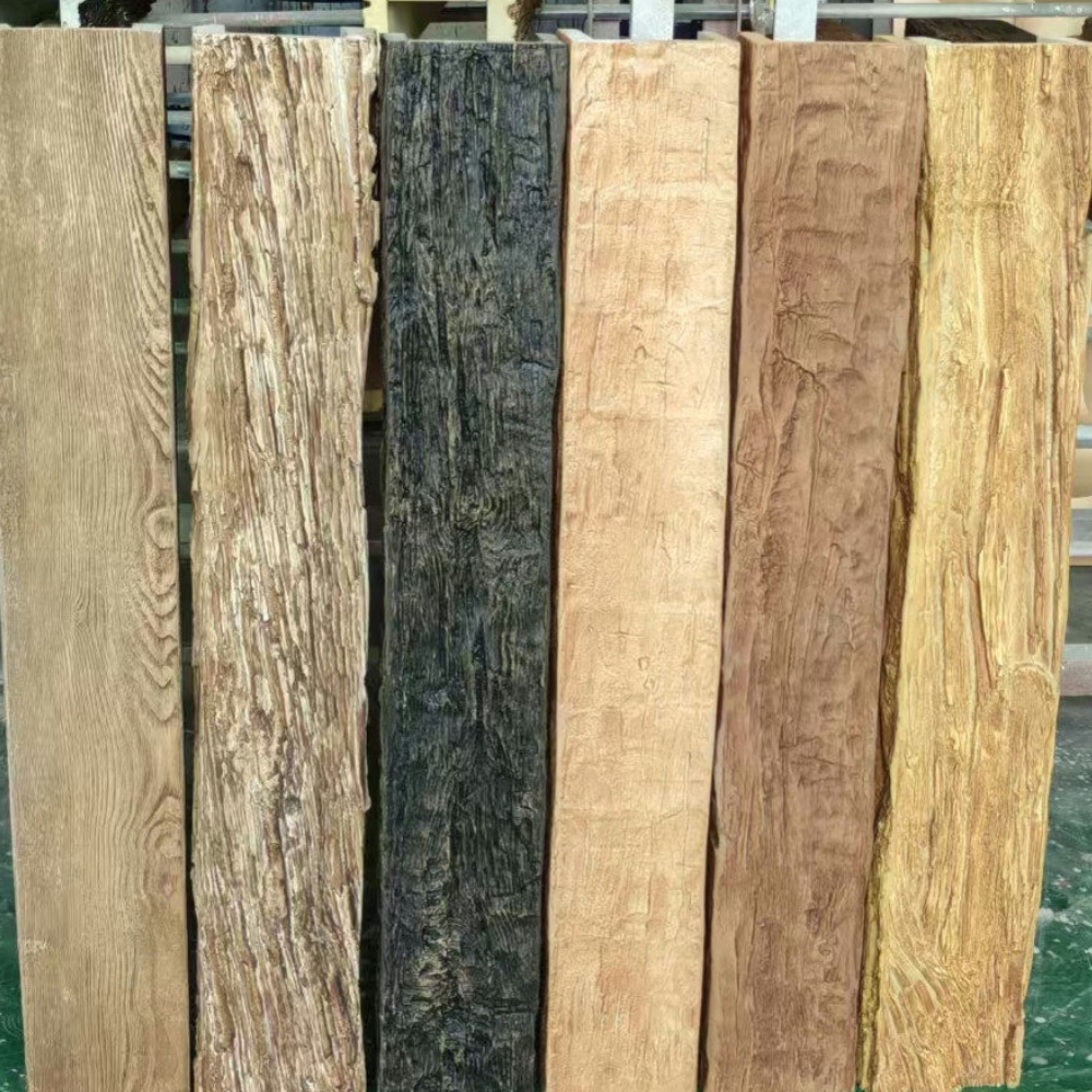
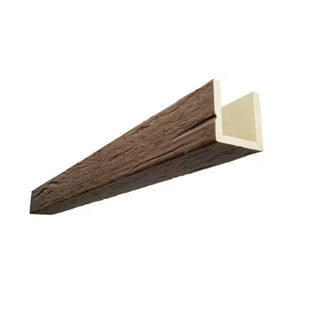
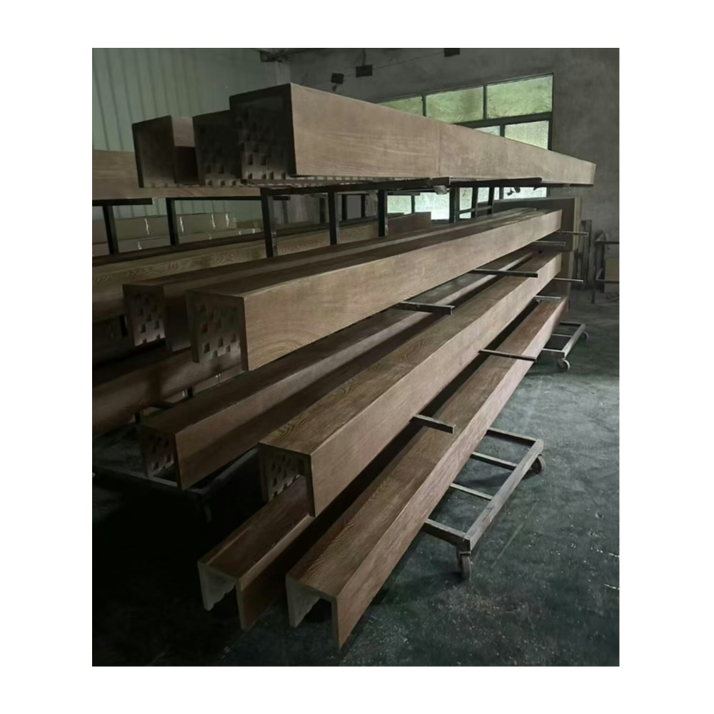
Monochromatic interior design presents a sophisticated approach to space planning that relies on variations of a single hue to create visual interest. Rather than combining multiple colors, this technique explores the depth and complexity available within one color family, using value shifts, texture changes, and tonal gradations to generate the visual dynamism that spaces need. The challenge lies in introducing warmth and character without disrupting the carefully calibrated color relationships that define monochromatic success.
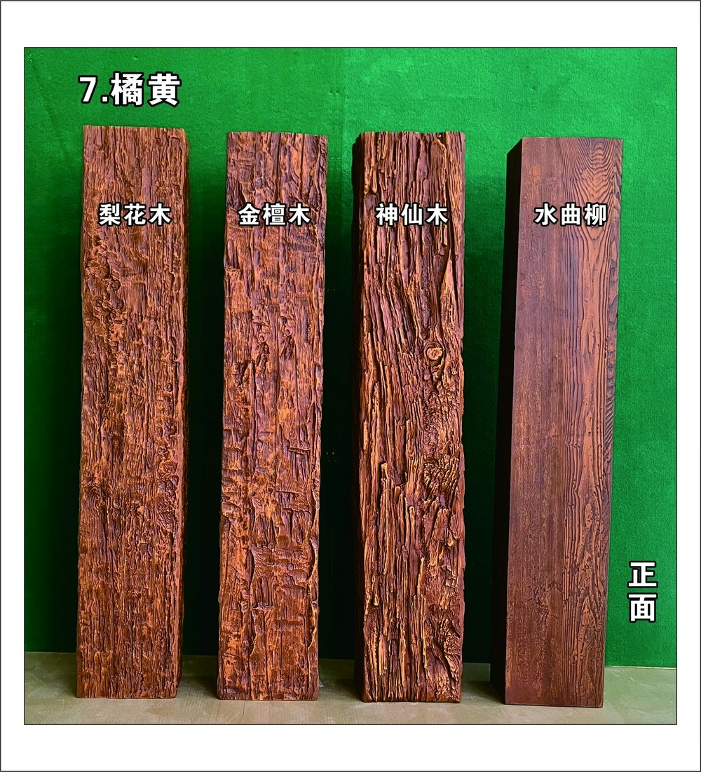
Textured surfaces become essential tools in this context. Without the visual complexity that color contrast provides, monochromatic spaces depend on surface variation to maintain interest. Wood faux beams serve this purpose exceptionally well, offering authentic wood texture that reads as architectural detail rather than color, allowing them to integrate seamlessly into single-hue color schemes while adding the organic warmth that prevents spaces from feeling cold or sterile.
Understanding Monochromatic Color Theory
The monochromatic approach operates on principles that differ fundamentally from multicolor schemes. Rather than establishing dominant, secondary, and accent colors, monochromatic design creates hierarchy through value—the lightness or darkness of a single hue. Near-whites dominate in airy, ethereal spaces. Mid-tones create balanced, sophisticated environments. Deep values produce dramatic, enveloping atmospheres.
Texture functions differently within this framework. In multicolor schemes, texture adds subtle interest that complements color relationships. In monochromatic spaces, texture becomes a primary design element, creating the visual complexity that prevents flatness. The grain patterns, surface relief, and material authenticity of wood faux beams contribute precisely this kind of meaningful texture.
Scale relationships require careful attention in monochromatic design. Without color contrast to establish hierarchy, size differences between elements must accomplish this work instead. Beams should be appropriately scaled to their surroundings—too small and they disappear into ceiling planes, too large and they overwhelm carefully balanced compositions.

Achieving Subtlety Through Color Matching
The key to successful monochromatic integration lies in achieving color harmony between beams and surrounding surfaces. Matching beam finishes to ceiling and trim colors allows wood texture to provide interest while remaining subordinate to overall color goals. The wood grain becomes a discovery rather than a statement, rewarding close attention without demanding it from across rooms.
Achieving precise color matching requires either working with manufacturers who offer custom finishing or selecting from extensive color libraries that accommodate common monochromatic palettes. Warm neutrals—creams, taupes, and soft browns—pair naturally with wood aesthetics and prove particularly common in monochromatic residential applications. Cool neutrals—grays, greiges, and soft blues—create more contemporary atmospheres that some designers prefer.
Finish sheen affects perceived color significantly. Matte finishes recede visually, while semi-gloss surfaces advance. Selecting appropriate sheen for beam installations ensures that they read as part of the monochromatic composition rather than as distracting elements. Test panels comparing proposed finishes in actual installation lighting eliminate the guesswork that color selection otherwise involves.
Texture Variety Within Single Hue Schemes
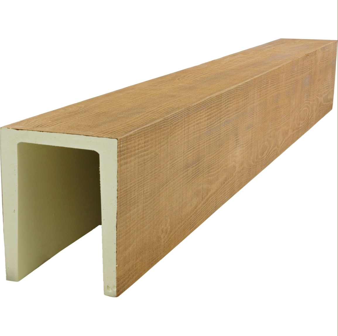
Even within carefully coordinated monochromatic palettes, texture variety maintains visual interest. Smooth plaster walls, fabric-upholstered furniture, and polished metal accessories all contribute different surface qualities that interact with light in distinct ways. Wood faux beams add another texture register—the organic, directional patterns of wood grain—that enriches the tactile vocabulary of monochromatic spaces.
Grain pattern selection influences the character that beams contribute to overall design. Subtle, uniform grain patterns create calm, refined atmospheres appropriate for minimalist contemporary spaces. More dramatic grain with pronounced figure adds energy and visual interest that prevents sophisticated spaces from feeling dull. The selection should align with the emotional quality that the design intends.
Relief depth affects how dramatically beams interrupt ceiling planes. Shallow relief patterns create subtle shadow that reads as texture without strong dimensional presence. Deep relief generates more pronounced shadow patterns that assert themselves visually, appropriate for spaces where beams should serve as significant architectural features rather than understated finishing touches.
Balancing Warmth and Coolness
Monochromatic color schemes often lean toward either warm or cool values, establishing emotional temperature that should be consistent throughout the space. Wood faux beams, with their inherent organic warmth, interact with this temperature in ways that require thoughtful consideration.
In warm monochromatic schemes built around cream, tan, or terracotta values, wood faux beams reinforce the existing temperature, adding to the enveloping comfort that such palettes create. These combinations feel natural and intuitive, with beams contributing to rather than contrasting with the design direction.
Cool monochromatic schemes built around gray, blue-gray, or greige values present more complex integration challenges. Wood warmth can either complement or disrupt depending on execution. Successful integration typically requires desaturated wood tones that read as neutral texture rather than warm color. Custom finishing allows this fine-tuning that stock products cannot always achieve.
The goal is achieving balance that feels intentional rather than accidental. When beams and surroundings work together, the result feels resolved and sophisticated. When beams clash with color temperature, the space feels confused—beautiful materials undermined by poor coordination.
Light Interaction in Monochromatic Spaces
Lighting design assumes particular importance in monochromatic spaces, where color contrast does not compensate for lighting mistakes. Wood faux beams interact dynamically with both natural and artificial light, with grain patterns becoming more or less visible depending on light direction and intensity.
North-facing rooms with cool, consistent natural light often benefit from beams that appear slightly darker than surrounding surfaces, creating subtle contrast that compensates for the limited light variation. South-facing rooms with warm, shifting natural light may call for beams that blend more closely with ceilings, preventing excessive brightness variation as sun angles change.
Artificial lighting adjustments complete the monochromatic integration. Recessed fixtures can wash ceiling planes uniformly, allowing beam texture to emerge subtly. Accent lighting aimed at beams emphasizes grain patterns and increases visual presence. The lighting system should be designed in coordination with beam specifications rather than specified independently.
Practical Implementation Guidance
Successfully integrating wood faux beams into monochromatic spaces requires coordination between design intentions and product selection. Beginning with specific color targets rather than general concepts produces more refined outcomes. Knowing exact ceiling and wall paint colors, or working from finish samples early in the specification process, enables matching that general specifications cannot achieve.
Professional finishing services often prove worthwhile for monochromatic projects. The precision that these schemes require exceeds what standard finish selections can provide. Investment in custom color matching pays dividends through spaces that feel resolved and intentional rather than approximate.
Installation sequencing affects final quality in monochromatic applications. Painting surrounding surfaces before beam installation allows clean, crisp edges where beams meet ceilings and walls. Installing beams before finishing permits treating them identically to adjacent surfaces, achieving seamless integration that separate finishing cannot match.
Technical References
ASTM standards cited in every specification
Test Data
Lab results from internal testing program
Updated 2026
Reviewed against current product specs