The combination of greige walls with natural oak beams represents one of interior design's most reliable pairings—a partnership that has endured through shifting trends because it addresses fundamental aesthetic principles rather than following fashion. Greige, that sophisticated blend of grey warmth and beige neutrality, provides a backdrop of refined calm. Natural oak, with its characteristic golden tones and distinctive grain patterns, introduces organic warmth without disrupting the overall neutrality that greige establishes. Together, these materials create spaces that feel both comfortable and elevated, appropriate for everything from casual family living to formal entertaining.
The term greige has only entered common interior design vocabulary relatively recently, but the color relationship it describes has ancient roots. The combination of warm grey and natural wood tones appears throughout traditional architecture across cultures, from Japanese temples with their honey-colored timber against grey stucco to Scandinavian farmhouses where light wood met whitewashed walls. Contemporary greige and oak represents a continuation of this proven partnership, translated into current color sensibilities and modern material options.
Natural oak has served as a premium furniture and architectural wood for millennia, prized for its combination of beauty, durability, and workability. The species displays distinctive grain patterns—the distinctive medullary rays that create the "flake" pattern when quartersawn, the bold cathedral arches when plain-sawn, and the subtle figuring that appears in certain cuts. The color palette ranges from pale straw through golden honey to deeper amber tones, all of which harmonize naturally with greige's balanced neutrality. This inherent compatibility explains why oak has remained a design staple across centuries of changing fashion.
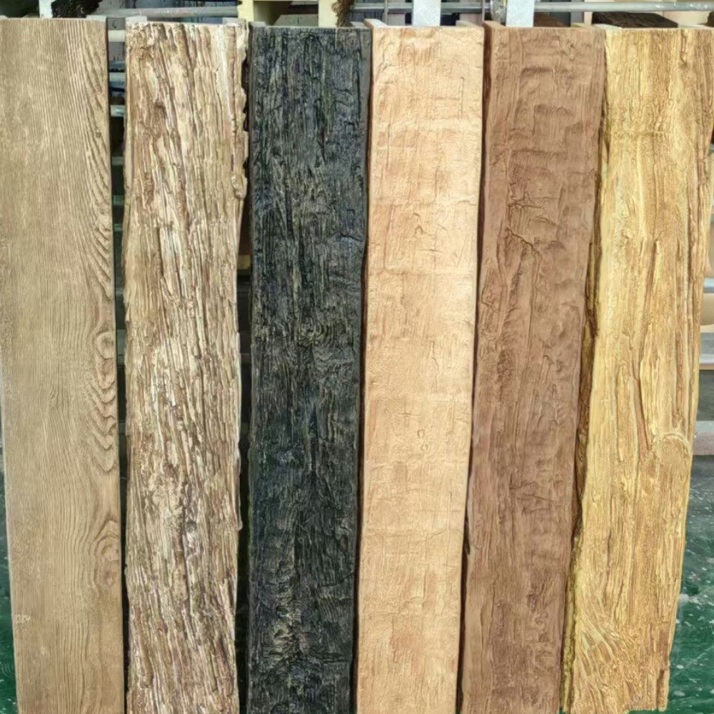
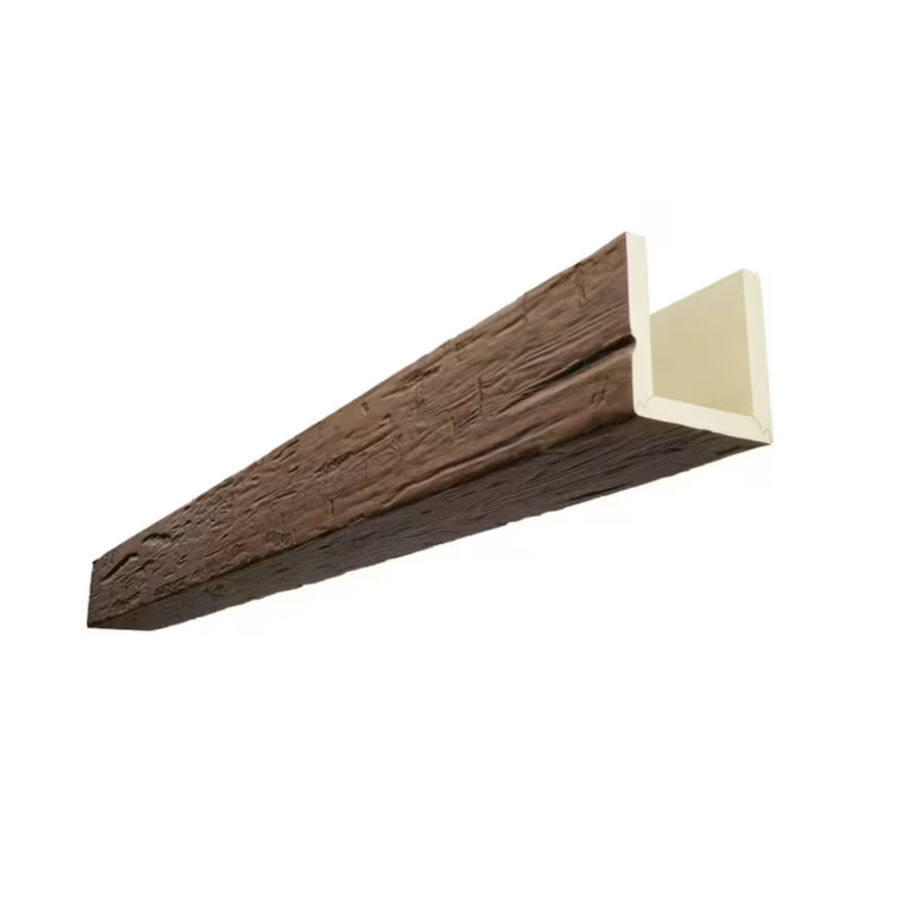
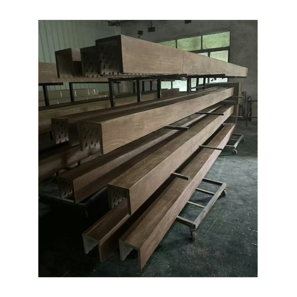
Faux oak beams make this classic combination accessible to projects where genuine oak timber would prove impractical. Solid oak beams require substantial structural support and command premium pricing that limits specification. The dimensional instability that oak exhibits—movement in response to humidity changes that can create gaps and checking—creates concerns for interior applications. And the visual variation between oak boards, while part of the species' charm, complicates coordination when multiple beams must match. Polyurethane oak-appearance beams address all these limitations while preserving the essential visual characteristics that make the combination successful.
Consider a primary bedroom renovation where the designers sought to create a serene retreat that would remain appropriate regardless of evolving design trends. The greige wall color provided an excellent foundation—sophisticated without being trendy, warm without being assertive. Natural oak appearance beams across the ceiling reinforced the neutral warmth while adding architectural interest that plain drywall could not provide. The resulting space felt simultaneously luxurious and comfortable, a combination that the homeowners valued for their daily relaxation. The timeless quality of the greige and oak combination ensured that the room would not feel dated as their tastes evolved.
The specific greige tone selected should harmonize with the oak beam finish to achieve the intended sophisticated character. Greige with stronger grey undertones pairs naturally with cooler oak finishes, creating refined spaces that lean toward contemporary aesthetics. Greige with warmer brown undertones complements amber oak tones, producing traditional warmth that suits classic interiors. The interplay between these subtle tonal choices determines whether the combination feels more modern or more traditional, allowing designers to calibrate the relationship precisely.
Lighting plays a crucial role in how greige and oak interact throughout the day. North-facing rooms with cooler natural light may benefit from warmer greige tones that compensate for the ambient coolness. South-facing spaces flooded with warm sunlight can accommodate cooler greige that maintains its sophisticated character. Artificial lighting should be considered as well—warm incandescent sources enhance the golden oak tones, while cooler sources create more clinical atmospheres that may feel less inviting in spaces meant for relaxation.
The furniture and textile selections that accompany greige walls and oak beams should honor the neutral foundation while providing sufficient visual interest to prevent spaces from feeling flat or underdeveloped. Upholstery in complementary neutrals—cream, taupe, charcoal—maintains the sophisticated palette without competing with the architectural elements. Accent pieces in brass or bronze introduce metallic warmth that echoes the oak tones. And artwork selection should consider how the neutral backdrop supports rather than conflicts with color expressions in chosen pieces.
The scale of oak beams in greige-wall contexts should relate to the overall room proportions and the visual weight of other elements. Larger rooms with higher ceilings can accommodate more substantial beams that create strong architectural presence. Smaller rooms may benefit from more restrained beam sizes that add warmth without overwhelming the space. The greige walls provide visual lightness that can support slightly larger beams than darker wall colors might accommodate, but proportionality remains important.
Texture considerations for both greige walls and oak beams affect how the combination ultimately reads. Smooth, refined greige paint finishes create formal sophistication that pairs well with more subtly textured oak. More textured wall finishes—subtle limewash,轻度stippled plaster, or similar treatments—add interest that benefits from calmer oak textures. The interaction between wall and beam textures should be considered as part of comprehensive design planning.
The practical maintenance of greige walls and oak beams involves different considerations for each material. Greige paint, particularly in eggshell or satin finishes, requires attention to scuffs and marks that show plainly on the neutral surface. Oak beams in polyurethane require only occasional dusting, their manufactured surface resisting the moisture absorption and discoloration that genuine oak might exhibit. This differential maintenance suggests that beams may outlast wall paint cycles, potentially requiring repainting around beam installations rather than complete renovation.
The investment perspective on greige and oak combinations favors durability over trendy alternatives. While fashion-oriented designs may require updates when colors fall out of favor, the neutral palette established by greige and oak provides protection against obsolescence. Spaces finished with these materials will remain appropriate as design fashions shift, requiring only accessory and furniture updates rather than architectural changes. This longevity of relevance makes the combination economically sensible despite any premium that quality materials might command.
Commercial applications of greige and oak benefit from the same timeless quality that makes the combination successful residentially. Hospitality venues, professional offices, and retail spaces all require environments that accommodate diverse users and evolving brand expressions. The neutral greige and oak palette provides exactly this flexibility, allowing furniture, signage, and merchandise changes without architectural conflict. The durability of polyurethane oak beams ensures that this flexibility persists throughout the space's service life.
The environmental credentials of the greige and oak combination improve when quality materials are selected and properly maintained. Quality paint finishes with low VOC content minimize environmental impact during application and occupancy. Polyurethane oak beams with extended service lives reduce replacement frequency. And the timeless quality that makes the combination durable also makes it sustainable, as spaces finished with these materials will not require early renovation due to obsolescence.
For designers specifying greige and oak combinations, physical samples under actual lighting conditions provide essential selection verification. Color perception varies dramatically based on surrounding materials, lighting, and individual viewer differences. What appears perfect in a showroom may read differently in the target space. Professional designers typically specify and verify colors through site mockups before finalizing selections, ensuring that the combination achieves intended effects.
The enduring appeal of greige walls with natural oak beams ultimately rests on how well the combination serves fundamental human needs for comfort, sophistication, and adaptability. Spaces finished with these materials provide calm backdrops for living, working, and gathering. The organic warmth of oak prevents spaces from feeling cold or institutional. And the neutral palette accommodates whatever life activities occupants bring to the space, providing foundation rather than demanding focus. This combination serves human purposes elegantly, which explains its continued relevance across design movements and cultural changes.

Technical References
ASTM standards cited in every specification
Test Data
Lab results from internal testing program
Updated 2026
Reviewed against current product specs