Greige—a portmanteau combining grey and beige—represents one of the most sophisticated wall colors available for contemporary interiors. This hybrid neutral bridges warm and cool tones, providing versatility that pure grey or beige cannot match. When paired with dark walnut faux wood beams, greige walls create depth-rich environments where architectural ceiling details command attention without appearing harsh or disconnected from surrounding finishes. The combination has become increasingly popular in high-end residential design, boutique hotel lobbies, and upscale restaurant interiors where establishing refined atmosphere takes priority over trendy styling.
The success of greige and dark walnut together stems from their shared complexity. Neither color exists as a pure tone—greige contains both grey and beige undertones that shift under different lighting conditions, while dark walnut displays rich browns, subtle purples, and warm highlights characteristic of genuine walnut lumber. This chromatic complexity creates visual interest that simpler color pairings cannot achieve. Spaces featuring greige walls and walnut-toned beams appear curated rather than default, suggesting thoughtful design decisions that elevate perceived property value and occupant experience.
Understanding Greige Undertones
Selecting the appropriate greige requires understanding how its dual-nature undertones interact with dark wood finishes. Cool greiges leaning heavily toward grey create contemporary spaces where walnut beams provide dramatic contrast and natural warmth. These combinations suit minimalist interiors with clean furniture lines, abundant natural light, and restrained accessory palettes. Warmer greiges approaching beige from the grey direction produce more traditional atmospheres where beams feel integrated rather than contrasted, better suited to transitional or craftsman-influenced décor.
The specific lighting conditions in a room determine which greige direction works optimally. North-facing rooms receiving primarily cool natural light benefit from warmer greige selections that prevent overall chilliness. South-facing rooms flooded with warm sunlight accommodate cooler greige tones that balance excessive golden illumination. Testing multiple greige samples throughout the day reveals how each option transforms across lighting scenarios, ensuring the final selection maintains desired characteristics from morning coffee until evening entertaining.
Dark Walnut Finish Characteristics
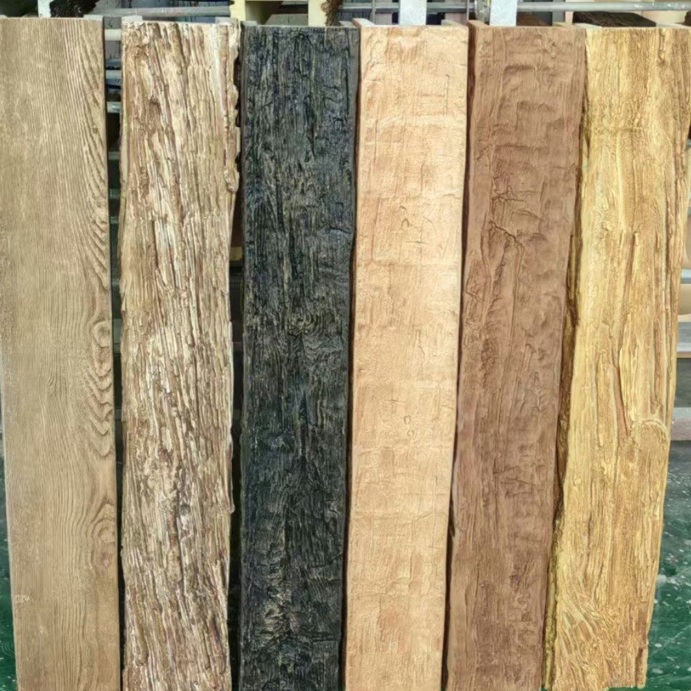
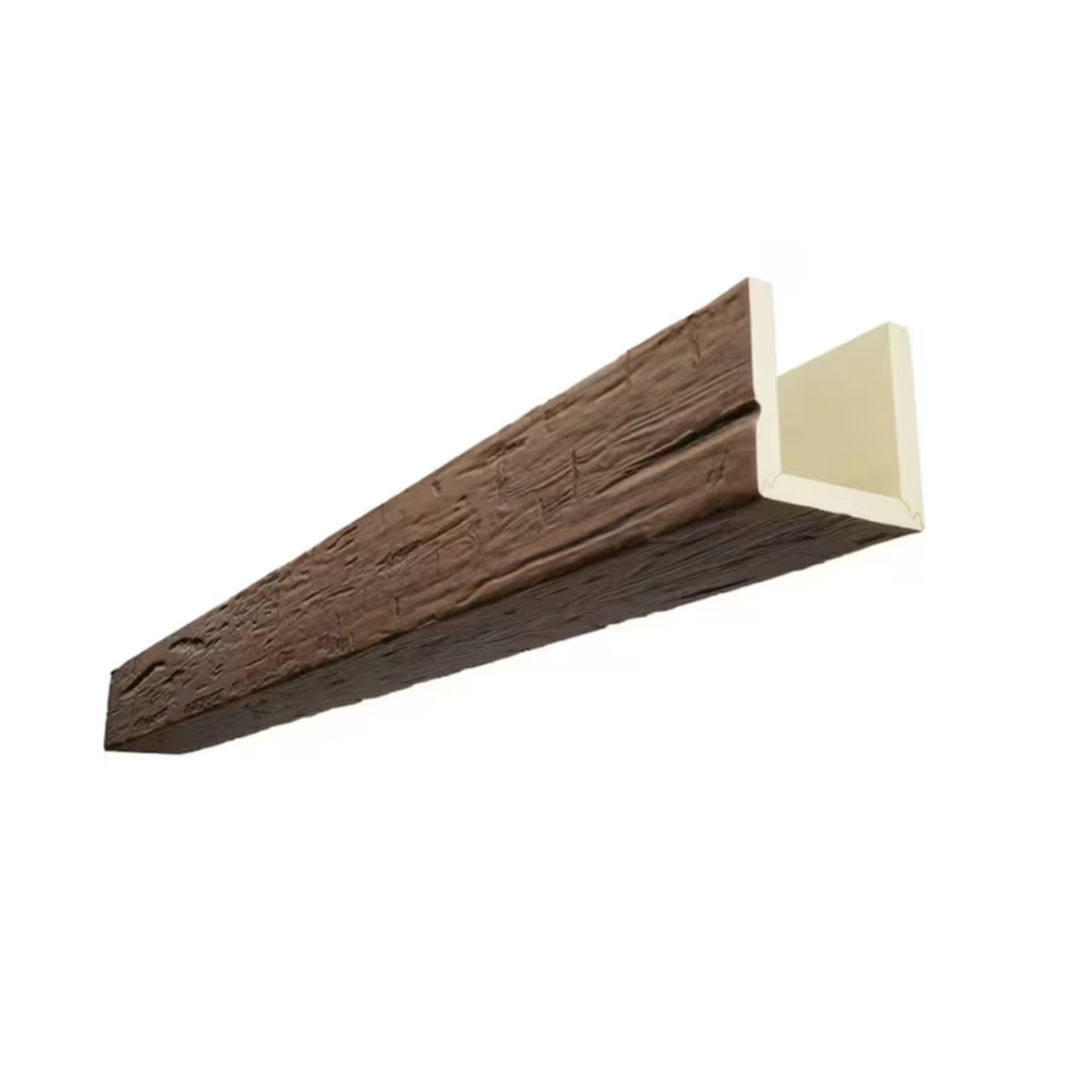
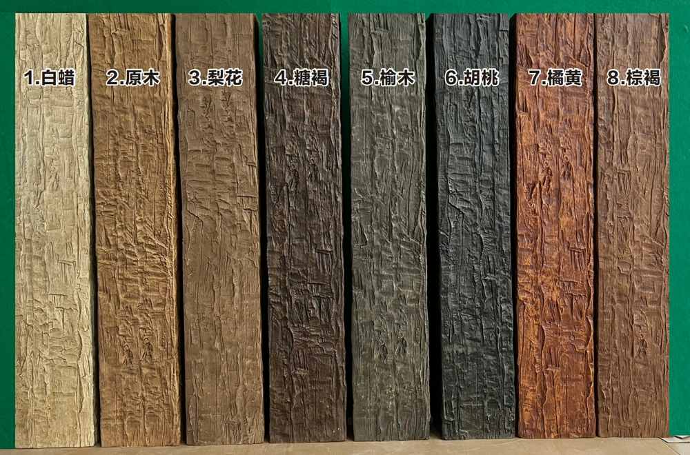
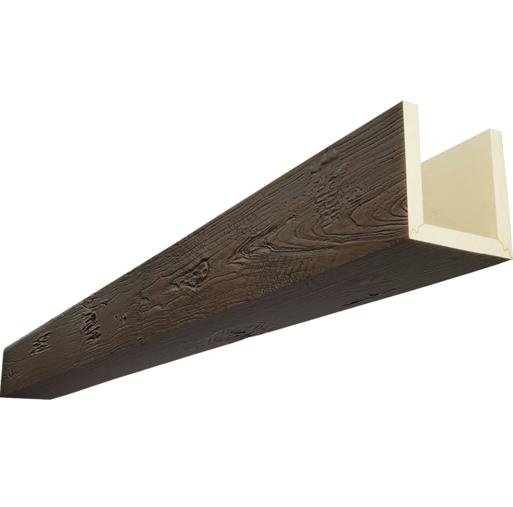
Dark walnut polyurethane faux beams replicate the distinctive appearance of genuine walnut lumber at various aging stages. Freshly milled walnut displays rich chocolate browns with occasional lighter streaks, while aged walnut develops deeper, almost purple-toned darkness with increased grain contrast. The specific walnut character reproduced in polyurethane beams significantly influences room mood—lighter "young walnut" appearances create approachable luxury, while deeply darkened finishes communicate formality and permanence.
Surface texturing on dark walnut beams ranges from smooth factory-sanded finishes to authentically distressed appearances featuring wire brushing, hand scraping, or artificial weathering marks. Smooth finishes suit contemporary interiors seeking refined elegance, while textured finishes introduce organic character appropriate for rustic-modern or industrial-influenced spaces. The grain pattern intensity in walnut beams should complement rather than compete with furniture, flooring, and other wood elements present in the room.

Ceiling Height and Beam Proportion
Grand proportions define successful greige and dark walnut interiors. The depth and richness of both colors require sufficient scale to breathe and display their characteristics effectively. In rooms with ceilings below 9 feet, the darkness of walnut beams risks creating oppressive overhead impressions unless carefully balanced with light-reflective ceiling paint and strategic artificial lighting. Standard 8-foot ceilings present the greatest challenge, potentially appearing cramped with dark beams unless the room receives exceptional natural light and uses predominantly light floor coverings.
For lower ceilings, consider using dark walnut beams in reduced dimensions—3 or 4 inches wide rather than 6 or 8—to maintain architectural presence without overwhelming the space. Alternatively, installing beams in painted white or cream finishes that complement dark walnut furniture provides visual hierarchy that prevents ceiling weight from pressing down on occupants. The goal remains achieving balance where the eye travels comfortably throughout the room without any single element commanding disproportionate attention in a negative manner.
Lighting Design for Depth Enhancement
Dark walnut beams require thoughtful lighting to reveal their surface detail and prevent them from reading as flat silhouettes against lighter ceilings. Uplighting positioned inside beam pockets or behind beam installations creates ambient glow that washes ceiling surfaces while defining beam edges through shadow contrast. This technique works especially well in dining rooms and master bedrooms where establishing intimate evening atmospheres takes priority over bright task lighting.
Track lighting with adjustable heads allows beams to be individually highlighted during evening hours while directing illumination toward task areas during daytime activities. The ability to reconfigure lighting focus as room functions change provides flexibility that fixed recessed lighting cannot match. For permanent mood lighting, cove lighting integrated into beam-to-ceiling intersections creates continuous luminous lines that frame beams elegantly without harsh spot illumination.
Furniture and Material Coordination
Furniture selection in greige and dark walnut spaces requires balancing multiple wood and neutral elements without creating visual confusion. A dark walnut dining table serves as an obvious anchor piece that echoes ceiling beam coloring while grounding the seating area. Grey upholstered dining chairs in complementary greige tones prevent the table from appearing isolated while maintaining the established neutral palette. Metal accent pieces—brushed brass hardware, matte black lighting fixtures, brushed nickel accessories—add finishing definition without introducing conflicting colors.
Flooring choices significantly impact overall success. Light hardwood floors in oak, ash, or maple create necessary contrast against dark ceiling beams, preventing rooms from reading as too heavy overall. Cream or ivory area rugs define conversation zones while introducing softness that counteracts the architectural formality of dark beams and greige walls. Dark hardwood floors, while matching ceiling beams, risk creating monochromatic heaviness that overwhelms—unless the room is exceptionally large with abundant natural light to carry the dark-on-dark palette successfully.
Window Treatment Integration
Window treatments provide opportunities to reinforce greige and dark walnut color relationships or introduce controlled contrast. Floor-length drapes in greige or cream fabrics blend with walls while adding soft texture at window locations. Roman shades in textured natural fibers complement wood tones without competing for attention. For spaces seeking additional drama, curtains in deep charcoal or midnight blue introduce color depth that enriches the neutral foundation without disrupting the greige-walnut relationship.
Sheer window treatments layered with heavier draperies create flexible light control while maintaining the refined aesthetic appropriate for luxury interiors. The sheers filter natural light softly, preventing harsh shadows on greige walls while preserving visibility to exterior views. When evenings require privacy or atmosphere, closing heavier drapes transforms the room immediately while the ceiling beams remain visible and continue providing architectural interest.
Maintaining Design Cohesion Across Connected Spaces
Open floor plans presenting greige walls across multiple connected rooms require special attention to beam installation continuity. Running dark walnut beams consistently across visible ceiling areas creates flow that guides occupants through the space while establishing unified design language. Discontinuing beams at room boundaries or using different finishes in adjacent spaces fragments the aesthetic and reduces overall sophistication.
However, complete uniformity may feel repetitive in very large spaces. Varying beam orientation—running some beams perpendicular to others, creating accent beam clusters in specific zones, or installing beams only in certain rooms while using different ceiling treatments elsewhere—maintains visual interest while preserving the fundamental greige and dark walnut relationship. These variations should feel intentional rather than arbitrary, creating discovery moments as occupants move through the space.
Technical References
ASTM standards cited in every specification
Test Data
Lab results from internal testing program
Updated 2026
Reviewed against current product specs