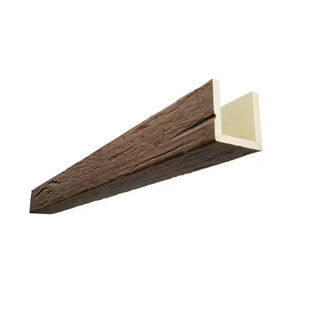
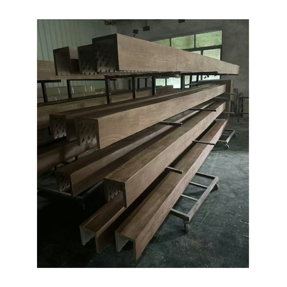
Few design combinations deliver visual impact as reliably as dark wood beams against white ceilings. This pairing has powered countless magazine spreads and Instagram features, but executing it successfully requires understanding why it works and how to avoid the pitfalls that undermine similar installations. I've watched this combination fail spectacularly when materials, proportions, or details fell short of the mark, and I've seen it transform spaces beyond what photographs suggested was possible.
The appeal of dark beams on white ceilings lies in the inherent drama of strong contrast. Our eyes naturally gravitate toward visual tension points, and the junction between dark and light creates exactly that kind of focal interest. Properly executed, this combination makes ceiling height feel greater than it actually is while drawing the eye upward and around the room in a satisfying visual circuit. The key lies in committing fully to the contrast rather than hedging with mid-tone alternatives that lack the punch of true dark and light separation.
Understanding the Visual Mechanics
Color relationships in interior design operate through principles that designers have refined over centuries. The contrast principle driving dark-on-white appeal relies on simultaneous contrast, where colors appear more intense when placed next to their opposites. Deep walnut beams next to crisp white become even more dramatically dark, while the white ceiling appears brilliantly clean in comparison. This mutual enhancement elevates both colors beyond what either could achieve independently.
Scale relationships determine whether the combination reads as sophisticated or overwhelming. Large beams on modest ceilings can crowd the space, while tiny beams on high ceilings can look precious and inadequate. The sweet spot typically involves beams proportional to the room's square footage rather than directly scaled to ceiling height. In most residential applications, beams ranging from four to eight inches in their smaller dimension create appropriate visual weight without dominating the space.
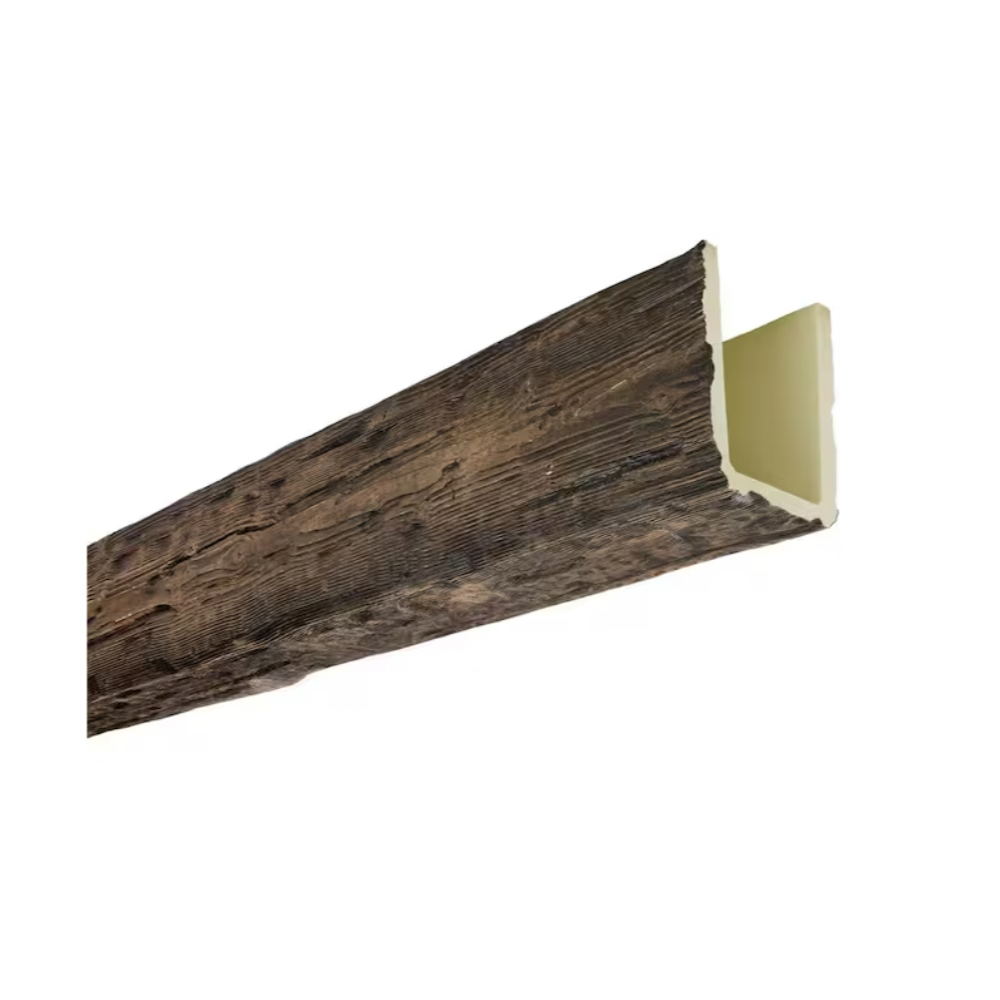
Texture interplay between smooth white drywall and detailed wood grain adds another dimension to the contrast relationship. The flat, seamless surface of painted drywall provides a neutral backdrop that lets the beam's wood texture command attention. This texture contrast explains why genuine wood grain feels essential even in faux implementations—the organic irregularity of wood cannot be convincingly faked, and the better the reproduction, the more effective the overall contrast becomes.
Selecting the Right Dark Finish
The term "dark" encompasses enormous variety within wood tone classifications. Espresso approaches near-black with warm undertones visible only in direct light. Charcoal offers cooler, more neutral darkness. Rich walnut occupies a middle ground with obvious brown tones visible even in shadow. Each creates a different relationship with surrounding whites, and the choice affects how the entire room feels.
Warm dark stains—those with obvious brown, amber, or reddish undertones—create inviting, traditional-feeling spaces. These beams pair naturally with creamy whites and off-whites, harmonizing with traditional trim and casement details. The warmth prevents the space from feeling stark, even when white surfaces dominate. This combination works particularly well in living rooms, dining spaces, and bedrooms where comfort matters as much as contemporary aesthetics.
Cool dark finishes—grays, charcoals, and wood tones with black added—create more contemporary, sometimes austere, atmospheres. These pair well with pure white or blue-tinted whites that emphasize the coolness of the contrast. The resulting spaces feel more formal and architectural, suitable for modern kitchens, professional offices, and retail environments where a refined aesthetic serves business objectives.

White Ceiling Preparation
The quality of the white ceiling directly affects how successfully dark beams will read. Dark tones expose every imperfection in surrounding surfaces, revealing tape lines, nail pops, and texture inconsistencies that might escape notice in neutral conditions. Investing in proper ceiling preparation—full mud and tape finishing, consistent texture application, and quality paint—pays dividends in the final appearance.
Paint selection influences both appearance and maintenance. Flat white paint creates the softest, most diffuse appearance but shows marks and scuffs easily. Eggshell or satin finishes provide better washability while maintaining reasonable reflectivity. For high-traffic areas or commercial applications, satin or semi-gloss finishes ensure surfaces clean without visible wear patterns.
The transition between ceiling and beam requires particular attention. Ideally, beams mount flush or nearly flush with the ceiling surface, with minimal gap visible from normal viewing angles. Some installers add crown molding or trim pieces to create graduated transitions that hide imperfect cuts and gaps. The complexity of trim work should match the overall design ambition—minimalist spaces may accept simple reveals, while traditional or farmhouse aesthetics benefit from more elaborate trim detailing.
Spacing and Layout Decisions
Beam spacing determines the rhythm of the ceiling design and affects how the room feels spatially. Tight spacing—beams every two to four feet—creates a heavily textured ceiling that feels cozy and enclosed. This approach works well in smaller spaces or rooms where an intimate atmosphere serves the intended use. The dense beam pattern becomes the dominant ceiling treatment, with the white between beams serving as accent rather than primary surface.
Generous spacing—beams six feet apart or more—creates a lighter, more contemporary feel. The white ceiling surface dominates visually, with beams reading as periodic punctuations rather than continuous texture. This approach works better in larger spaces where overwhelming the room with texture would be counterproductive. The spacing gives the white ceiling room to breathe while still introducing the warmth and character that wood tones provide.
Consistency matters more than the specific spacing chosen. Beams should maintain roughly equal spacing throughout the installation, with any adjustments made gradually rather than creating obvious irregularities. Planning the layout carefully before installation—measuring carefully, marking reference lines, and possibly dry-fitting beams temporarily—prevents the disappointing irregularities that careless spacing creates.

Technical References
ASTM standards cited in every specification
Test Data
Lab results from internal testing program
Updated 2026
Reviewed against current product specs