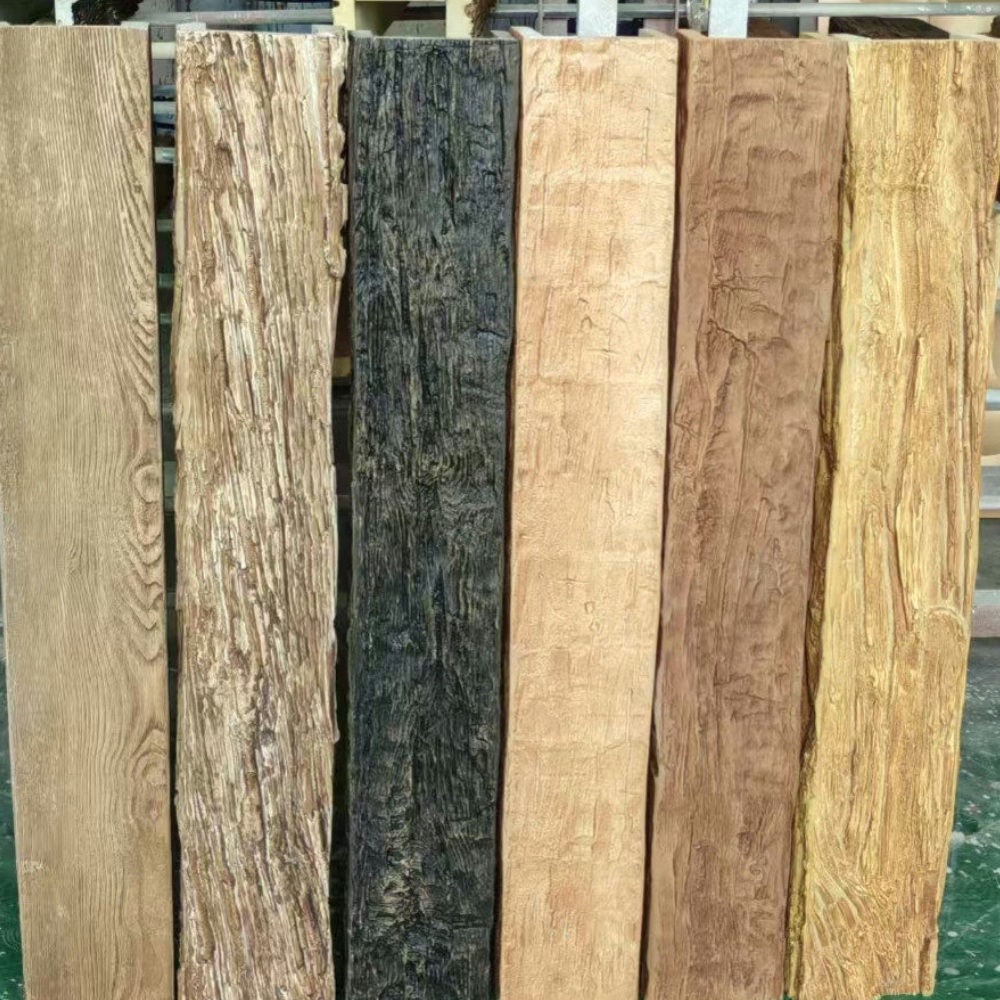
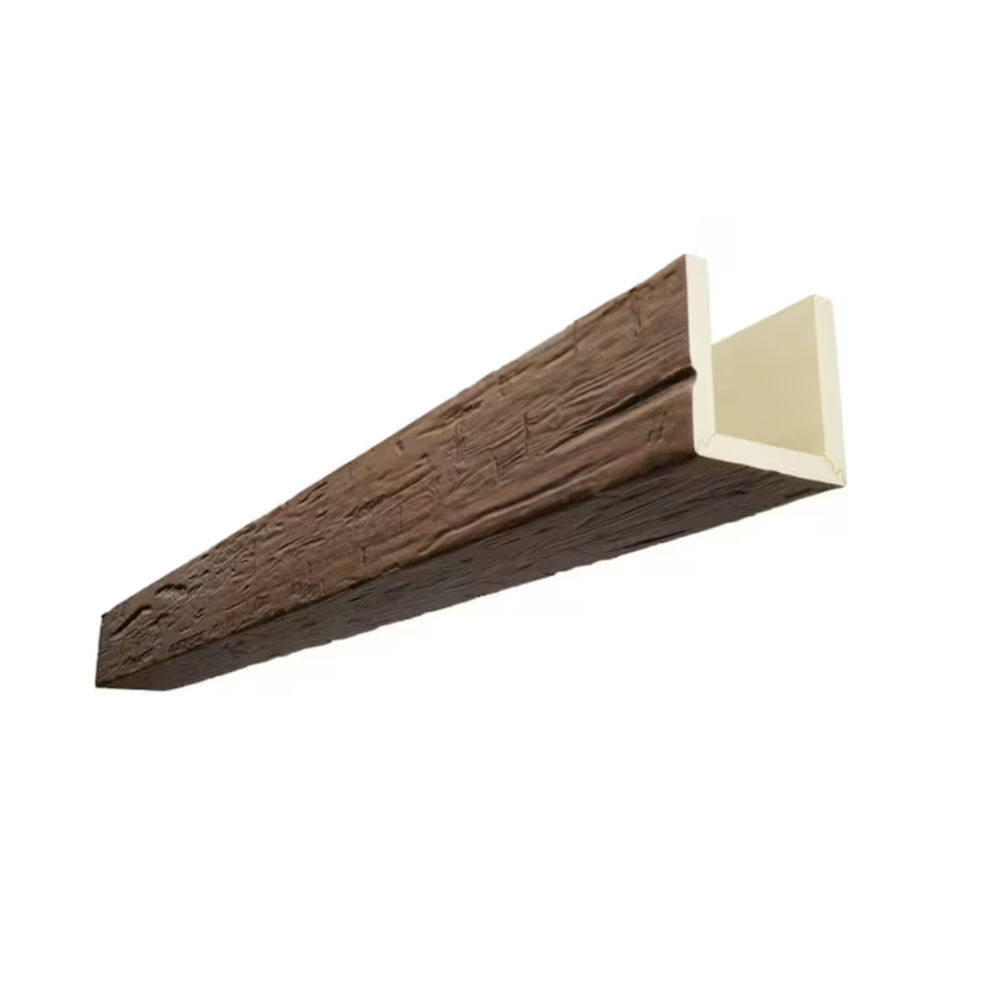
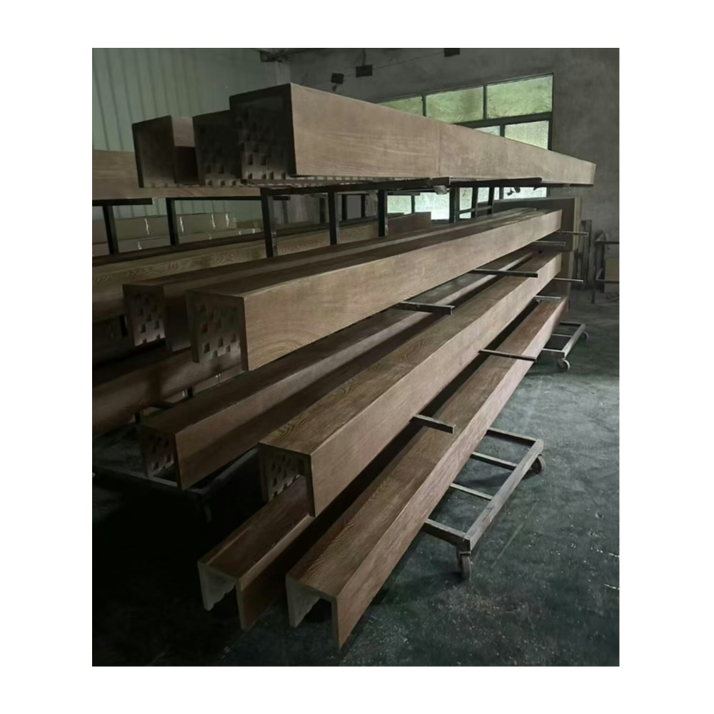
The partnership between warm chestnut beams and linen colored walls represents one of interior design's most reliable color combinations, creating spaces that feel simultaneously sophisticated and approachable. This pairing draws from the natural world, where autumn forests meet golden fields in scenes that have inspired human aesthetics for millennia. When translated into residential interiors, the combination achieves a balance between warmth and neutrality that works across diverse design styles and personal preferences, making it a versatile foundation for customized decorating approaches.
Linen's characteristic neutrality provides the perfect canvas for warmer wood tones to express themselves fully. Unlike pure white or stark grays that might create uncomfortable contrast, linen carries subtle warmth that harmonizes with chestnut's rich browns without competing for attention. The result allows beams to establish their presence while walls recede gracefully, creating the layered depth that distinguishes thoughtfully designed spaces from those where all elements demand equal attention.
The texture of linen-colored surfaces adds another dimension to this color partnership. Whether achieved through paint with subtle sheen variations, wallpaper with fabric-like embossing, or actual linen wall coverings, textured surfaces catch light differently than flat paints, introducing gentle visual interest that prevents rooms from feeling flat or uninspired. When combined with the pronounced texture of wood-grain beams, this layered surface treatment creates rich environments that reward extended occupation.
Achieving Depth Through Color Layering
Color layering in interiors requires understanding how different tones interact under varying lighting conditions. Chestnut beams with linen walls create natural depth through value contrast, where darker overhead elements visually recede while lighter wall surfaces advance. This basic optical principle underlies much of successful interior design, creating the spatial perception that transforms flat rooms into environments with perceived dimension and interest.
Natural daylight interacts with this color pairing in ways that enhance the relationship throughout the day. Morning light tends toward cooler temperatures that make linen walls appear slightly warmer by contrast. Midday sun saturates both surfaces, revealing the full depth of chestnut grain patterns while illuminating linen textures beautifully. Evening light shifts toward amber warmth that harmonizes all elements, creating the golden-hour glow that makes these spaces feel particularly inviting as day transitions to night.
Artificial lighting selection should honor the warm intent of this color combination. Bulbs in the warm white range around 2700K to 3000K reinforce the cozy atmosphere that chestnut and linen establish together. Dimmers allow adjustment from bright functional illumination during daytime hours to intimate evening ambiance with simple control adjustments. Avoid cool fluorescent or stark LED options that would introduce color dissonance undermining the designed warmth.
Furniture and Accessory Selection for Coordinated Spaces
Successful interior design extends color coordination beyond architectural elements to encompass all visible objects within a space. Furniture in leather, fabric, or wood should either echo chestnut tones or provide appropriate contrast through neutral or complementary colors. The goal is creating visual flow that guides the eye naturally through the room without jarring transitions or uncomfortable color clashes.
Leather furniture in medium browns or cognac tones creates strong connections with overhead chestnut beams, unifying ceiling and floor visually. Sofas and chairs in warm gray, cream, or subtle pattern fabrics provide softer alternatives that maintain the relaxed elegance the color scheme establishes. Avoid very dark furniture that might create oppressive weight at lower room levels, disrupting the balanced vertical distribution that this pairing naturally achieves.
Decorative accessories offer opportunities to introduce accent colors that energize the neutral foundation. Throw pillows in rust, terracotta, or deep green provide seasonal or personal touches without overwhelming the designed color relationship. Artwork featuring landscapes, still lifes, or abstract compositions in warm palettes reinforces the overall atmosphere. Ceramic accessories in earth tones add tactile interest that complements the visual warmth established by beams and wall colors.

Textile Integration Throughout Living Spaces
Textiles throughout the room should honor the natural, relaxed sensibility that chestnut and linen establish. Curtains in linen or cotton blends maintain the wall color's essence while adding soft architectural treatment to windows. Area rugs in natural fibers or traditional patterns provide grounding for furniture groupings while introducing pattern complexity that prevents visual monotony.
Bedding ensembles in bedrooms featuring this color scheme should prioritize comfort through quality linens in complementary tones. White or cream bedding pops beautifully against warm chestnut beams while harmonizing with linen wall backgrounds. Decorative pillows in rust, gold, or sage green add seasonal interest while maintaining the established palette. The overall effect should feel restful and cohesive, appropriate for spaces dedicated to relaxation.
Kitchen and dining areas benefit from the same color principles applied through appropriate materials. Natural wood dining tables echo beam coloring while providing functional surfaces for family meals. Linen napkins, cotton placemats, and ceramic dishware in warm neutrals or earth tones extend the palette throughout dining experiences. The continuity between architectural and decorative elements creates environments where every detail reinforces the overall designed atmosphere.
Technical References
ASTM standards cited in every specification
Test Data
Lab results from internal testing program
Updated 2026
Reviewed against current product specs