A designer friend of ours once spent three weekends sampling greige paints against six different grey-toned beam swatches before landing on the right combination for a renovated 1940s bungalow. Her conclusion, after the dust settled and the swatches went in the bin, was that driftwood grey is the one timber tone that almost never fights the wall. It is the finish equivalent of a neutral trouser — it works with everything in the wardrobe, it photographs cleanly, and it never feels like a decision you have to defend.
That kind of reliability is exactly why driftwood grey-tone polyurethane faux beams have become a quiet bestseller for designers working in the modern neutral space. The finish is muted, the grain is soft, and the overall effect is closer to a worn plank on a Baltic beach than to a freshly milled oak. This piece walks through how the color behaves, where it sits most comfortably, and how specifiers and homeowners can avoid the common pitfalls when ordering.
What driftwood grey actually looks like in production
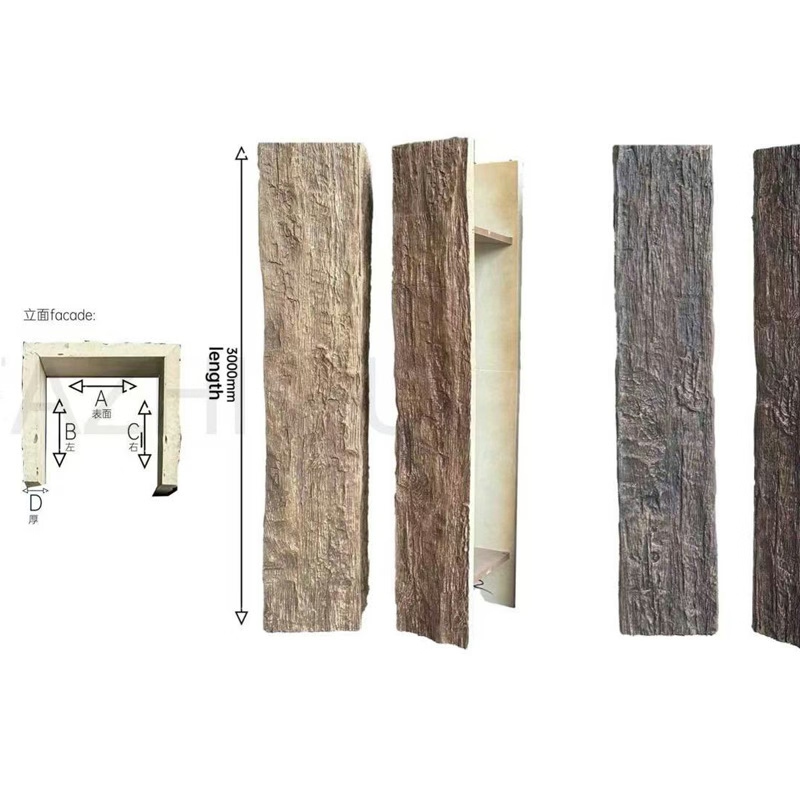
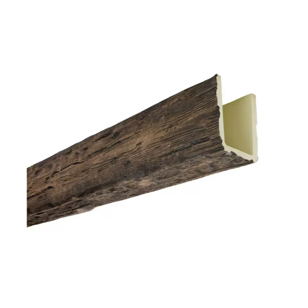
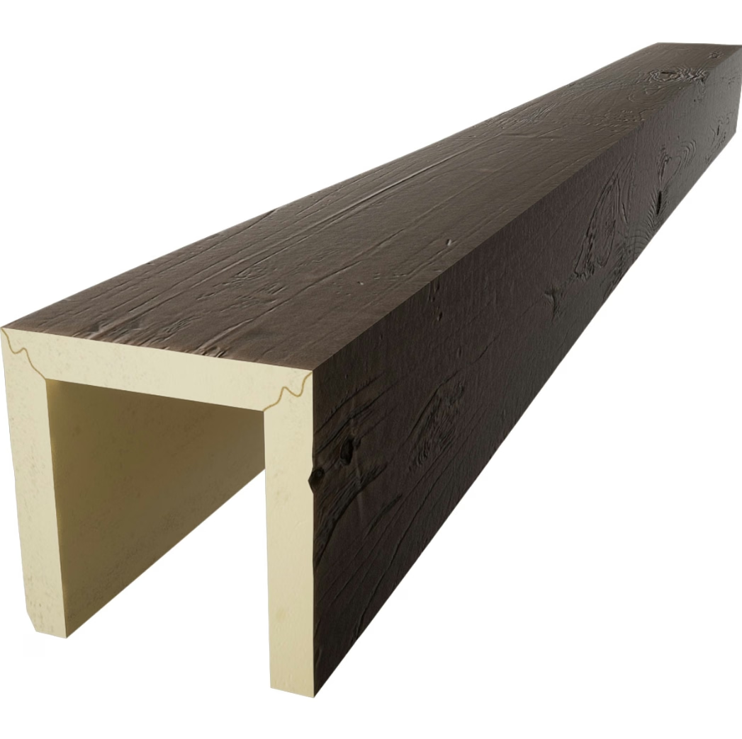
Driftwood grey is not a single color. On real timber it is what happens when UV light, salt air, and rain leach the tannins out of wood over years, leaving behind a silvery, slightly cool surface that still has the underlying warm grain showing through. Reproducing that effect in polyurethane takes a multi-step finish: a pale base wash, a translucent grey glaze that pools in the deeper grain lines, and a subtle highlight tone that lifts the high ridges of the embossed texture. The result should not look painted grey — it should look like wood that became grey.
When you compare samples, look for three things. First, the grey should not be uniform — there should be visible warm undertone in the grain channels and cooler grey on the raised surface. Second, the embossed texture should be deep enough that the glaze actually catches in the grooves; a flat finish with a single grey tone will read as plastic at any distance beyond arm's length. Third, the ends and edges should not look like cut plastic — properly finished driftwood grey beams have variation right up to the cut edge, not a sudden transition to raw foam.
A genuine driftwood grey finish also shifts subtly under different lighting. In north-facing daylight it leans cooler and more silver. Under warm 2700K bulbs it warms up and reads almost taupe. Under 4000K daylight it sits in the middle and looks most like the natural reference. Designers who care about evening ambience tend to spec 2700K lighting with this finish because the warmer bulb brings out the brown undertone that prevents the room from feeling cold.

Why it pairs so well with modern neutral palettes
Modern neutral interiors are built on a relatively narrow palette: warm whites, off-whites, soft greiges, putty, taupe, stone, and the occasional deeper charcoal accent. Driftwood grey is the only timber tone that sits comfortably across the entire spectrum of those wall colors without competing. Warm oak against a warm white wall reads as too monochromatic and a little institutional. Walnut against a soft greige looks heavy and pulls focus. Driftwood grey sits in the middle of the temperature range — warm enough to harmonize with cream walls, cool enough to sharpen up against stone.
The visual logic is straightforward. Driftwood grey has roughly equal warm and cool content. A warm wall pulls the finish slightly cooler; a cool wall pulls it slightly warmer. The timber tone adapts. This is also why designers who work in Scandinavian, Japandi, coastal modern, and California casual styles tend to gravitate to it — those aesthetics share a low-saturation palette that rewards finishes that adapt rather than dominate.
In a Scandinavian-leaning room, driftwood grey beams over a chalk-white ceiling with lime-washed walls and pale oak floors create the kind of layered softness the style depends on. The beams are visible but quiet, providing a ceiling line that anchors the room without demanding attention. In Japandi interiors, the same beams against clay-toned plaster walls and black accents read as a bridge between the warm natural materials and the cooler restraint of the modern elements.
Coastal modern — driftwood grey's natural home — uses the finish to extend a beach palette indoors. Against shiplap or tongue-and-groove panelling, against linen-upholstered furniture, and against sisal or jute flooring, driftwood grey beams look like the architecture of the room has always been that color. They do not feel added. They feel like the ceiling was weathered by the same sea air that bleached the deck outside.
A quick pairing reference
For project specs, the following combinations have proven reliable across hundreds of residential and small commercial projects:
- Warm white walls (Benjamin Moore White Dove, Farrow & Ball Wimborne White): driftwood grey beams + pale oak floors + natural fiber rug. The room reads bright and contemporary, the beams provide the only saturated timber note.
- Greige walls (SW Accessible Beige, BM Natural Cream): driftwood grey beams + medium-tone wood furniture + black or bronze hardware. The room reads warm but grounded, the beams blend into the mid-tones rather than standing out.
- Soft taupe or putty walls (BM Natural Linen, F&B Skimming Stone): driftwood grey beams + ivory upholstery + brushed nickel hardware. A classic neutral envelope with the beams providing the only textured element.
- Charcoal accent wall (BM Kendall Charcoal, SW Iron Ore): driftwood grey beams + ivory walls + charcoal on one wall only. A higher-contrast approach where the beams become a deliberate bridge between the dark and light planes.
- Clay or terracotta accent (BM Baked Terra, F&B Book Room Red): driftwood grey beams + cream walls + clay-toned accessories. A more confident palette where the beams stay neutral so the accent color can lead.
Where this finish works best
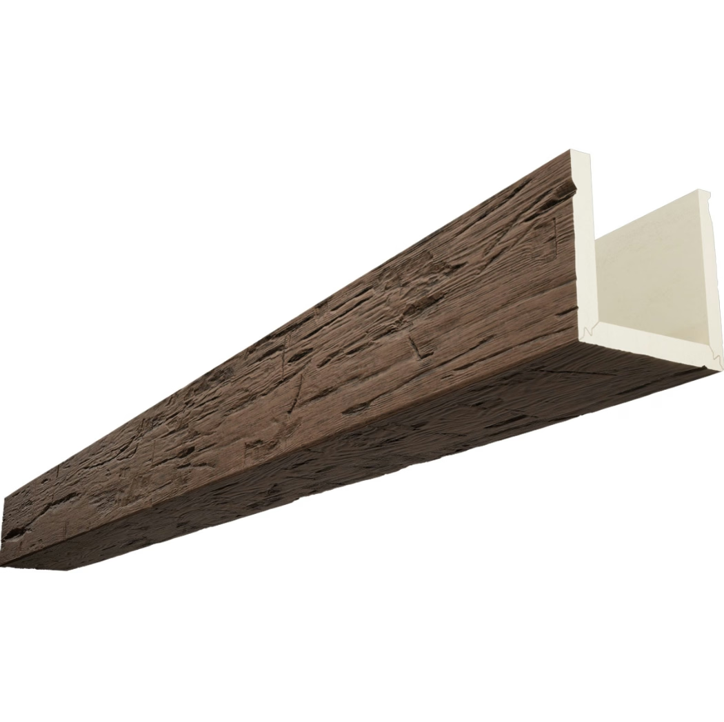
Driftwood grey faux beams perform in most rooms where a soft timber aesthetic is wanted, but a few settings are particularly worth calling out.
Open-plan living and dining. The muted finish reads cleanly from across a large space. The beams can be used to define the ceiling plane between the two zones without overwhelming either side of the room.
Vaulted or pitched ceilings. The soft grey tone prevents the beams from competing with skylights or tall window walls. Where a darker walnut or espresso beam would create visual heaviness at the apex of a vault, driftwood grey disappears into the architecture.
Bedrooms with neutral bedding palettes. Driftwood grey above a bed with linen, cotton, or wool bedding in muted tones creates a restful envelope. The beams are visible enough to give the ceiling character without keeping anyone awake.
Small commercial interiors. Boutique retail, design studios, beauty salons, and restaurants with neutral branding use driftwood grey beams as a way to add warmth without committing to a strong material statement. The finish photographs consistently across social media and menu cards.
Where it is less ideal
Driftwood grey against very saturated, high-chroma walls (deep emerald, saturated cobalt, terracotta red) creates a tension that the muted finish cannot resolve. Designers who want a saturated wall usually want a warmer or darker beam to anchor the room. Driftwood grey is also not the right call for rustic lodge aesthetics — the finish is too refined for rough-sawn timber associations and too cool for the orange-amber lighting that usually accompanies that style.
Specifying and sampling driftwood grey
For designers and homeowners, the right way to evaluate driftwood grey is to order a hand sample rather than rely on screen images. Monitors and screens render the grey differently depending on the panel calibration, and the glaze depth that defines the finish is impossible to judge from a flat image.
When samples arrive, lay them flat against the wall color you intend to use and view them under three lighting conditions: natural daylight, warm evening bulbs, and the actual bulbs you plan to install in the room. The driftwood grey should look like the same finish across all three — that is the test of a properly formulated neutral tone.
For contractors and project managers ordering in volume, driftwood grey is one of the more forgiving finishes to specify because the tolerance for color variation between batches is wider than with darker stains. Slight variation between two production runs is more easily absorbed by the soft glaze layering than it would be on, for example, a deep espresso or a fresh white. That makes batch consistency slightly easier to manage on larger projects.
Sizing and layout considerations
Driftwood grey reads slightly cooler than its actual color under bright lighting, which means it pairs well with beams that are slightly larger in profile than you might use for a darker tone. A 6-inch by 4-inch beam in driftwood grey carries enough visual weight to anchor a 9-foot ceiling without feeling heavy. In rooms with ceilings above 10 feet, an 8-inch by 6-inch profile looks more proportionate and prevents the beams from looking like thin trim.
Long runs (over 16 feet) work particularly well with this finish because the soft glaze variation helps disguise the joints between beam sections. Where a darker stain would highlight every seam, driftwood grey allows the joints to sit quietly in the overall pattern. This is one of the practical reasons designers working on open-plan renovations tend to reach for it.
Working with importers and project managers
For overseas projects, driftwood grey is among the easier finishes to communicate across language and screen differences. The reference is broadly understood — most international designers have a sense of what weathered grey timber looks like — and the sample board can be evaluated without requiring color-matching expertise. Lead times tend to run shorter for driftwood grey than for darker stains because the finish layering is slightly simpler and the cure time between coats is faster.
Project managers handling multi-room commercial installations often find that driftwood grey unifies disparate spaces. The same beam profile in the same driftwood grey can carry from a reception area through a corridor into a back-of-house lounge without ever feeling repetitive. The eye reads it as one continuous architectural decision rather than as repeated copies of the same object.
A note on authenticity and expectation
Some clients ask whether a driftwood grey polyurethane beam will look "fake" next to real driftwood pieces they already own, such as a salvaged coffee table or a piece of beach-found sculpture. The honest answer is: it depends on the manufacturer. High-density polyurethane beams with deep embossed grain, multi-tone glaze finishes, and properly textured end caps will pass a side-by-side comparison at conversational distance. Budget-tier products with smooth surfaces and single-tone grey paint will not.
The driftwood grey we produce is built to read as the same species and weathering as natural driftwood, not as a grey-painted box. When a homeowner holds a salvaged piece of driftwood next to a sample of our beam, the conversation should be about how well they complement each other — not about whether they are the same material. That is the standard worth holding any manufacturer to, and it is the standard worth asking about in your RFQ.
Bringing it together
Driftwood grey-tone polyurethane faux beams are not a trend finish. They are a working neutral that has held a steady position in residential and commercial design for over a decade because they solve a specific problem: how to add the texture and warmth of timber without introducing a strong color commitment. For designers building modern neutral interiors, for homeowners renovating a space they want to live in for ten years rather than two, and for contractors looking for a beam finish that will satisfy a range of clients, driftwood grey is the dependable choice. It will not surprise you, it will not fight your wall color, and it will quietly do its job for as long as the ceiling holds up.
Technical References
ASTM standards cited in every specification
Test Data
Lab results from internal testing program
Updated 2026
Reviewed against current product specs