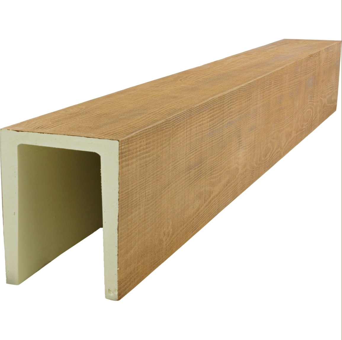
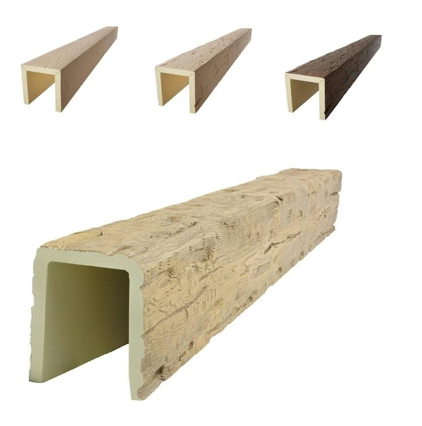
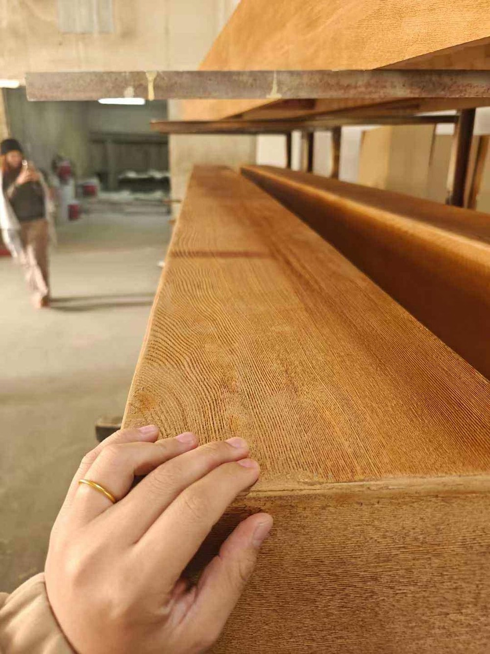
The homeowner's request was unusual: she wanted her living room to feel like a private club, with the intimacy and sophistication of spaces designed for conversation rather than display. The designer responded with deep charcoal walls, burgundy leather seating, antique brass accents, and ceiling beams in a rich chocolate brown that anchored the entire composition. The result felt immediately established, as though the room had always existed rather than being newly designed.
Moody interiors have experienced significant growth in residential design, driven by desires for spaces that feel different from the bright, neutral aesthetics that dominated previous decades. The appeal connects to authenticity—moody rooms feel inhabited rather than staged, personal rather than generic, intimate rather than performative. Chocolate brown beams contribute essentially to this atmosphere through both color and character.
Defining chocolate brown requires distinguishing it from other dark wood tones. The reference evokes the rich, warm darkness of premium chocolate—deep brown without red or orange undertones, substantial without being black, sophisticated without being severe. This specific coloration requires careful formulation in faux beam production, as slight shifts in pigment balance create noticeably different appearances that may read as mahogany, walnut, or simply brown rather than chocolate.
The psychological effects of deep brown interiors merit consideration in design planning. Dark walls and ceilings create enclosure that some find claustrophobic and others find cocooning. The warmth of brown tones tempers this effect, creating spaces that feel protective rather than oppressive. Appropriate room proportions and strategic lighting enhance positive effects while mitigating negative ones. These considerations should inform beam and finish specification.
Lighting design becomes critical in moody interiors. The dark surfaces that create intimate atmosphere also absorb light, potentially creating inadequate illumination for functional purposes. Layered lighting approaches—ambient, task, and accent combinations—provide both atmosphere and utility. The beams themselves become light reflection surfaces when properly illuminated, their chocolate tones catching and warming light from nearby sources.
Material coordination with chocolate brown beams requires attention to the overall color scheme. The deep brown reads as neutral in many contexts, allowing other colors to register more clearly against it. In other contexts, it becomes a dominant presence that surrounding colors must complement rather than compete with. This flexible role requires understanding of color relationships and design balance.
The contrast between chocolate beams and lighter floor surfaces creates visual grounding that prevents spaces from feeling top-heavy. Light hardwood, pale carpet, and neutral stone all provide the counterbalance that chocolate overhead needs. Without this contrast, the overall composition can feel unbalanced, with too much weight concentrated in the upper portion of the room.
Texture contribution to chocolate brown beam appearance deserves attention during specification. The deep color absorbs detail, potentially creating flat surfaces that lack the character of lighter options. Surface textures that provide subtle variation—grain patterns, gentle relief, and organic irregularity—maintain visual interest in the dark coloration. Too smooth and the beams read as painted rather than wood; too rough and texture overwhelms color.
Scale considerations for chocolate beams follow general principles with specific emphasis on the dramatic potential of larger dimensions. The deep color creates visual weight, so proportionally larger beams may feel appropriate in spaces seeking bold presence. However, the enclosure effect of dark coloration means that oversized beams in smaller spaces intensify the cramped feeling that some users may find uncomfortable. Testing proportions through visualization or temporary mockup helps prevent disappointing results.
The classic interior context for chocolate brown beams includes libraries, studies, dining rooms, and master bedrooms—spaces where intimacy serves the room's function. Living rooms and great rooms can accommodate moody treatments when appropriately sized, but the extended time spent in these spaces may make darker schemes exhausting for some users. The room's primary function should inform the darkness level appropriate for each application.
Maintenance of chocolate brown faux beams follows standard faux wood care practices. The deep color masks dust and minor soiling better than lighter options, reducing cleaning frequency. However, the same darkness that provides this practical advantage also reveals any surface damage more clearly. Care during installation and use prevents the scratches, dents, and finish damage that would be less visible in lighter-colored alternatives.
The durability advantages of polyurethane over genuine timber become particularly relevant in dark-finished applications. The consistent color throughout the material means that any damage that penetrates the surface shows the same color rather than revealing different-colored substrate beneath. This characteristic supports long-term appearance maintenance in ways that wood-grain foil and veneer products cannot match.
The luxury market segment has embraced chocolate brown aesthetics as a sophisticated alternative to traditional light wood finishes. The depth and richness of proper chocolate coloration creates premium perceptions that justify premium pricing. Hospitality venues using these aesthetics create memorable atmospheres that support brand positioning. Residential clients seeking sophisticated environments find chocolate brown beams provide the dramatic presence their projects require.
Environmental considerations for dark-finished faux beams parallel those for lighter options. Polyurethane production avoids the harvesting impacts of genuine timber while potentially incorporating recycled content in foam cores. The durability advantage over natural wood reduces replacement frequency and associated environmental costs. These factors support environmental positioning for projects with sustainability commitments.
The comparison between chocolate brown and black walnut in dark interior applications involves subtle aesthetic distinctions. Walnut carries warmer red undertones; chocolate reads as more neutral brown. Walnut shows more prominent grain; chocolate can present more uniformly. The choice between them depends on specific design intent and coordination with other materials in the space.
Photography and visualization of chocolate brown beams present challenges common to all dark materials. The color that creates dramatic presence in person often photographs as flat or loses distinction between beam and surrounding surfaces. Professional documentation of these installations requires careful lighting setup that reveals rather than flattens the dimensional quality that makes chocolate brown so effective in occupied spaces.
The emotional resonance of properly executed moody interiors explains their sustained appeal despite—or perhaps because of—the contrasting brightness that dominates most contemporary spaces. The chocolate brown beams overhead create enclosure that feels like shelter, warmth that feels like welcome, and sophistication that feels earned rather than imposed. These emotional qualities reward the additional design attention that successful moody interiors require.
Technical References
ASTM standards cited in every specification
Test Data
Lab results from internal testing program
Updated 2026
Reviewed against current product specs