Color relationships in interior design determine whether spaces feel harmonious or chaotic, comfortable or jarring. When introducing natural wood beams into interiors, understanding these relationships becomes essential for creating cohesive environments. The warm tones of wood beams interact with every other color in the room, creating either supportive harmony or uncomfortable discord. Learning to select and coordinate warm tones ensures beam installations enhance rather than disrupt overall design.
Understanding Color Temperature
Color temperature provides the foundation for understanding how colors relate to each other. Colors exist on a spectrum from cool to warm, with implications for how they make spaces feel.
Cool colors—blues, greens, and grays with blue undertones—tend to recede visually and create feelings of calm, clarity, or even chill. These colors work well in spaces requiring focus or serenity but can feel uncomfortable when dominant in spaces meant for gathering and warmth.
Warm colors—reds, oranges, yellows, and browns—advance visually and create feelings of energy, comfort, and intimacy. These colors suit social spaces, bedrooms, and anywhere warmth and welcome are priorities. Natural wood beams fall squarely in the warm spectrum, contributing inherent warmth that influences entire rooms.
Neutral colors occupy middle ground, neither distinctly cool nor warm. True neutrals like gray or greige can work with warm beams when carefully selected; warm neutrals like cream, ivory, and tan naturally complement wood tones. Cool neutrals risk creating uncomfortable contrast that undermines beam warmth.
The Warm Wood Beam Spectrum
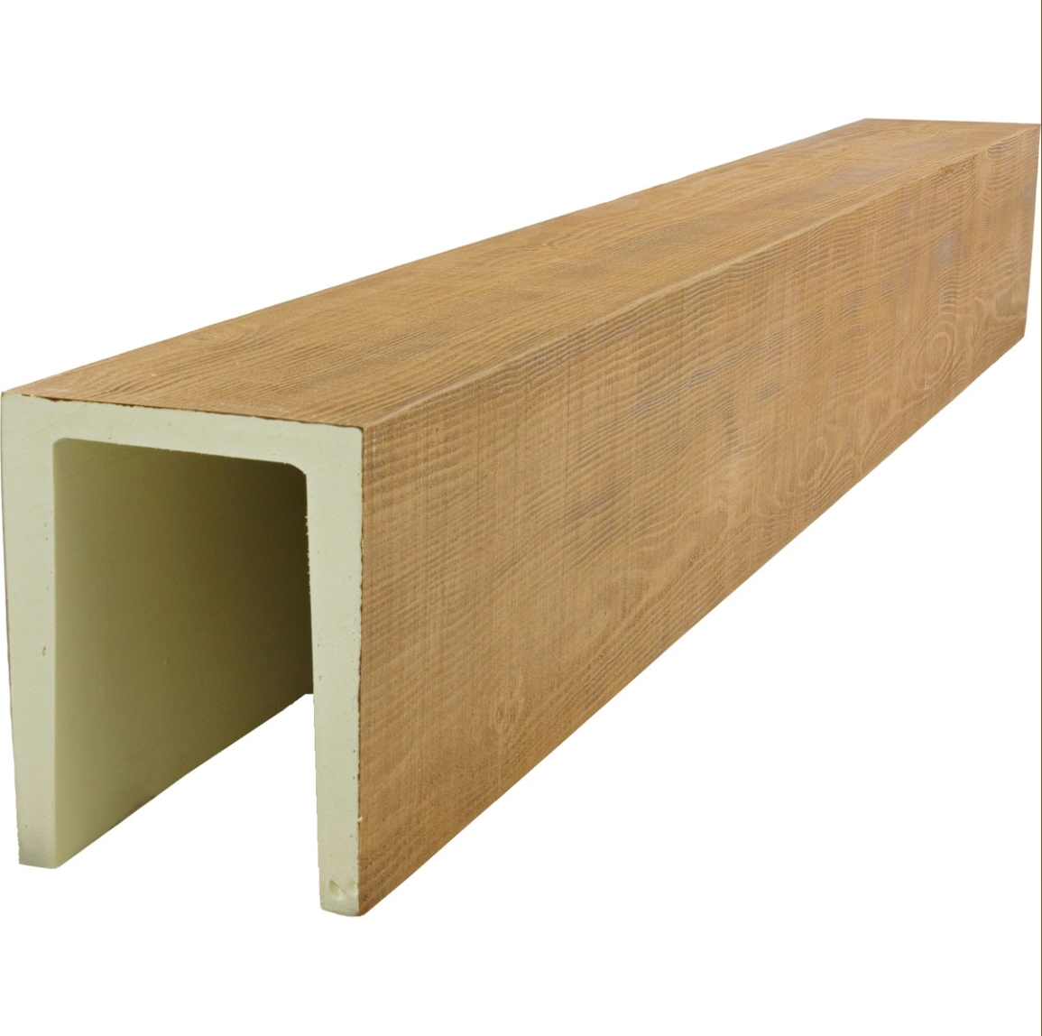
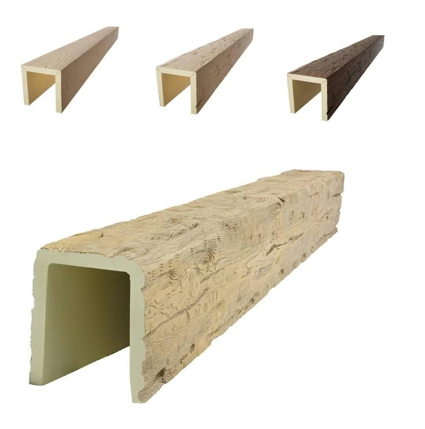
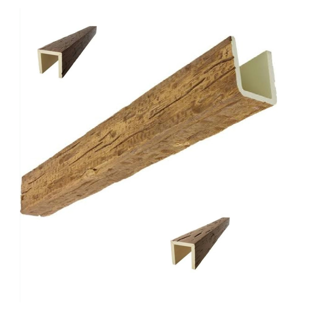
Natural wood beams encompass a range of warm tones, each with specific color implications for room coordination.
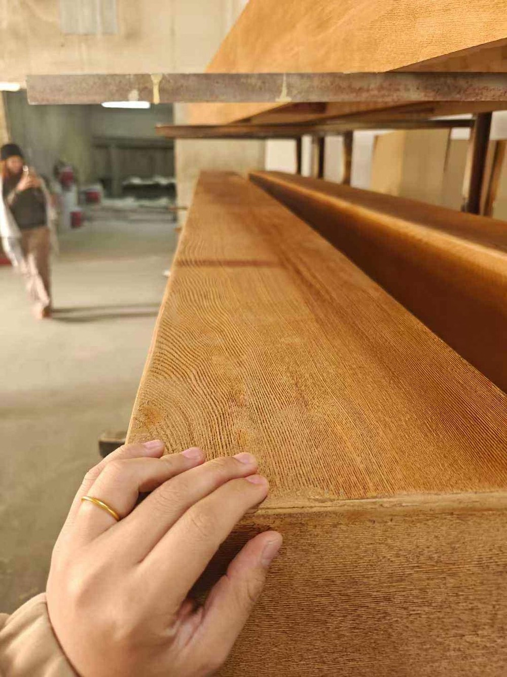
Honey and golden oak beams feature bright yellow-orange tones that bring sunshine into spaces. These lighter beams reflect rather than absorb light, making them excellent for rooms needing visual warmth without additional weight. The bright character suits casual, cheerful spaces more than formal ones.
Butterscotch and amber tones occupy the middle warm spectrum, providing balanced warmth appropriate for most applications. These beams complement both warm and neutral backgrounds, offering versatility that lighter or darker options cannot match. The approachable character suits family spaces and formal rooms alike.
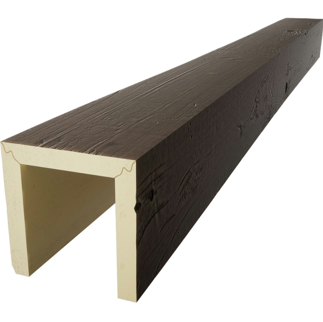
Chestnut and walnut beams feature deeper brown tones with subtle red or orange undertones. These substantial beams add visual weight that suits formal spaces, larger rooms, and design schemes seeking gravitas. The rich character creates dramatic impact that demands thoughtful coordination.
Rust and reddish mahogany beams incorporate orange-red undertones that create the warmest environments. These beams make bold statements that dominate spaces, suitable for accent treatment or dramatic focal areas. The intense warmth suits intimate spaces and rustic aesthetics.
Harmonious Wall Colors
Wall color selection significantly impacts how wood beams read in finished spaces. The right wall color amplifies beam warmth; the wrong choice undermines it.
Warm whites and creams provide the most universally harmonious backgrounds for wood beams. These colors—often labeled as ivory, antique white, or warm white—contain subtle yellow or beige undertones that complement wood warmth without competing. The combination has appeared in countless traditional interiors, proving its timeless appeal.
Soft yellows and pale oranges create cheerful backgrounds that enhance beam warmth without overwhelming. These sunny tones suit kitchens, breakfast rooms, and other spaces where bright, uplifting atmosphere is desired. The playful character suits casual family living more than formal entertaining.
Sage green and dusty blue offer intriguing alternatives that break from traditional pairings. These cooler tones create interesting contrast with warm beams, but selection requires careful attention to undertones. Warm greens and blue-greens complement wood more successfully than cool blue-greens or yellow-greens.
Terracotta and rust wall tones create intense warmth that demands equally substantial beams. This bold combination suits Spanish, Mediterranean, and rustic aesthetics where dramatic impact is desired. The unified warm palette creates enveloping atmospheres that feel exotic and inviting.
Avoid cool whites with blue or gray undertones when pairing with warm beams. These colors create uncomfortable visual tension that undermines both elements. The blue casts make wood appear dirty rather than warm, destroying the natural harmony intended.

Coordinating Furniture and Furnishings
Furniture colors must harmonize with beam warmth throughout daily living. Understanding these relationships ensures comfortable environments rather than jarring contrasts.
Leather furniture in warm browns, tans, and cognac tones creates natural harmony with wood beams. The shared warm palette unifies spaces while leather's material warmth provides tactile comfort. This combination suits living rooms, studies, and libraries where cozy atmosphere is paramount.
Upholstered furniture in warm neutrals—cream, tan, oatmeal—provides comfortable contrast against both beams and leather. These flexible colors adapt to various design schemes while maintaining warmth throughout. Avoid gray or cool-toned upholstery that would feel discordant.
Bold accent colors work best when drawn from the warm spectrum. Deep burgundy, forest green, rich navy, and warm gold all complement wood beams while providing visual interest. Position these accents through pillows, throws, artwork, and decorative accessories rather than dominant furniture pieces.
Wood furniture matching or complementing beam tones creates cohesive unity. Matching exact beam color might feel overly coordinated; choosing similar but distinct tones provides variety within harmony. Darker wood grounds lighter beams; lighter wood provides contrast against darker beams.
The 60-30-10 Color Rule
Professional designers often employ the 60-30-10 rule for balanced color distribution. This framework provides helpful guidance for coordinating warm beams with overall color schemes.
The dominant color (60%) typically appears on walls, creating the foundational atmosphere. For warm beam installations, this color should be warm—either neutral warmth or intentionally warm hue. This foundation ensures the room's basic character supports rather than conflicts with beam warmth.
The secondary color (30%) appears through larger furniture pieces—sofas, chairs, area rugs. These elements should complement wall warmth while providing sufficient contrast for visual interest. Warm neutrals often serve well in this role, supporting walls while contrasting with beams.
The accent color (10%) provides visual punctuation through smaller elements—pillows, accessories, artwork, decorative objects. Accent colors offer opportunities for bolder choices that might overwhelm if used more extensively. This is where burgundy, forest green, or golden yellow can shine.
Wood beams don't fit neatly into this framework since they're architectural rather than decorating elements. Consider beams as additional color contribution that slightly shifts the overall palette toward warmth. This shift means accent colors can run slightly cooler than might otherwise be appropriate, as beam warmth balances any tendency toward coolness.
Lighting and Color Interaction
Lighting significantly affects how all colors read in interiors, including warm wood beams. Understanding these interactions ensures beam installations achieve intended effects.
Natural daylight contains significant blue content that can flatten warm colors. Rooms with abundant northern light may need additional warmth through bulbs and accessories to compensate. Southern light enhances warm tones, making honey and amber beams glow.
Incandescent and halogen bulbs emit warm yellow light that flatters wood beams beautifully. These traditional light sources enhance warm tones throughout rooms, making them excellent choices for spaces with wood beam installations. The cost and heat of these bulbs have led to alternatives.
LED bulbs in warm white (2700K-3000K) provide energy-efficient alternatives that approximate incandescent warmth. Quality matters significantly—cheap LEDs may emit harsh or cool light that undermines beam warmth. Select reputable brands known for accurate color temperature.
Layered lighting creates nuanced warmth that changes throughout the day. Combine ambient, task, and accent lighting to achieve flexibility that accommodates varying natural light conditions. Dimmers provide additional control over warmth intensity.
Seasonal Color Adjustments
Warm wood beams provide constant foundation that seasonal accessories can enhance or temper throughout the year.
Spring and summer bring opportunities to introduce fresh, lighter accents that feel appropriate for seasons of growth and renewal. Pale greens, soft yellows, and airy whites complement beam warmth without overwhelming. Lighter textiles, fresh flowers, and botanical elements reinforce seasonal themes.
Fall and winter invite deeper, richer accents that match the season's own warmth. Burnt orange, deep burgundy, forest green, and golden yellows echo autumn foliage and holiday festivities. Heavier textiles—wool blankets, velvet pillows—provide tactile warmth that complements visual warmth.
The constant presence of warm wood beams provides stability that seasonal changes enhance rather than contradict. This foundation allows bold seasonal statements that might feel jarring in cooler-toned spaces. The beams create coherence that makes seasonal transitions feel intentional rather than arbitrary.
Testing Color Selections
Before committing to color selections for beam-coordinated spaces, testing provides valuable assurance against costly mistakes.
Large paint samples applied to walls and observed throughout the day reveal true color behavior under varying light conditions. Colors that appear perfect in morning light might look wrong at noon or evening. Apply samples, live with them, and observe repeatedly before finalizing.
Fabric samples placed near beams show true coordination relationships. The interplay between warm wood and textile color may differ from isolated observation. Bring actual beam samples to fabric showrooms when possible, or photograph fabric options alongside beam finishes.
Digital tools allow experimentation without commitment, though screen calibration affects accuracy. Use apps and online visualizers as starting points rather than final decisions. Physical samples and lived experience remain more reliable than digital prediction.
Professional color consultations provide expert guidance for complex spaces. Color specialists understand nuances that DIY approaches might miss, ensuring harmonious results that justify the investment. This proves especially valuable for larger projects or challenging existing conditions.
By understanding warm tone color palettes and their relationships with natural wood beams, homeowners create interiors where every color supports rather than contradicts. The resulting harmony makes spaces feel designed rather than assembled, comfortable rather than chaotic.
Master warm tone color coordination with our guide to pairing colors with natural wood faux beams. Contact us for beam samples and expert consultation on your warm interior project.
Technical References
ASTM standards cited in every specification
Test Data
Lab results from internal testing program
Updated 2026
Reviewed against current product specs